Classic BigPanda Reporting
The analytics feature helps you visualize trends in your monitoring data.
Unified Analytics
With improved visualizations and customizable options, Unified Analytics can help you see the metrics you need to monitor and improve your IT Operations.
See the Unified Analytics documentation for more information on features and improvements, or reach out to your BigPanda Account Manager to learn about the rollout.
BigPanda Reporting will be deprecated following the migration to Unified Analytics.
The BigPanda Live Dashboards and Analytics Reports provide insights that you can use to make better decisions about your infrastructure. You can gain insights into hot spots in your environment and see how BigPanda is correlating alerts into actionable incidents.
BigPanda Dashboard—provides a dynamic view of your data that is continuously updated, making it ideal for operational health monitoring and situational awareness.
Analytics Reports—provide on-demand snapshots of your data for a specific period of time, which helps you visualize historical trends in your monitoring data and identify problem areas in your infrastructure.
Use these complementary features together to understand and proactively monitor your infrastructure for increased up-time and reduced mean time to resolution (MTTR).
Reports and Widgets
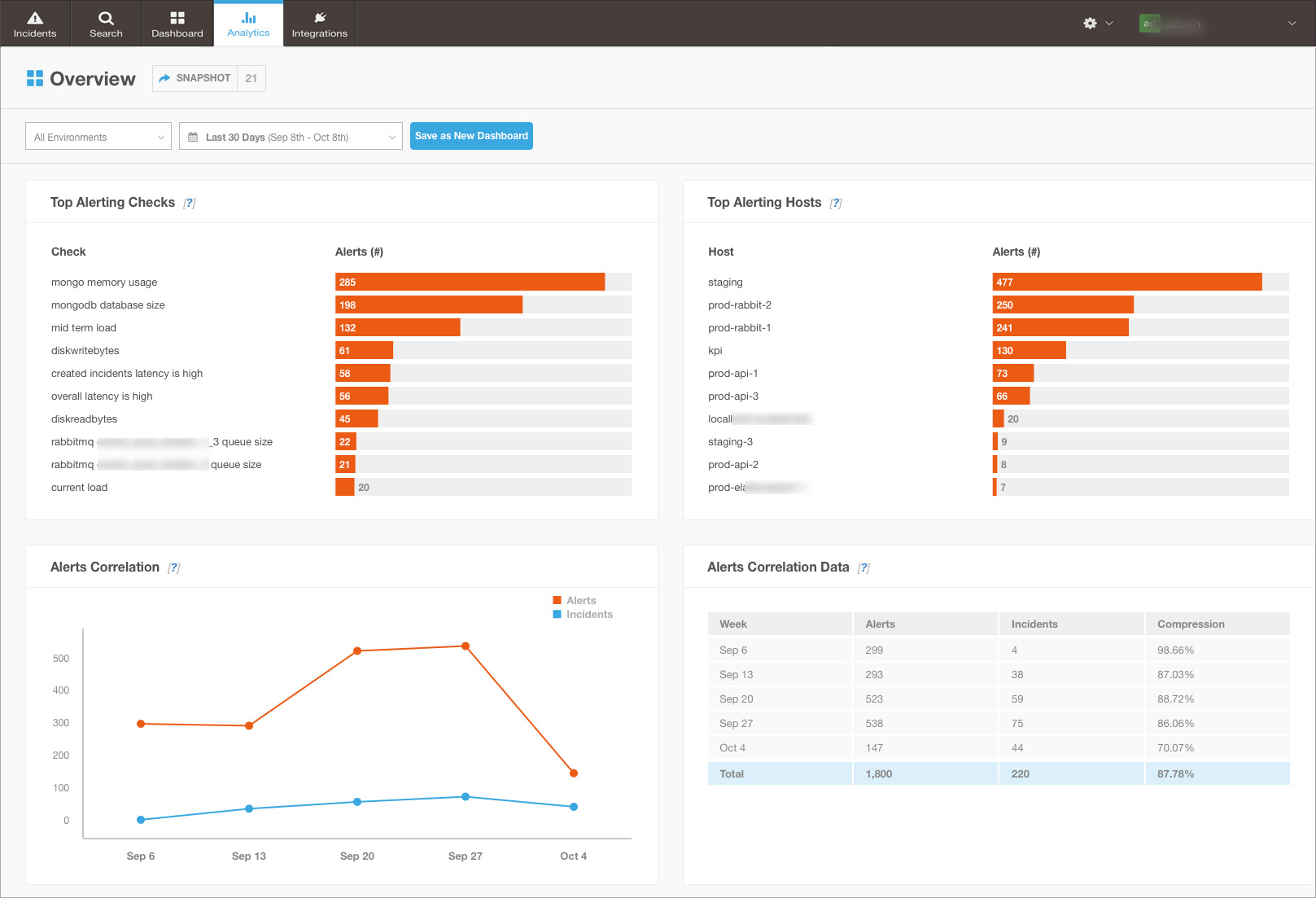
Use BigPanda's built-in reports and widgets to meet your business needs. Reports display key metrics in a consolidated view. They contain widgets, which are visualizations of your monitoring data. Types of widgets include charts, graphs, and tables.
Overview Report
| Widget | Description | Configurable Attributes |
|---|---|---|
| Top Alerting Charts | Displays up to 10 of the grouping field values with the most frequent alerts for the selected Environment and date range. By default, the widgets show the top alerting checks and top alerting hosts. You can select a different grouping field. | Grouping Field |
| Alerts Correlation Graph | Compares the number of alerts to the number of incidents opened during the selected date range for the selected Environment. You can point to a data point to see the exact number of alerts or incidents opened during the time period. | |
| Alerts Correlation Data Table | Displays the ratio of alerts to incidents opened during the selected date range for the selected Environment. | |
| MTTR Combo Chart | Compares the mean time to resolution (MTTR) to the number of incidents opened during the selected date range for the selected Environment. MTTR calculates the average duration that an incident is open before it is resolved. For incidents that are reopened, the MTTR calculation includes only the time when the incidents are open. It also includes the time when incidents are snoozed and, by default, the time when incidents are flapping. You can choose whether to include the time when incidents are flapping. MTTR is graphed as a line and the number of incidents appears as a bar chart. You can point to a data point to see the MTTR duration and the number of incidents opened during the time period. | Include Time When Flapping |
| MTTR Data Table | Compares the number of incidents opened to the mean time to resolution (MTTR) during the selected date range for the selected Environment. | Include Time When Flapping |
Top Alerting Charts
Be sure to select a grouping field that relates to the selected Environment. For example, if you select a grouping field that relates only to AppDynamics alerts, but the selected Environment contains only Nagios data, then the chart will not display any data.
Counting Alerts and Snoozed Incidents
For widgets with alert calculations, the number of alerts counts both warning and critical alerts. For example, the top alerting host is the host with the greatest total number of warning and critical alerts, not necessarily the host with the most critical alerts.
Snoozed incidents are included in all calculations, including MTTR.
Determining Time Periods
For widgets with time periods, the length of a time period is determined automatically based on the selected date range. For example, the Alerts Correlation graph shows weekly data points for the default date range of the most recent 30 days. Similarly, the MTTR Data table shows one row per week for the most recent 30 days. Each data point or row in a table represents the time period starting on the specified date.
Use Analytics
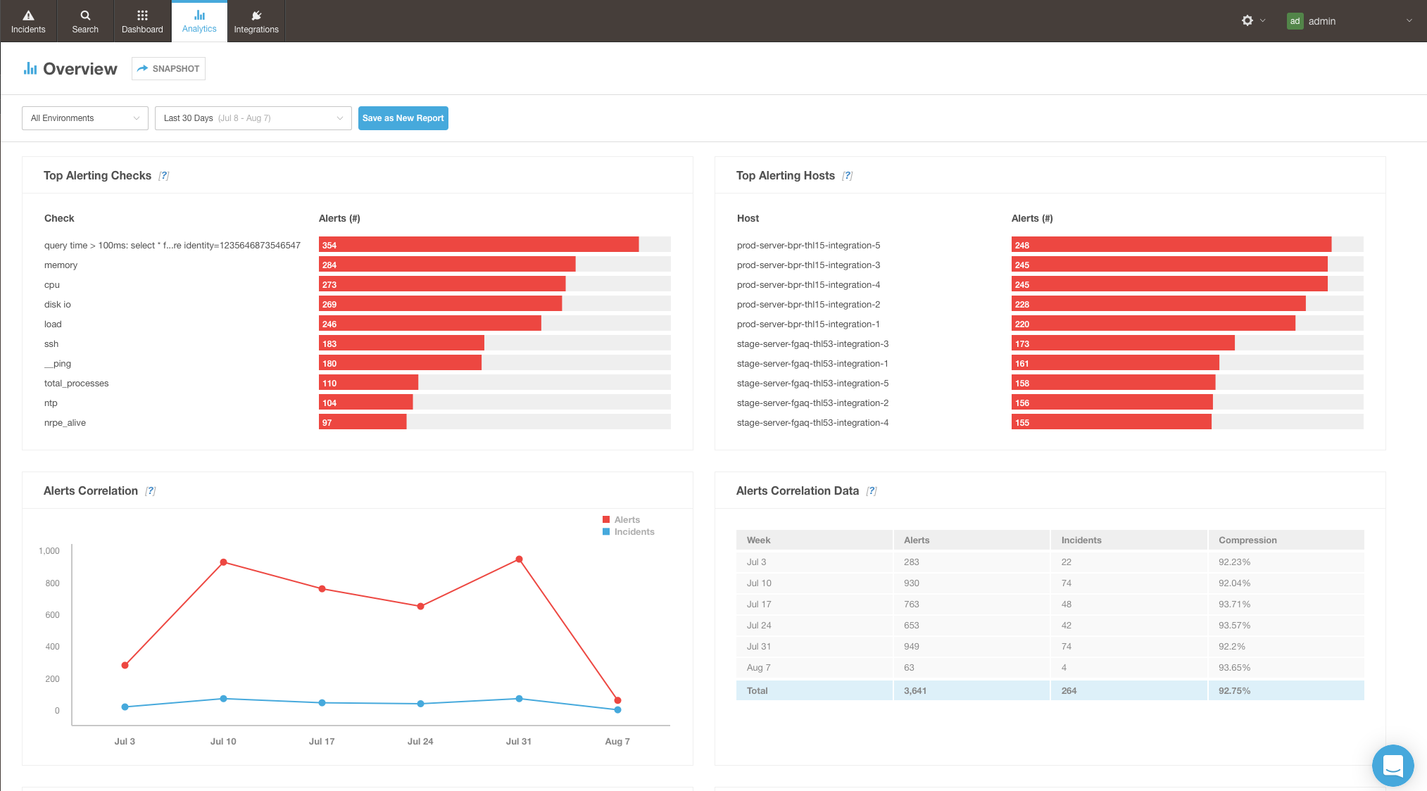
Use analytics to visualize trends in your monitoring data. Customize reports and widgets to focus on the data that you want to analyze.
Before You Start
(Optional) Set up Environments.
Open Analytics Reports
- At the top of the screen, click the Analytics tab.
- In the left pane, click the report you want to view.
Select The Data
All widgets on a report include data for the selected Environment and date range.
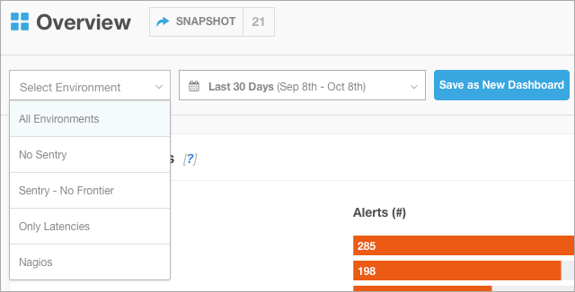
- At the top of the report, select the Environment.
By default, built-in reports display incidents in All Environments. - Select a date range, or select Custom Timeframe to enter specific dates.
By default, built-in reports display the Last 30 Days.
Refreshing Data
The report data is updated every time you change a report or widget setting. Alternatively, you can refresh the data by reloading the page in your browser.
Customize Widgets
- Point to the widget, and then click the gear icon.
- Edit the configurable attributes.
For example, select a different field for grouping the data. For more options, see Available Reports and Widgets.
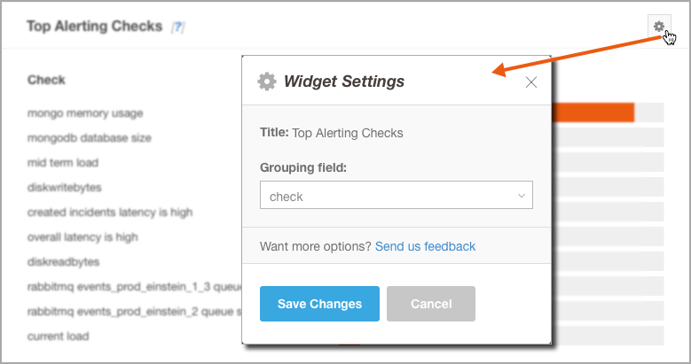
- Click Save Changes.
The widget is updated with your changes.
Saving Selections and Customizations
Custom reports load with the most recent data selections and widget customizations. However, built-in reports load with the default data selections and widgets. To save your selections, create a custom report.
Create a Custom Report
Administrators can save their selections as a custom report that is available to all users.
- Open a built-in report.
- Select the data to include in the widget results.
- Customize the widgets on the report, as desired.
- Click Save as New Report.
- Enter a Report Title.
- (Optional) Click Add a Description and then enter a Report Description.
- Click Save Report.
The report is saved and is listed in the left pane.
Manage Saved Reports
Administrators can rename, duplicate, or delete saved reports.
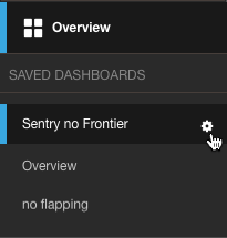
On the left pane, point to the report name, and then click the gear icon. Select the desired option.
After Creating Reports
- Make appropriate changes to your environment based on your insights and continue to monitor trends.
- (Optional) Export Reports.
Export Reports
Export a report to share a static snapshot of your monitoring data at a specific point in time. Recipients can view exported reports from a browser or mobile device without logging in to BigPanda.
Before You Start
Create Snapshots for Export
Administrators can create a static snapshot of a report at a specific point in time.
- At the top of the screen, click the Analytics tab.
- In the left pane, click the report you want to export.
- Ensure that your report is configured as desired.
- At the top of the report beside the name, click Snapshot.
A window opens that summarizes the settings for the snapshot. - Click Generate Link.
When the snapshot is completed, a link appears in the window.
Copying The Link Immediately
To copy the link immediately, click Copy. If your browser does not support this function, a message appears above the link and you can select the text and press CTRL+C to copy it manually. To view snapshots anytime, see Sharing Exported Reports.
Share Exported Reports
- Open the report you want to share.
At the top of the report beside the name, you can see the number of existing snapshots. - Click the number.
A window opens that lists the existing snapshots for the report, including the creation time and settings for date range and environment.
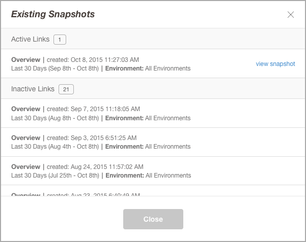
- Find the desired snapshot and click the view snapshot link beside it.
The exported report opens in a new tab. - Review the exported report to ensure you selected the correct one.
- Send the page link to the desired recipients.
View Exported Reports
When you receive a link to an exported report, you can view it from any supported desktop or mobile device browser without logging in to BigPanda. From a desktop browser, you can also print the static view or log in to BigPanda to view live data.
- Click the link to the exported report.
The page opens and shows static data from your BigPanda report. The date range and Environment are indicated at the top of the page.
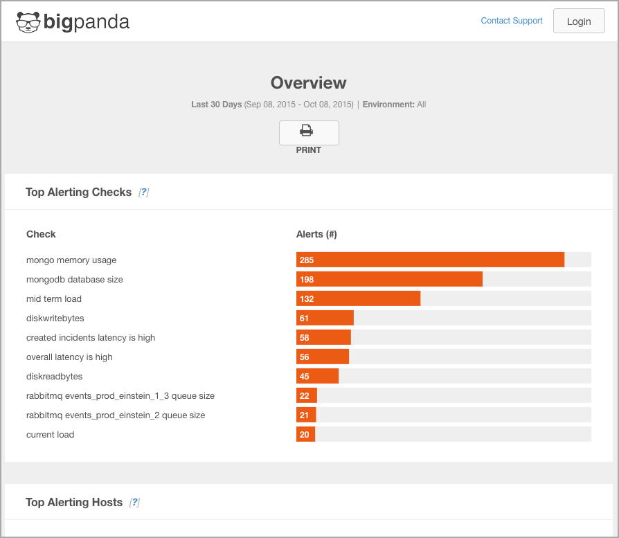
- To print the exported report, click Print.
The page opens in a print-friendly layout. You can use your browser options to print the page or save it to PDF. - To view live data in BigPanda, click Login at the top right of the page. Then, enter your credentials and open the desired report.
Limitations On Mobile Devices
Printing and logging in are not available on mobile devices.
Troubleshooting
Problem
In Analytics, a Top Alerting chart does not display any data.
Symptoms & Diagnosis (Option 1):
The following message appears:
No data matches the selected criteria...
Possible Causes
-
The grouping field is not related to the selected data. For example, the selected grouping field relates only to AppDynamics alerts, but the selected Environment contains only Nagios data.
-
No alerts have been generated for the selected Environment and data range.
Solutions
-
Adjust the grouping field by customizing the widget.
-
Adjust the report filter selections for Environment and date range.
Symptoms & Diagnosis (Option 2)
The following message appears:
Oops! An error occurred...
Possible Causes
An error occurred in BigPanda or a connecting system.
Solutions
-
Try running the report again by reloading the page.
-
If some time has passed and the report still won't load, you can contact BigPanda support.
Next Steps
Learn about the new Unified Analytics platform
View information about the Reporting Data Tables used by BigPanda Reporting
Learn how to set up Live Dashboards
Updated 17 days ago
