Change Analysis
Use the Change Analysis dashboard to view trends in change data sent to BigPanda.
Root Cause Changes (RCC) dramatically speeds up the process of identifying the changes that cause issues and outages. First, RCC collects change information through inbound change integrations. Then, BigPanda's AI technology analyzes these changes against your existing incidents in real-time, to identify and surface the suggested root cause right alongside that incident.
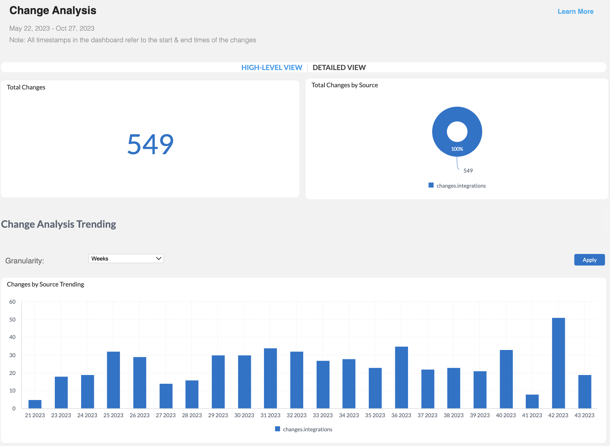
The Change Analysis dashboard shows you data sent from your change integrations to BigPanda, such as the number of changes per source system, change trends by time period, and change duration. This allows you to quickly pinpoint anomalies and trends in your change data.
You can use this dashboard to inform proactive improvements to your change tools, allowing RCC to provide accurate root cause analysis resulting in faster incident resolutions.

Change Analysis Dashboard
Dashboard Duplication
The Change Analysis dashboard cannot currently be duplicated. See the Unified Analytics Dashboards documentation for a full list of duplicable dashboards.
Key Features
- View the total number of changes sent to BigPanda, broken down by source system.
- Find trends in your change data over time.
- Assess the average duration of change windows and identify source systems with long change windows.
Widgets
The top section of the Change Analysis dashboard can be updated to display either high level or detailed information. To change the widgets displayed, click High-Level View or Detailed View.
| Widget | Description |
|---|---|
| Total Changes | Displays the total number of unique changes sent to BigPanda. |
| Total Changes by Source | To view this widget, select High-Level View. A pie chart displaying the total number of unique changes sent to BigPanda, broken down by source system. To filter the dashboard by a specific source system, click one of the sections of the pie chart to drill down. |
| Total Changes Status by Source | To view this widget, select Detailed View. A table displaying the number of unique changes per status sent to BigPanda from each source system. |
Change Analysis Trending
The Granularity drop-down menu above the Change Analysis Trending widgets allows you to select the time period for the Changes by Source Trending widget.
Select from Years, Quarters, Months, Weeks, Days, or Hours.
| Widget | Description |
|---|---|
| Changes by Source Trending | A bar graph displaying the number of changes broken down by source system for the selected time period. |
| Changes by Hour (Time of Day) | A bar graph displaying the number of changes broken down by source system for each hour of the day. |
| Changes by Day of the Week | A bar graph displaying the number of changes broken down by source system for each day of the week. The day of the week starts with 0 for Sunday. |
Change Duration
The Change Duration widgets provide details about the duration of your changes.
| Widget | Description |
|---|---|
| Weekly Average Change Duration (Hours) | A bar graph displaying the average change duration in hours, by each day of the week. |
| Longest Change Duration | A table displaying details about changes that had the longest duration, in hours. The longest changes appear at the top of the chart. The following details about each change are available: - Change URL - Source System - Duration (hours) - Change Start - Change End |
| Shortest Change Duration | A table displaying details about changes that had the shortest duration, in hours. The shortest changes appear at the top of the chart. The following details about each change are available: - Change URL - Source System - Duration (hours) - Change Start - Change End |
Next Steps
View Unified Analytics dashboards
Learn how to Manage Unified Analytics
Find definitions of Unified Analytics key metrics
Dive into potential reporting fields in Unified Analytics Reporting Tables
Updated 26 days ago
