Manage Biggy Analytics
The Analytics module of the Biggy Web App gives you insights into how your organization is interacting with Biggy. These powerful reports can help you visualize the amount of time that Biggy is saving your users, and see which operators are utilizing Biggy the most. Feedback and action plan metrics can also help you determine ways to improve Biggy's responses by adjusting action plan settings or by providing Biggy with additional context.
The Analytics module contains five sections:
Usage Metrics - Information on who is using Biggy and how they're interacting with it.
Team Analytics - Details about how specific groups in your organization are using Biggy.
User Feedback - Details about the feedback your users gave to Biggy's query responses.
Change Risk - High-level analysis of changes in your IT environment for a specific time period. This section is only available if your organization has the AI Incident Prevention module.
Workflow Executions - Usage details about workflows that trigger from new messages in your chat channels.
Biggy API Usage - Details about how your organization is using the Biggy API.
Guardrail Violations - Information about blocked queries and the effectiveness of the content filter.
Key Features
See how many queries were sent to Biggy, and which users are interacting with Biggy the most.
Determine which action plans your users trigger most often during queries.
View detailed Biggy interactions including the full text of queries and responses.
See the specific feedback your users gave Biggy.
View usage details about your workflows.
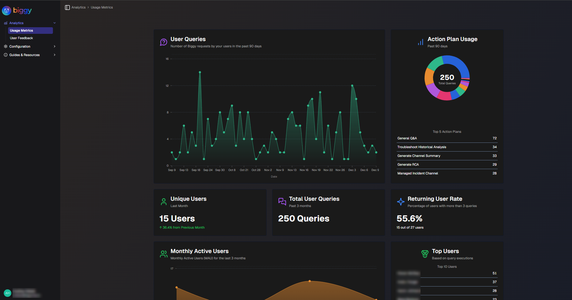
Usage Metrics
The Usage Metrics section provides detailed information on how often your users interact with Biggy, which users utilize Biggy the most, and which action plans Biggy uses to answer user queries.
Use the drop-down menu at the top right of the screen to adjust the selected time period.
Usage Metrics
The following report widgets are available in the Usage Metrics section:
Report | Description |
|---|---|
User Queries | A line graph displaying how many times users interacted with Biggy on each day over the selected time period. On the bottom of the widget, the Total Daily Usage, Peak Daily Usage, and Recent Usage is displayed. Total Daily Usage shows the total number of queries over the selected time period, and the average number per day. Peak Daily Usage shows the day that had the highest number of queries, and the number of queries on that day. Recent Usage shows the number of queries that were executed on the previous day. |
Action Plan Usage | A pie chart displaying the number of times each action plan was used, and the top 5 most used action plans. Hover over a specific section of the pie chart to view details about that action plan, including the number of times it was used for the selected time period. |
Unique Users | The number of unique Biggy users over the past month, and the percent increase or decrease in the past month. A unique user is counted once they send a query to Biggy, either using Slack, Teams, or the web app chat. |
Total Queries | The total number of user queries and the number of active users over the selected time period. |
Returning User Rate | The percentage and number of users out of the total users who have placed more than 3 queries. |
Avg Queries/User | The average number of queries that each user executed. |
Monthly Active Users | The number of monthly active users over the selected time period. Hover over a dot on the line chart to see the exact number of active users for that month. |
Top Users | The top 10 Biggy users for your organization based on the number of queries placed. |
Usage by Platform | The total number of user queries for each supported platform (Slack, Teams, and Web chat), and the percentage of the total for each platform. |
Web Chat Usage | A chart displaying web chat usage over the selected time period. Hover over a specific date to view the number of sessions and messages for that day. The bottom of the widget displays the total number of sessions, and the total number of messages. |
Action Plan Usage Flow | Flowing visualization of action plan adoption trends. Each colored layer represents a specific action plan. Hover over a section of the visualization to view trends for that week. The list of action plans is at the bottom of the widget. Click a plan name to highlight it in the visualization. |
User Engagement Matrix | A chart segmenting users by activity patterns and personas. The X axis in the chart represents the total number of queries. The Y axis represents the number of active days. Each circle in the chart represents a user. The color, size, and position of the circle show engagement levels. Larger circles have a higher number of queries per day. Red circles are low engagement users, Orange represents medium engagement, and Green represents high engagement. Hover over a user to view additional details. Their Total Queries, number of Active Days, Intensity (average number of queries a day), number of Action Plans Used, and how long ago they were Last Active is displayed. Users in the upper left corner of the chart are Consistent Champions. These are regular users of Biggy, but have a low number of total queries. Users in the upper right corner of the chart are Power Users. They use Biggy frequently, and with a high volume of queries. Users in the lower left corner of the chart are Casual Users. They have low levels of engagement with Biggy. Users in the lower right corner of the chart are Burst Users. They do not use Biggy frequently, but when they do, they have a high volume of queries. |
Action Plan Execution Heatmap | A heat map displaying each of your action plans, and the number of times the action plan was used for each week over the selected time period. |
Action Plan Execution Bar Chart | A bar chart displaying how many times each action plan was used for each week over the selected time period. |
Team Usage Analytics | A breakdown of Biggy usage, separated by Team. The following information is available for each team:
|
All Usage | A table displaying details about how your users are interacting with Biggy. Each line on the table displays:
You can filter usage by User or Action Plan using the drop-down menus at the top of the table. To view the report in CSV format, click Export to CSV. |
Team Analytics
Track how specific groups within your organization are using Biggy with Biggy Teams. The Team Analytics page provides usage and feedback metrics to track the team's engagement.
Use the drop-down menus at the top right of the screen to adjust the selected time period or adjust the Team or Team Group.
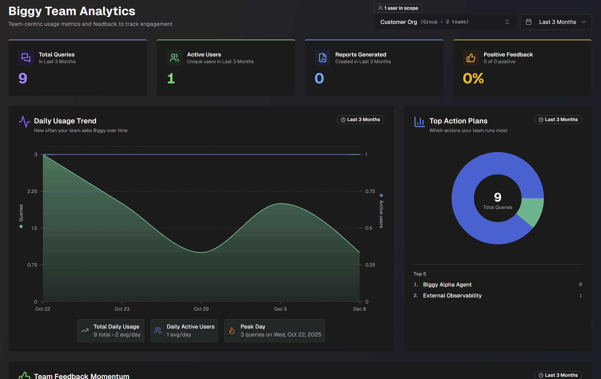
The following widgets are available in Team Analytics:
Widget | Details |
|---|---|
Total Queries | Number of queries the team has sent to Biggy. |
Active Users | Number of unique active team users. |
Reports Generated | Number of reports generated by the selected team. |
Positive Feedback | Percent of positive feedback the team has sent to Biggy. |
Daily Usage Trend | How often your team sends queries to Biggy, over time. The green line shows daily active usage. The blue line shows the number of daily active users. |
Top Action Plans | Pie chart displaying the top 5 action plans that the selected team used the most. |
Team Feedback Momentum | How sentiment and value are trending across the team. Feedback Rate shows the number of times the team provided feedback to Biggy. Positive Rate shows the number of times the team gave Biggy positive feedback. Time Saved shows the average amount of time that Biggy saved the team, based on user feedback. |
Feedback Over Time | Daily positive and negative feedback sent to Biggy by the team, over time. |
Usage by Platform | Distribution of queries broken down by platform (MS Teams, Slack, or Web Chat). |
Action Plan Usage Flow | Flowing visualization of the team's action plan usage trends. Hove over a section of the graph to view which action plans were used on that date, with a breakdown of the total number of queries per action plan. |
User Activity | Breakdown of who on the team is using Biggy the most. The following information about the team is displayed:
Click a team name to view additional information about each user. The following information about each user is displayed:
Click any column to sort the list of users by that facet. |
AI Team Report | An on-demand qualitative analysis for the team. Click Generate Report or Generate New to create the report. See the AI Team Report section for more information about the contents of the report. |
Drill-Down | Table displaying recent team activity. The table is separated into two tabs: Recent Queries and Recent Feedback. For each recent query, the following information is displayed:
For each recent feedback, the following information is displayed:
|
AI Team Report
The AI Team Report gives you on-demand qualitative analysis for your selected team or team group.
To generate a report, click Generate Report or Generate New.
After the report is generated, you can view previous reports by selecting them from the drop-down menu, or click Export PDF to export the report.
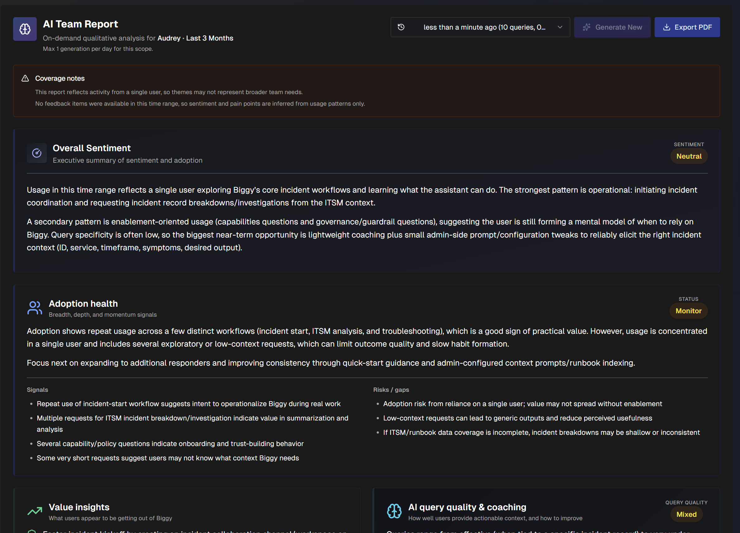
The report is divided into the following sections:
Section | Description |
|---|---|
Overall Sentiment | Executive summary of the team's sentiment and adoption of Biggy. |
Adoption Health | Details about the team's adoption of Biggy. The Signals section shows signs of positive adoption health. The Risks/Gaps section highlights issues that may hinder the team's adoption of Biggy. |
Value Insights | Benefits users are getting out of Biggy. |
AI query quality and coaching | How well users provide actionable context in their queries, and how to improve. |
What users are using Biggy for | Categories of query types that users on the team are asking Biggy, and the number of queries in each category. Categories do not show raw queries. |
What the team is trying to do | Jobs that the team is trying to complete, inferred based on query history. |
Common themes | Recurring patterns across usage and feedback. |
What's working well | User behaviors or Biggy features that are working well. |
What needs attention | Gaps, friction, or risks to address related to Biggy usage. |
Feedback themes | Common praises and complaints about Biggy, with estimated counts. |
Recommended next actions | Recommended next actions and configuration steps. Each action listed contains a description, impact level, level of effort, completion steps, and success metrics. |
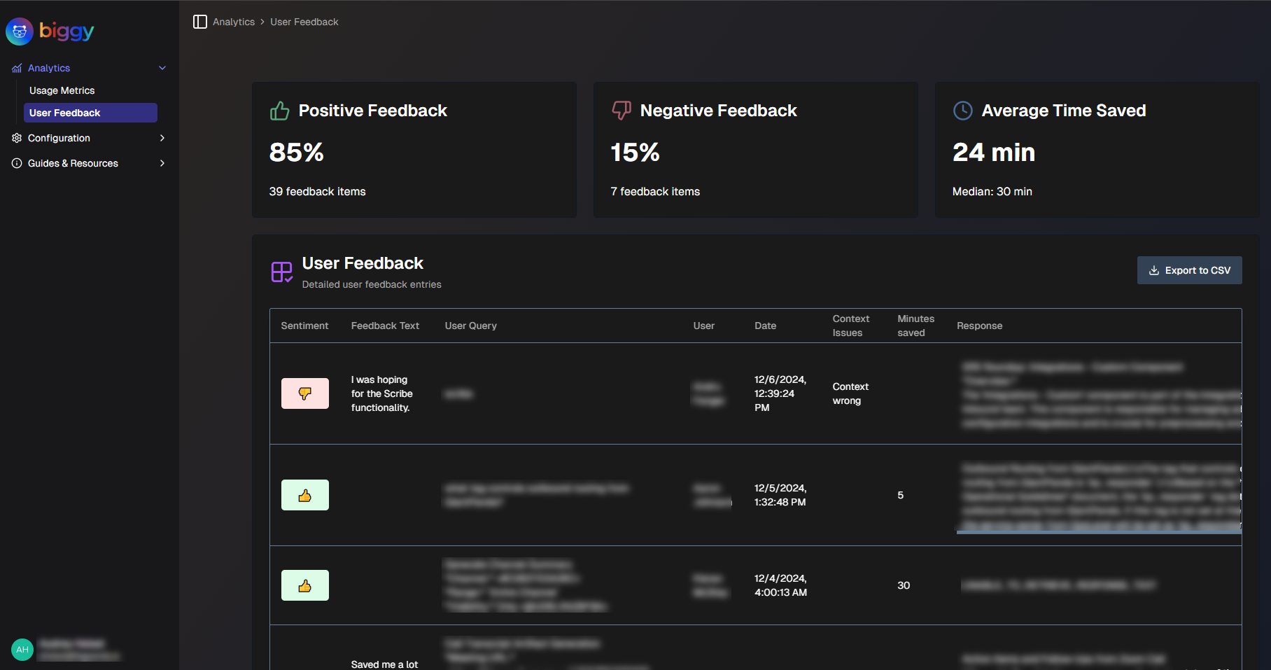
User Feedback
The User Feedback reports display details about the feedback your users provided on Biggy's responses. You can use these reports to see how much time Biggy is saving for your operators, and find areas where Biggy may need more context to improve responses.
Use the drop-down menu at the top right of the screen to adjust the selected time period.
User Feedback
For more information about giving Biggy feedback, see the Provide Biggy Feedback documentation.
The following report widgets are available:
Report | Description |
|---|---|
Feedback Rate | Average number of times feedback was given per day, calculated from the last 7 days of data. The percent change compares the most recent 7 day average against the previous 7 day average. |
Positive Rate | Percentage of positive feedback, calculated from the last 7 days of data. The trendline displays the daily positive feedback rate over the past 14 days. The dotted line displays the 50% threshold. |
Average Time Saved | Average amount of time in minutes saved for each query that Biggy helped with, and the median amount of time in minutes. |
Feedback Over Time | Displays the positive and negative feedback over the selected time period. The green section represents positive feedback, the red section represents negative feedback. Hover over a specific spot on the line graph to view the positive feedback rate for that day. |
Top Feedback Users | The top ten users who left the most feedback for Biggy. Displays the number of times each user has provided feedback, broken down by positive and negative ratings. |
Action Plan Performance Analysis | A chart identifying high-impact action plans, and opportunities for improvement. The X axis in the chart represents the total number of times the action plan has been used. The Y axis represents the positive feedback rate. Each circle in the chart represents an action plan. The color, size, and position of the circle show performance insights. Larger circles represent a higher amount of time saved. Red circles represent action plans with low positive feedback, Orange represents medium positive feedback, and Green represents high positive feedback. Hover over a circle to view additional details. The action plan's Usage Count, Positive Rate, Total Feedback, and Average Time Saved is displayed. Action plans in the upper left corner of the chart are Hidden Gems. They aren't used often, but receive positive feedback when they are used. Action plans in the upper right corner of the chart are High Impact. They are frequently used, and receive consistent positive feedback. Action plans in the lower left corner of the chart are Low Priority. They aren't used often, and receive negative feedback when they are. Action plans in the lower right corner of the chart Need Attention. They are used frequently, but often receive negative feedback. These action plans may need configuration updates. |
Feedback per Action Plan | A table displaying feedback grouped by action plan. The following information is displayed:
|
All User Feedback | A table displaying detailed feedback that users gave Biggy about responses to their queries. The following information is displayed:
To view the report in CSV format, click Export to CSV. |
Configuration Suggestions
Biggy can suggest configuration changes based on user feedback. These recommendations are available in the Configuration Suggestions section.
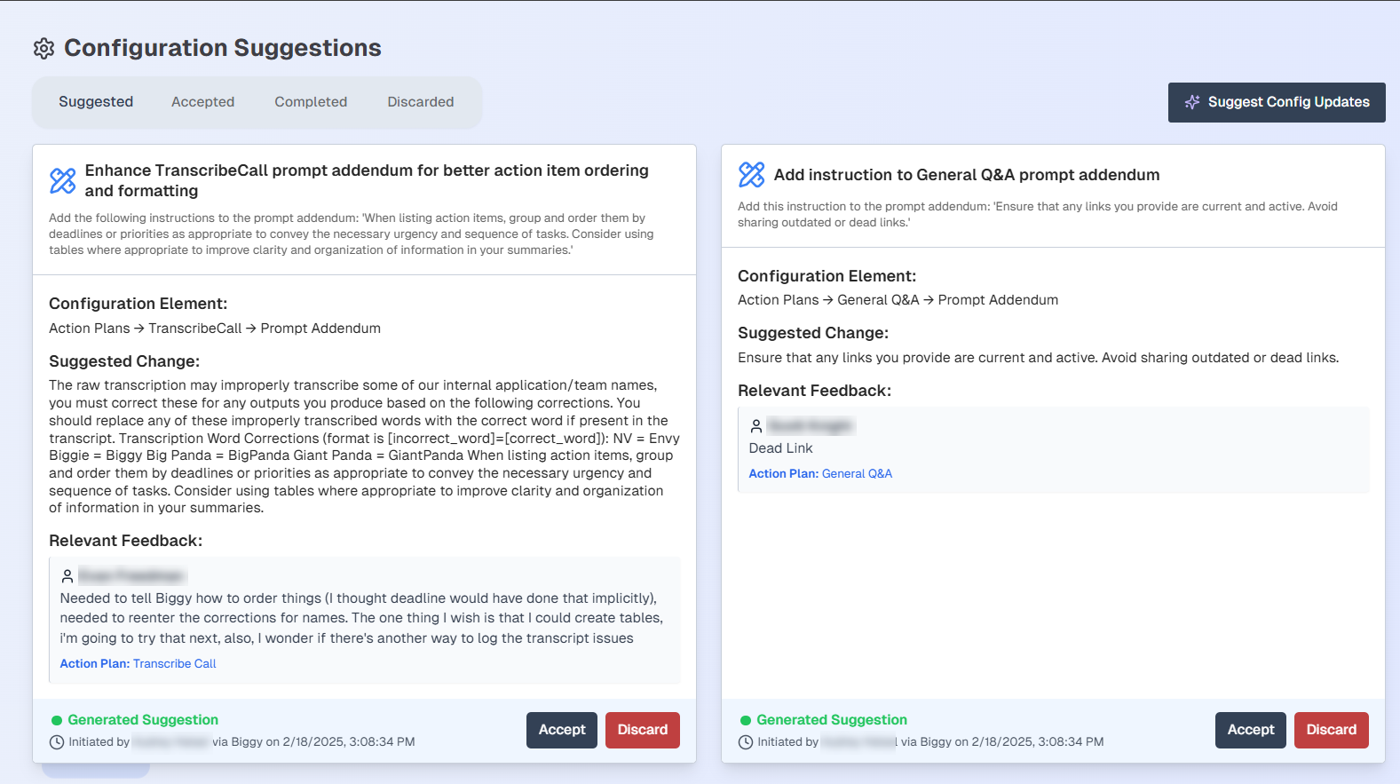
Configuration Suggestions
Each configuration suggestion displays the following information:
Summary of the suggested changes
The affected configuration element
The full suggested change
The feedback that the suggested change is based on
The date and time the suggested change was generated, and the user who generated the suggestion.
To add the configuration change to the Accepted list, select Accept. To reject a suggestion, select Discard.
All current suggestions appear within the Suggested tab. To view suggestions you have accepted but not applied, select the Accepted tab.
Applying suggested changes
Biggy does not automatically apply suggested changes. You must copy a suggested change and apply it to the configuration element suggested by Biggy.
To view accepted suggestions that have been applied, select the Completed tab.
To view discarded suggestions, select the Discarded tab.
If no suggestions appear or if you would like to see new suggestions, select the Suggest Config Updates button.
Change Risk Analytics
The Change Risk Analysis dashboard is only available if your organization has the AI Incident Prevention module. See the Change Risk Analysis documentation for more information.
If you're interested in purchasing the AI Incident Prevention module, contact your BigPanda account team.
Workflow Executions
The Workflow Executions section allows you to track how your Workflows are performing.
Use the drop-down menu at the top right of the screen to adjust the selected time period.
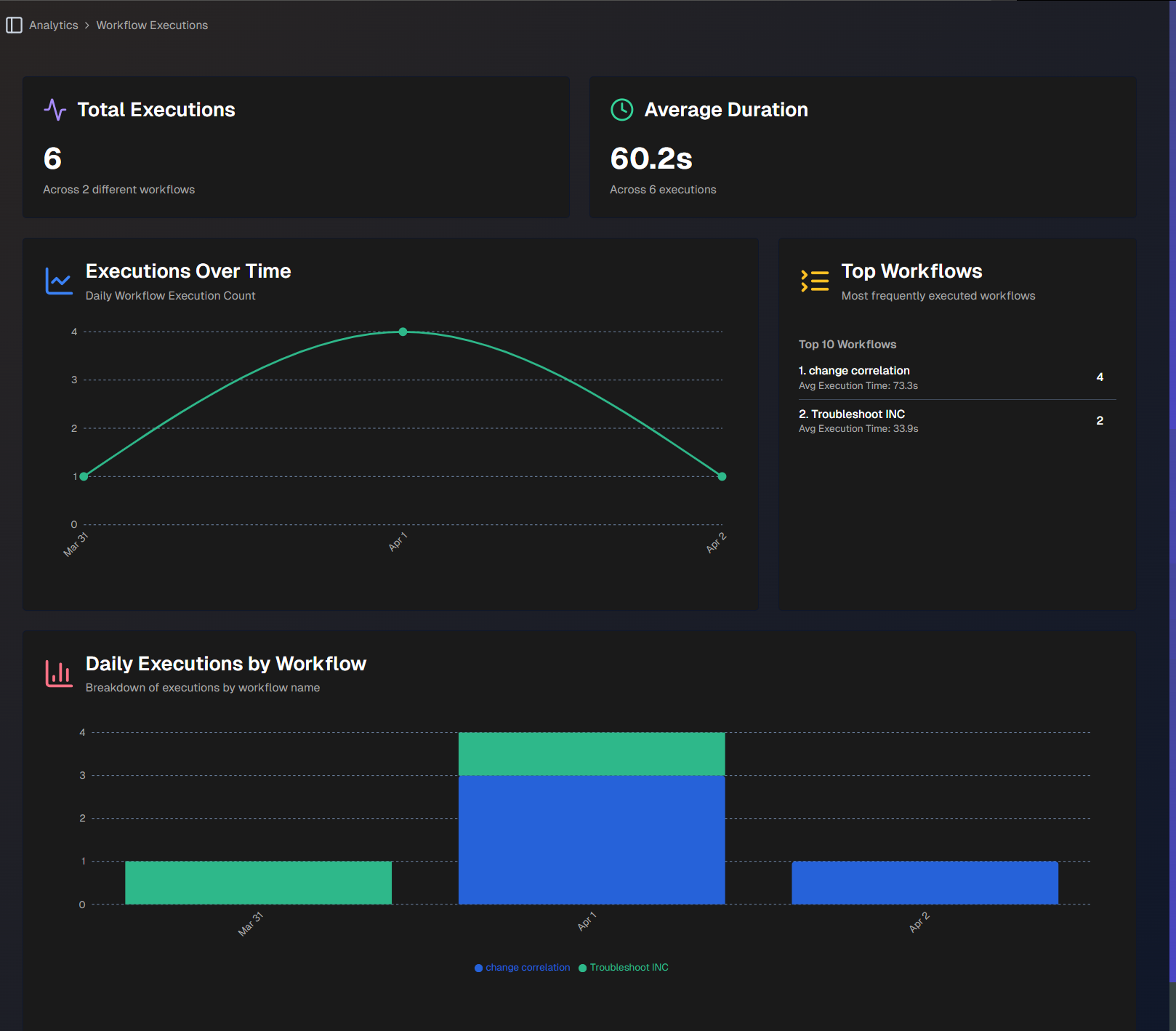
Workflow Executions
The following report widgets are available in the Workflow Executions section:
Report | Description |
|---|---|
Total Executions | Total number of times that all of your workflows have been used. |
Unique Workflows | Total number of unique workflows, and the average number of times each has been used. |
Average Duration | The average number of time each workflow execution takes. |
Executions Over Time | Daily count of your workflow executions, over time. |
Top Workflows | Top 10 most frequently used workflows. Each workflow displays the number of times it was used, and the average execution time. |
Type Distribution | A pie chart comparing the types of workflows executed. Hover over a section of the chart to view the number of times the type of workflow was executed, and the percent of the total number of executions. |
Daily Workflow Type Trend | Displays trends in workflow executions over time, broken down by type. Hover over a specific section of the chart to view the number of workflows by type that were executed on that day. |
Daily Executions by Workflow | Breakdown of daily workflow executions by workflow name, over time. |
All Workflow Execution Metrics | Detailed statistics for all executions, by workflow. The following information is displayed for each workflow:
|
Recent Workflow Execution Results | The latest 500 workflow executions. At the top of the section, you can filter by Workflow Name, Workflow Type, or App Type. Click Export to CSV to download a CSV file containing the table. The following information is displayed for each workflow execution:
|
Biggy API Usage
Use the Biggy API Usage analytics page to track your organization's use of the Biggy API.
Use the drop-down menu at the top right of the screen to adjust the selected time period.
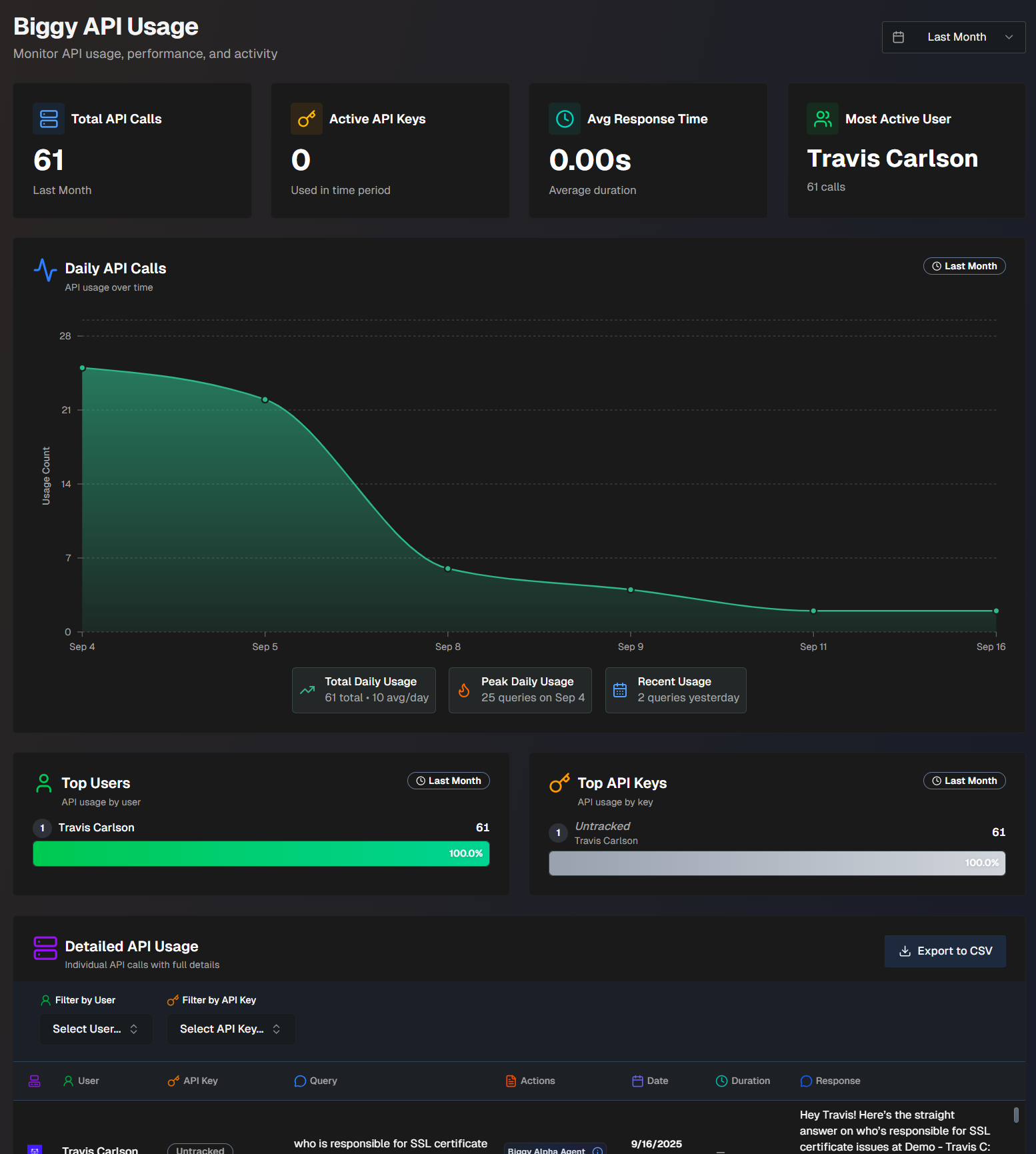
The following report widgets are available in Biggy API Usage:
Report Name | Description |
|---|---|
Total API Calls | Number of API calls made over the selected time period. |
Active API Keys | Number of active API keys that were used during the selected time period. |
Avg. Response Time | The average amount of time the API call took. |
Most Active User | The user who made the most API calls. |
Daily API Calls | Tracks daily API usage over time. Hover over a specific spot in the graph to view usage details for that day. At the bottom of the widget, the Total Daily Usage, Peak Daily Usage, and Recent Usage are displayed. Total Daily Usage shows the total number of API calls over the selected time period, and the average number per day. Peak Daily Usage shows the day that had the highest number of API calls, and the number of calls on that day. Recent Usage shows the number of API calls that happened on the previous day. |
Top Users | A list of users who have made the most API calls, and the number of calls each user made. |
Top API Keys | A list of the API keys used the most, and the number of calls each key made. |
Detailed API Usage | Detailed information about each call made to the Biggy API. The following information about each call is displayed:
|
Guardrail Violations
If your organization has enabled Guardrails, use the Guardrail Violations page to monitor blocked queries and assess the effectiveness of the content filter.
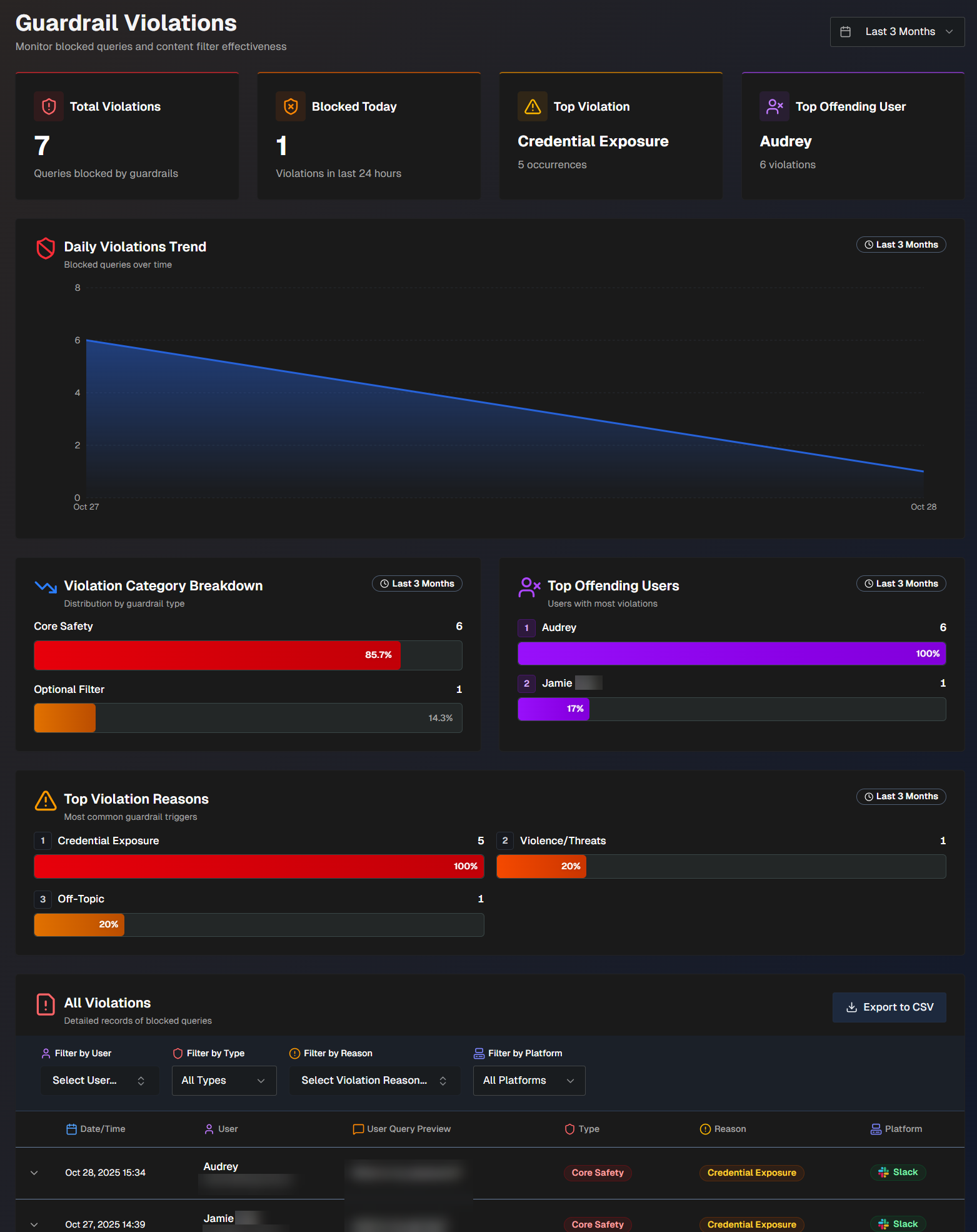
Use the drop-down menu at the top right of the screen to adjust the selected time period.
The following report widgets are available in the Guardrail Violations section:
Widget | Description |
|---|---|
Total Violations | Number of queries that were blocked by guardrails. |
Blocked Today | Number of queries that were blocked by guardrails today. |
Top Violation | The guardrail policy that has the highest number of policy violations associated with it. |
Top Offending User | The user who has the highest number of guardrail violations. |
Daily Violations Trend | A graph displaying the number of queries blocked by guardrails, over time. Hover over a specific day on the graph to view the number of blocked queries on that date. |
Violation Category Breakdown | The number and percentage of violations by each high-level guardrail category. (Core safety, Custom, Optional) |
Top Offending Users | List of users with the most guardrail violations. Hover over a user to view their total number of violations and their most common guardrail violation category. |
Top Violation Reasons | The most common reasons guardrails were triggered, and the number of times each reason occurred. |
All Violations | Detailed records of all queries blocked by guardrails. The following information about each blocked query is available in the list:
Click any query in the list to view additional information. The following appears in the full details:
You can filter the list by User, Type of violation, Reason for the violation, or Platform (Slack, Teams, or Biggy Web Chat). To view the report in CSV format, click Export to CSV. |
Next Steps
Find an overview of the Biggy Web App.
Find best practices and tips for Managing Incidents with Biggy.