Create Analytics dashboards
Analytics dashboards give your teams visibility into the patterns and trends that shape their day-to-day work. When the standard dashboards don't match your organization's needs, you can build your own dashboards and fill them with widgets that visualize the exact data you care about.
Roles
To create and edit dashboards, your BigPanda account must have the Unified Analytics role set to Edit. See the Roles documentation for more information.
Best practice: plan before you build
Focus on quality over quantity. A focused dashboard with a handful of clear widgets is easier to read and performs better than one crowded with visualizations. Group related metrics onto a single dashboard, and create separate dashboards for different teams, regions, or use cases.
Open the Dashboards Tab
In the top navigation bar, click Analytics > Platform Intelligence. Click the Dashboards tab to create and work with dashboards.
All dashboards are listed in the left pane, grouped into folders. The BigPanda Templates folder contains the standard dashboards provided by BigPanda.
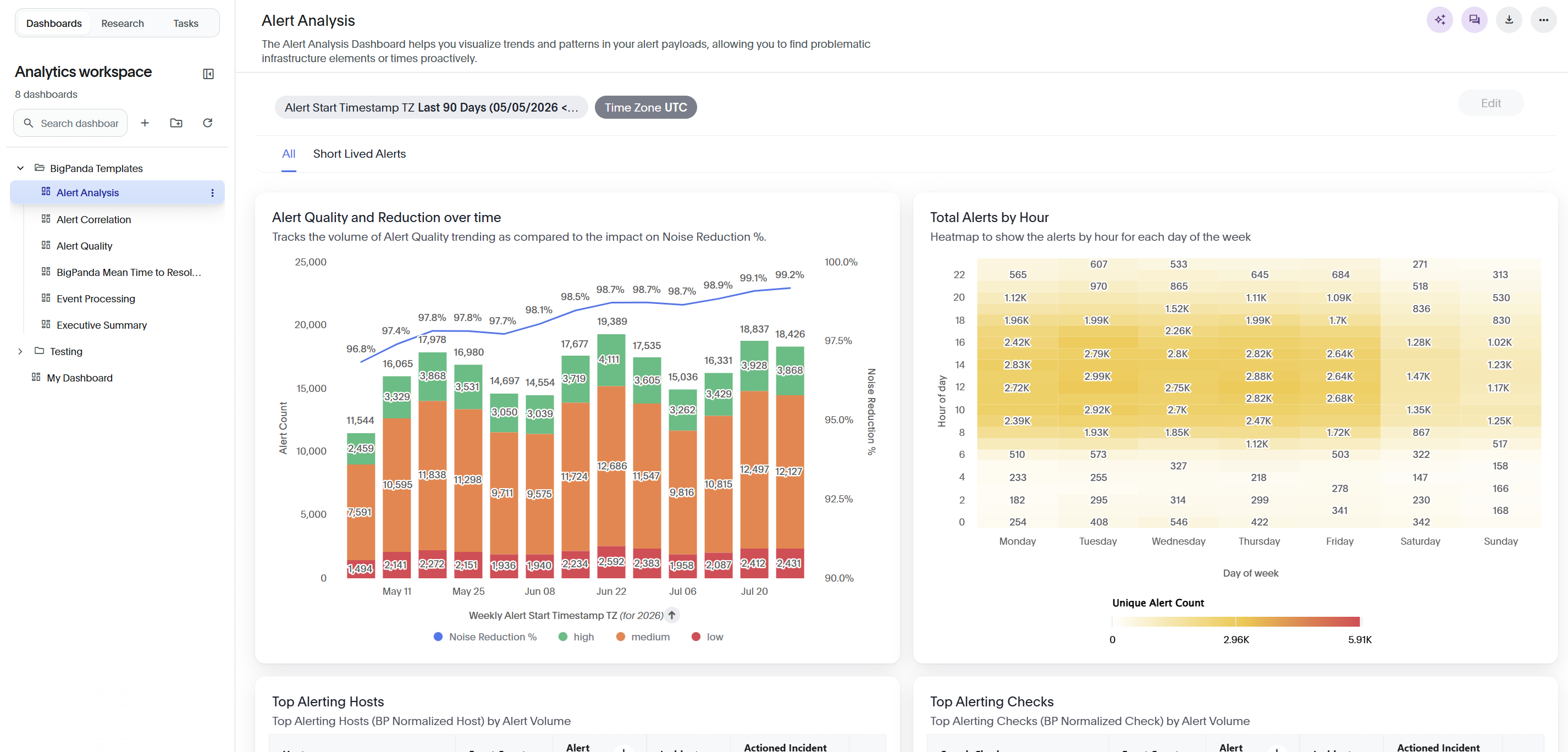
From the Dashboards Tab you can:
Search for a dashboard by name in the Search dashboard field.
Open a dashboard by clicking its name.
Create a new dashboard or folder.
Dashboard actions
To act on a dashboard, open its menu from the three-dot icon next to the dashboard name in the left pane, or from the more menu in the dashboard header.
Permission required
To take action on a dashboard, you must have the Unified Analytics Full Access permission. See the Roles documentation for more information.
Available actions include:
Make a copy: Duplicate the dashboard so you can reuse its widgets and settings as a starting point.
Set as Default: Make this the dashboard that opens by default in the Analytics workspace.
Edit Metadata: Update the dashboard's name and description. This option is only available in custom dashboards.
Share: Share the dashboard with other Analytics users. This allows a custom dashboard to appear in other users' Analytics workspace. This option is only available in custom dashboards.
Export: Download the dashboard as a .tml file.
Delete: Permanently remove the dashboard.
Organize dashboards into folders
Group related dashboards into folders to keep the list easy to navigate. The BigPanda Templates folder holds the standard dashboards and can't be changed directly.
At the top of the left pane, click the + icon, then select New Folder.
In the New Folder page, enter a name in the Folder name field.
Confirm to create the folder.
To move a dashboard into a folder, drag the dashboard onto the folder in the left pane.
Create a new dashboard
You can start a dashboard from scratch or import one from a saved .tml file.
Copy a dashboard
If the dashboard you're creating is similar to an existing one, you can copy it rather than create it from scratch.
Copying an existing dashboard lets you use its settings as a template when creating a new one. Copying a dashboard will duplicate all widgets, filters, and data settings into the new dashboard, allowing you to edit existing settings rather than create widgets from scratch.
To copy a dashboard, go to the dashboard list and click the three dots icon on the selected dashboard, and then select Copy.
To create a new dashboard from scratch:
At the top of the left pane, click the + icon.
In the New Dashboard page, choose how you want to start:
Create Dashboard: Start with an empty dashboard.
Upload TML: Import an existing dashboard from a
.tmlfile. This lets you reuse a dashboard configuration without rebuilding it by hand.
If you chose Create Dashboard, enter a name for the dashboard in the Name field.
(Optional) In the Description field, enter a short description of what the dashboard is for.
Click Create.
The new dashboard appears in the left pane and opens to an empty view. Click + Add widget to begin building.
Add a widget
Dashboards are made up of widgets, individual visualizations such as charts, tables, and KPIs. You build each widget by selecting the columns from the Standard Data Model (SDM) to visualize and choosing how to display them. Or, copy an existing widget
To create a widget:
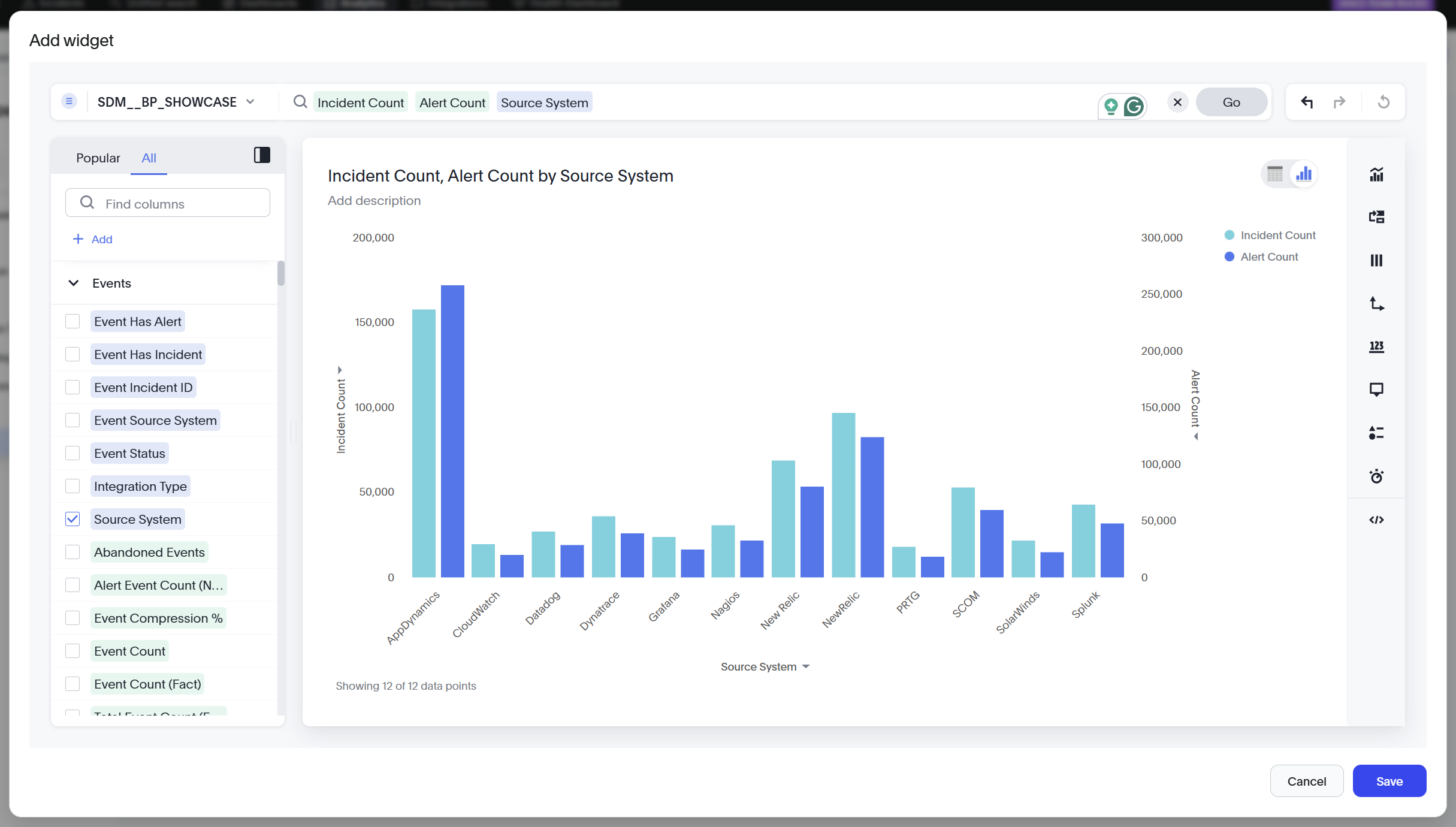
On the dashboard, click + Add widget. If the dashboard already has widgets, click the + icon in the dashboard header. The Add widget builder opens.
In the search bar, enter the columns, measures, or keywords you want to visualize. Matching columns appear as you type. Press Enter or click Go to run the search. You can also browse the columns in the left pane, using the Popular and All tabs to find fields. As you add columns, the widget updates automatically to show the results.
(Optional) Choose how to display the data. See the Configure the widget sections.
(Optional) In the widget header, click Add description to add a description below the widget title.
Click Save.
Explore a field before adding it
In the upper right corner of the columns list, click the Column Information icon to open the column information panel.
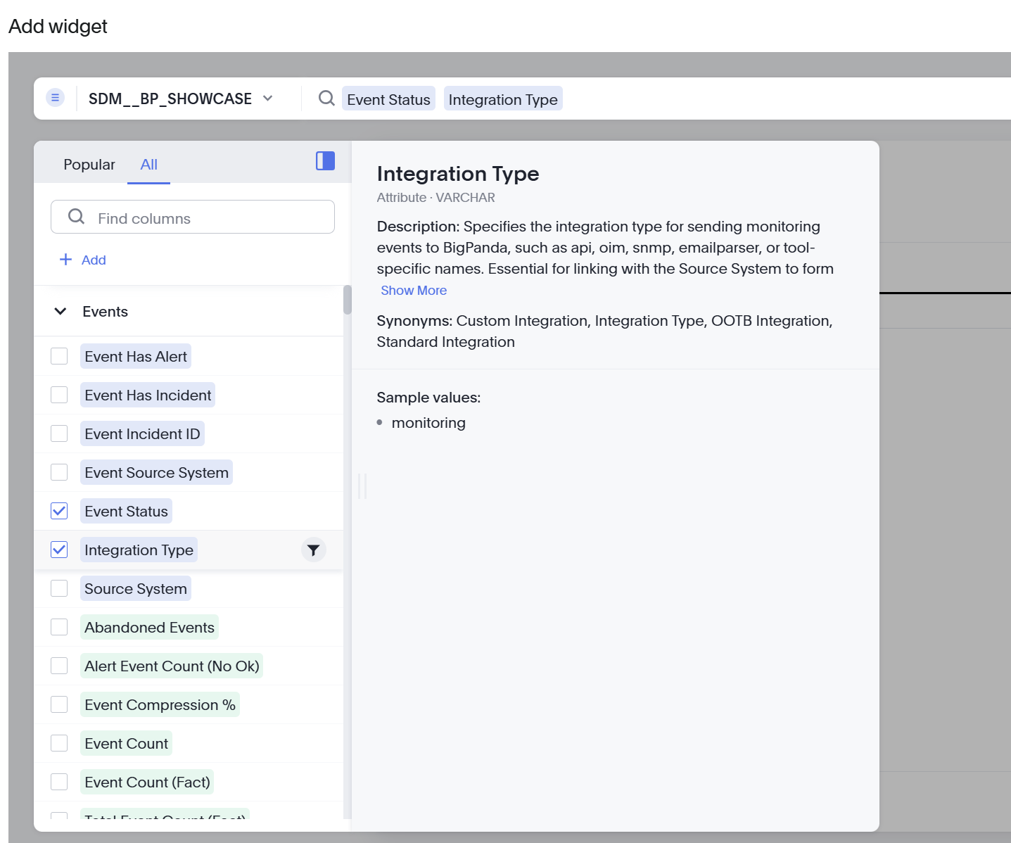
The panel shows the selected field's description, synonyms, data type, and sample values, so you can confirm it's the field you want before you add it.
Add a field as a filter
To filter the widget by a field rather than display it, hover over the column in the list and click the funnel icon.
Filters let you narrow a widget to the most relevant data. When you add a field as a filter, or click a field's funnel icon, the filter configuration opens.
Choose Include or Exclude to keep or remove the selected values.
Select values from the list, or use Search to find them.
(Optional) To add many values at once, click Add values in bulk, type or paste the values, and click Add values. Separate multiple values with a comma, a semicolon, or a line break.
(Optional) Turn on Show unfiltered values to see all values, regardless of the other filters applied to the widget.
Click Apply.
Customize a widget
The right toolbar has panels to fine-tune the widget's layout, fields, and appearance. The available panels depend on the visualization type.
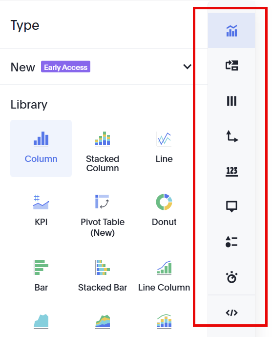
The following options are available:
Type: Select the visualization type.
Layout: Drag columns between Visible Columns and Hidden Columns to control which columns appear and in what order.
Column: Configure each column individually. Rename the column, set the sort order (None, Alphanumeric, or Custom), choose a number format, toggle Display summary, and add conditional formatting.
Axis: Configure the X-axis and each Y-axis, including the axis name, value labels, position, and range (Min and Max). When a chart has two measures, you can align the second axis with the first.
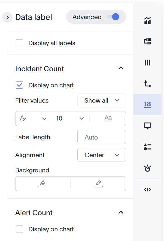
Data label: Show or hide data labels, filter which values are labeled, and set the label font, length, alignment, and background.
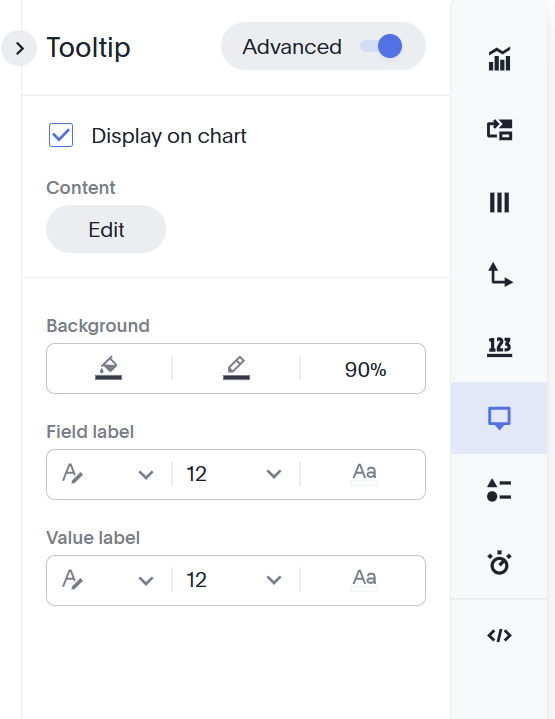
Tooltip: Show or hide the tooltip, and edit its content, background, and labels.
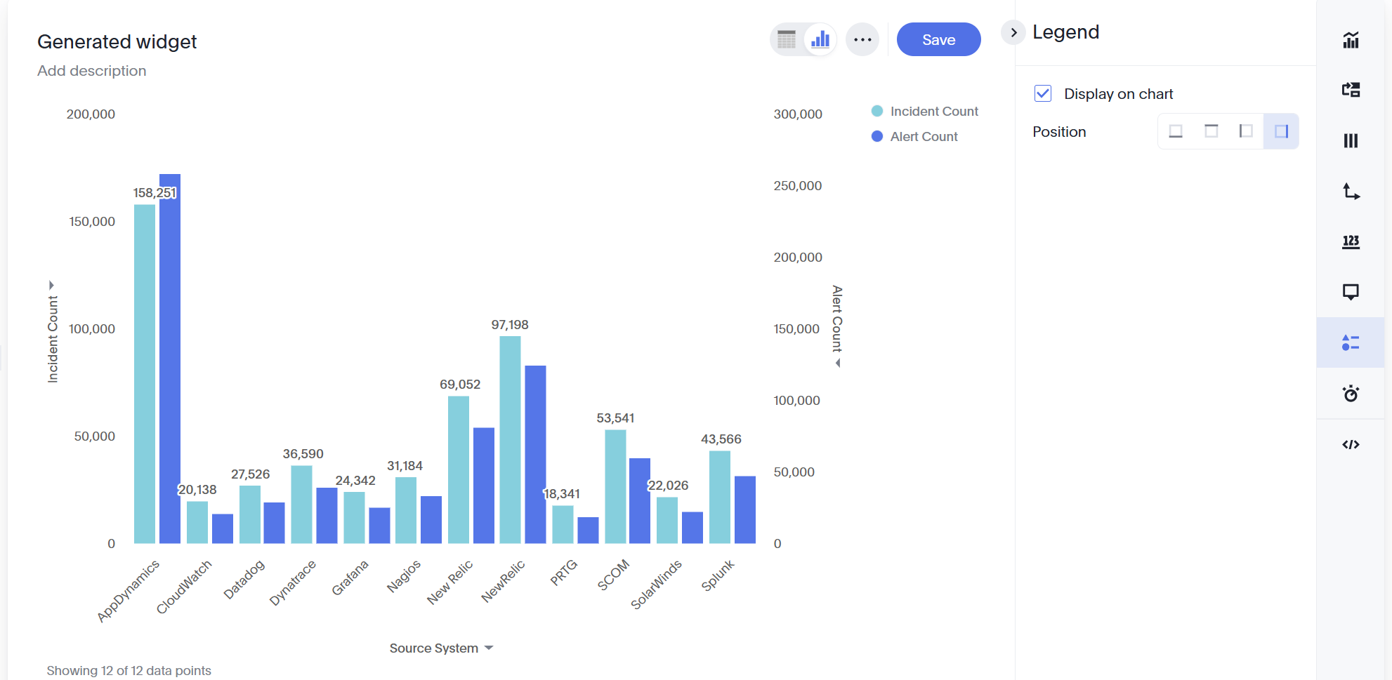
Legend: Show or hide the legend, and set its position.
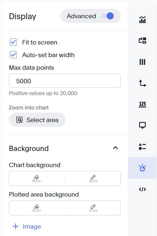
Display: Set the table theme (Outline, Row, or Zebra), content density (Regular or Compact), text wrapping, and whether to display the footer.
Query: Create a visualization of the query, or view it in SQL.
Choose a visualization type
By default, the builder shows your data as a chart or a table. Use the toggle at the top right of the preview to switch between View chart and View table.
When Chart is selected, use the Type tab to choose a visualization type.
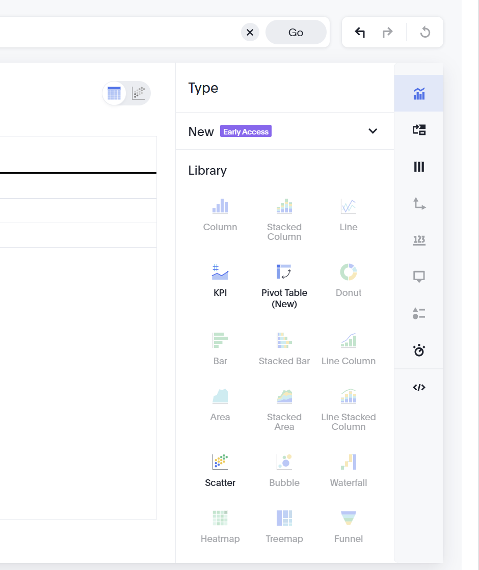
To change the visualization type:
In the right toolbar, click the Type icon.
Select a visualization from the library. Visualization types that can't represent the current data are unavailable.
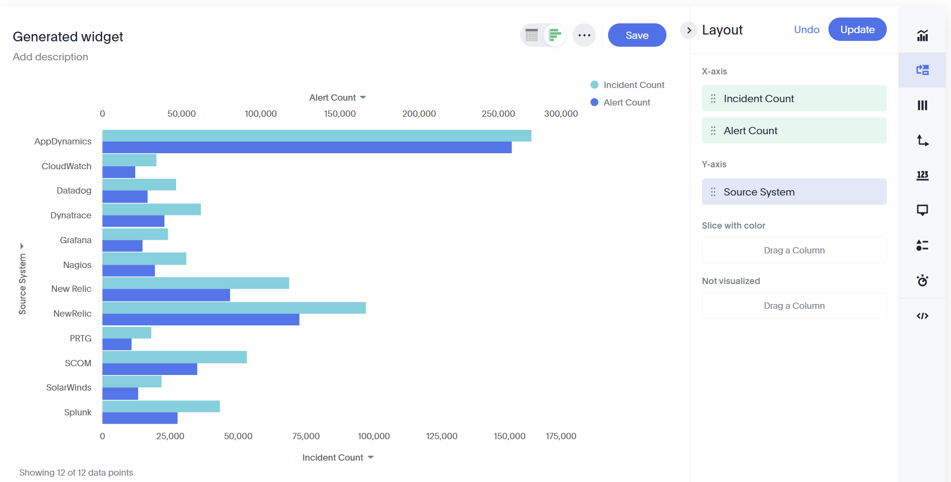
Layout
Adjust how columns are visualized in the widget within the Layout tab. Drag and drop columns to update how they appear in the chart.
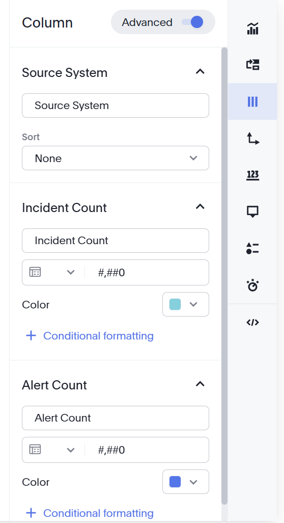
Column
In the Column tab, adjust how each column appears in the widget. You can adjust how column names appear, number formats, and colors of columns. You can also apply Conditional Formatting to highlight values in the data.
Conditional formatting
Conditional formatting highlights values that meet a condition you define, for example, values below a threshold.
In the Column panel, click Conditional formatting.
Select the column to format.
Define the condition. For a value-based condition, choose the comparison, for example, Less than, and enter a value.
(Optional) Set the text and background formatting, and toggle Highlight entire row to format the whole row when the condition is met.
(Optional) Click Add condition to add more conditions.
Click Apply.
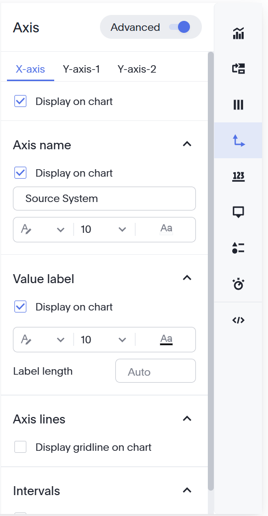
Axis
In the Axis tab, adjust how the X and Y axes are displayed in the chart. You can choose whether values are displayed, the names of values, adjust fonts, and select whether you would like to display grid lines and intervals.
Data Label
In the Data Label tab, select whether data labels, such as counts, will appear in the chart.
If you choose to display a data label, you can apply filters and adjust how the font appears on the chart.
Tooltip
In the Tooltip tab, select whether you'd like tooltips for your columns to appear on the chart. Select Edit to choose which columns should have tooltips.
Adjust the Background of the tooltips, Field label font, and Value label font.
Legend
Use the Legend tab to determine whether the legend should appear on the chart, and adjust which section of the chart it should appear in.
Display
In the Display tab, adjust display options for your chart, including fitting it to the screen, automatically setting bar widths, and maximum data points. You can also zoom into a specific area of the chart.
If the Advanced mode is enabled, adjust settings like chart and plotted area background and border colors.
Review the underlying query
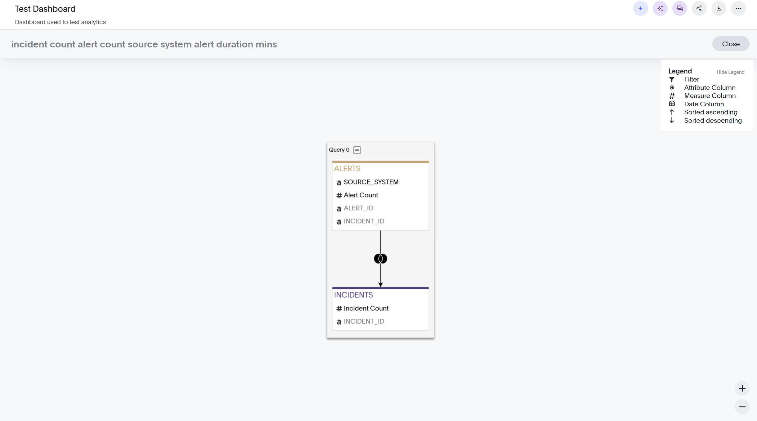
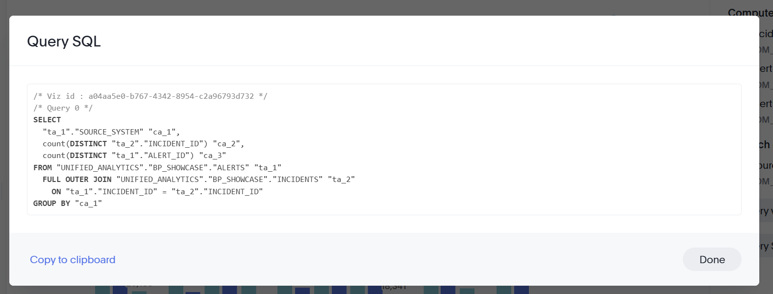
Use the Query tab to see exactly how a widget queries your data. Use the following options to view query information:
Query visualizer: Shows the tables and columns the widget draws from, including how they're joined.
Query SQL: Shows the generated SQL. Click Copy to clipboard to reuse it.
Save the widget
When the widget looks the way you want, click Save. The widget is added to the dashboard. To discard the widget without saving, click Cancel.
Repeat these steps to add more widgets to the dashboard.
Organize your dashboard
To make edits at the dashboard level, navigate the right corner of the page and click Edit.
Drag and drop widgets to change the dashboard's display. Click the edge of a widget to adjust the size.
Click any widget to see menu options. You can Edit a widget, choose a preset Tile Size, or Delete a widget.
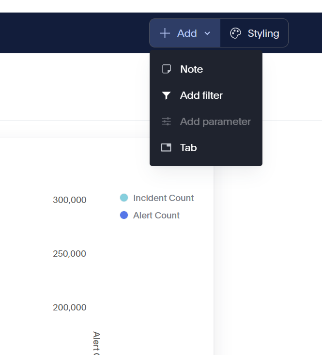
Use the menu above the widgets to structure its content with notes, filters, parameters, and tabs.
Save the dashboard
When your dashboard is ready, click Save in the dashboard toolbar to save the layout, tabs, notes, and filters.
Organize your dashboard
To make edits at the dashboard level, navigate the right corner of the page and click Edit.
Drag and drop widgets to change the dashboard's display. Click the edge of a widget to adjust the size.
Click any widget to see menu options. You can Edit a widget, choose a preset Tile Size, or Delete a widget.
Use the menu above the widgets to structure its content with notes, filters, parameters, and tabs.
Add a tab
Tabs let you group widgets into separate views within a single dashboard.
In the dashboard toolbar, click + Add tab. A new tab is added.
To rename or remove a tab, click the tab, then select Rename or Remove.
Drag and drop existing widgets into the new tab to move them.
Add a note
Notes let you add headings, context, and supporting content alongside your widgets.
In the dashboard toolbar, click Add note. A note block is added to the dashboard.
Enter text in the note. Use the formatting toolbar to add a heading or to apply bold, italic, strikethrough, underline, lists, or a link.
To add other objects, click + Insert and choose Image, Table, Embed iFrame, or Divider.
To remove a note, open its menu and click Delete.
Add a dashboard filter
Dashboard filters apply to every widget on the dashboard, so users can focus all of the visualizations on the same data at once. This is different from a widget filter, which affects only a single widget.
In the dashboard toolbar, click Add filter.
In the Add Filters panel, find the column to filter by. Search for it in the Find columns field, or browse the columns under the data source.
Select the column.
Configure the filter values, then apply the filter. See Filter widget data for details on include, exclude, and bulk value options.
Add a parameter
A parameter is a container or a placeholder such as a number, date, or string that can replace a constant value or a list of values. Use parameters to run different scenarios with adjustable values, without creating or modifying the constants in formulas for each new value.
To add a parameter, go to the dashboard toolbar and click Add parameter.
Save the dashboard
When your dashboard is ready, click Save in the dashboard toolbar to save the layout, tabs, notes, and filters.