AI Incident Prevention Analytics and Dashboards
The AI Incident Prevention module helps you assess and analyze the risk associated with proposed changes in your IT environment. It calculates a risk score based on specific change fields and compares the current planned change details with data from your change integrations to identify potential risks.
Use the Change Analytics and Change Risk Prediction dashboards to find risk prediction information for change requests.
Change Risk Analytics
Note
Your organization must have the AI Incident Prevention module to access Change Risk Analytics. If you're interested in purchasing this, contact your BigPanda account team.
The Change Risk Analytics page provides a high-level analysis of changes in your IT environment for a specific time period. You can access this page within the web app in the Analytics section.
Use the drop-down menu at the top right of the screen to adjust the selected time period.
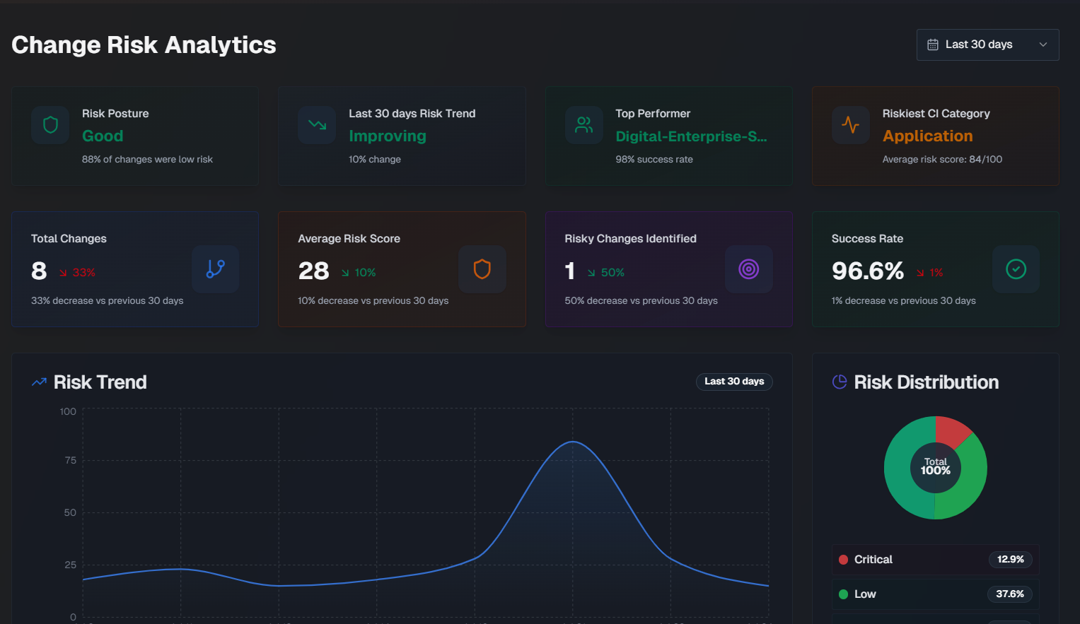
The following widgets are available in the Change Risk Analytics dashboard:
Widget | Description |
|---|---|
Risk Posture | How well your organization is doing from a change risk perspective. This score is based on the percentage of changes that were considered low risk. |
Risk Trend | Whether your organization's change risk scores are getting better or worse, and the percent change over the selected time period. |
Top Performer | The team that deployed changes with the lowest average risk score, and their success percentage. |
Riskiest CI Category | The configuration item (CI) category with the highest average risk score. |
Total Changes | The total number of changes, and the percent change for the selected time period. |
Average Risk Score | The average risk score across all changes, and the risk score percent change for the selected time period. |
Risky Changes Identified | The percent of changes that were identified as high risk, and the risk score percent change for the selected time period. |
Success Rate | The average success rate of changes, and the risk score percent change for the selected time period. |
Risk Trend | A graph displaying the risk score change over the selected time period. Hover over a specific day on the graph to see the average risk score for that day. |
Risk Distribution | A pie chart displaying the distribution of change risk levels. |
Team Change Health | A comparison of each team's percentage of successful changes, and the number of risky changes. The calculation for success rate is (total changes - incidents caused) / total changes. |
Risk by CI Category | Risk information for changes grouped by the category of their affected CIs. For each CI, the number of changes, incidents, success percentage, average risk score, and number of incidents that were either critical or high severity. |
Riskiest Times to Deploy | The riskiest times to deploy, broken down by Riskiest Day and Riskiest Time. Riskiest Day shows the average risk score by day of the week for changes scheduled in the selected time period. The riskiest day and safest day are highlighted below the full week. Riskiest Time is an hourly risk analysis shown in your local time zone. The riskiest time and safest time are highlighted below the full day. |
Risk Score Averages and Weights | Shows the average risk score for each risk component across all analyzed changes, and the component's relative importance (weight). |
Incidents Caused by Changes
The Incidents Caused by Changes section of the Change Risk Analytics dashboard displays data about incidents that were caused by changes.
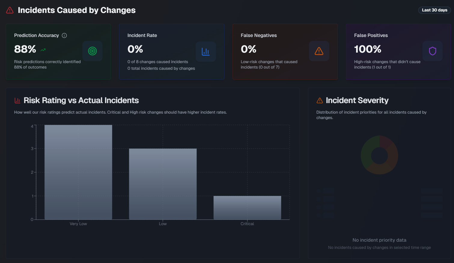
The following widgets are available in this section:
Widget | Description |
|---|---|
Prediction Accuracy | The percentage of risk predictions that accurately identified the outcome of the change. Prediction accuracy is measured using the following calculations:
The formula is (True positives + True negatives) / Total Changes x 100 Medium risk changes are excluded from the calculation. |
Incident Rate | Displays the percent of changes that caused an incident, the number of changes that resulted in an incident out of the total number of changes, and the total number of incidents caused by changes. |
False Negatives | The percent of low-risk changes that resulted in an incident. |
False Positives | The percent of high-risk changes that didn't cause an incident. |
Risk Rating vs. Actual Incidents | A bar chart showing how well risk ratings predict incidents, broken down by the risk level. Hover over a section of the chart to see the number of changes with or without incidents for that risk level. |
Incident Severity | A pie chart showing the distribution of incident priorities for all incidents caused by changes. |
Incident Timeline | A line graph showing a daily view of changes vs. incidents caused by the change over the selected time period. Hover over a specific day to see the number of changes that were implemented and the number of incidents that occurred on that day. |
Teams Causing the Most Incidents | Assignment groups causing the most incidents from their changes. |
Changes that Caused the Most Incidents | Changes that directly caused incidents, showing change details and related incident information. |
Change Risk Dashboard
AI Incident Prevention required
Your organization must have the AI Incident Prevention module to access the Change Risk Dashboard. If you're interested in purchasing this, contact your BigPanda account team.
Within the Change Risk Dashboard, view all change requests and their associated risk, predicted by AI Incident Prevention.
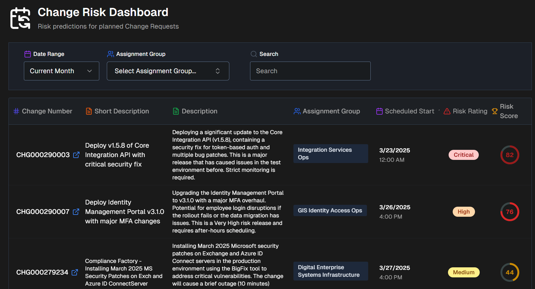
Click any change in the dashboard to open the Change Risk Assessment screen.
Filter and Sort the Change Risk Dashboard
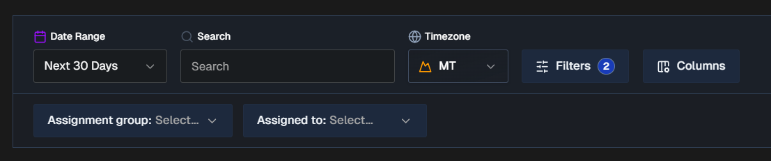
By default, all changes for the next 30 days appear on the Change Risk Dashboard. You can filter the list using the Date Range, Time Zone, or click Filters to select one or more ServiceNow fields to filter on. Selected ServiceNow fields will appear as dropdowns in the bar below where you can choose specific values.
To find a specific change, use the Search bar. You can search for a change number or keyword.
Click Columns to customize the columns that appear in the changes table. You can choose from default columns, or select ServiceNow fields. Reorder columns by dragging and dropping them.
The following columns appear in the Change Risk table by default:
Change number
Short description
AI Change Summary (Full description)
Assignment group
Scheduled start
Risk rating
Risk score
Filter and column persistence
All filters and column selections persist on a user-level basis. Your selections will not affect other users' view of the dashboard.
When you exit the dashboard or web app, your selections will be retained and appear the next time you access the dashboard using your account.
Change Volume by Risk Level
Below the filters and search bar is the Change Volume by Risk Level graph. This displays the total number of changes over time broken down by risk level.
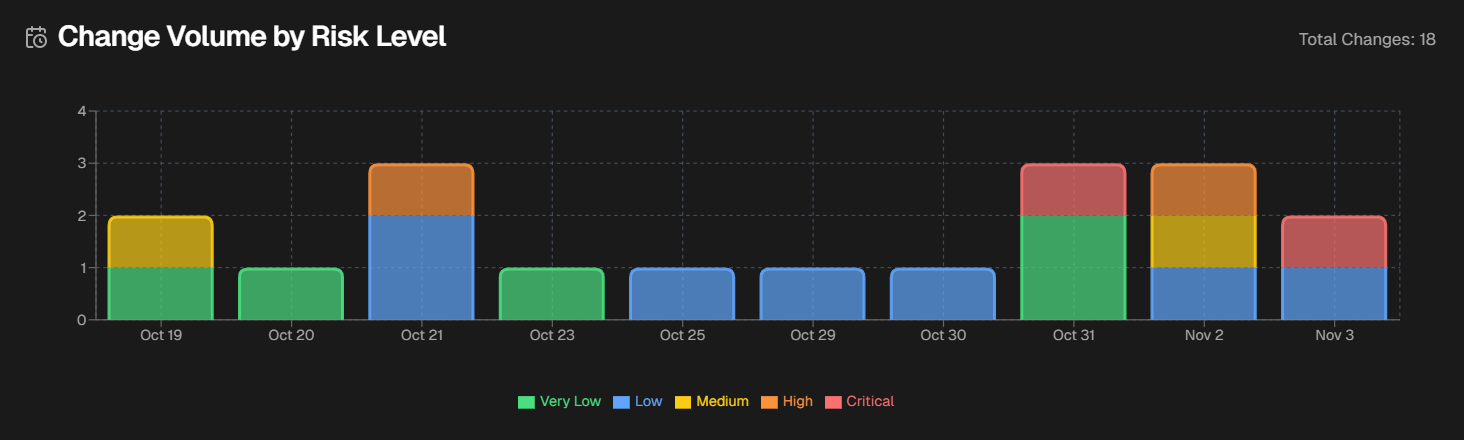
Hover over a specific day to see the numer of changes in each risk level that occurred on that day.
Change Risk Assessment
Click any change in the dashboard to open the Change Risk Assessment screen.
The Change Risk Assessment screen shows you details about the potential risk associated with the selected change.
The assessment screen is divided into the following tabs:
Change Details
The Change Details tab displays high-level information about the selected change.
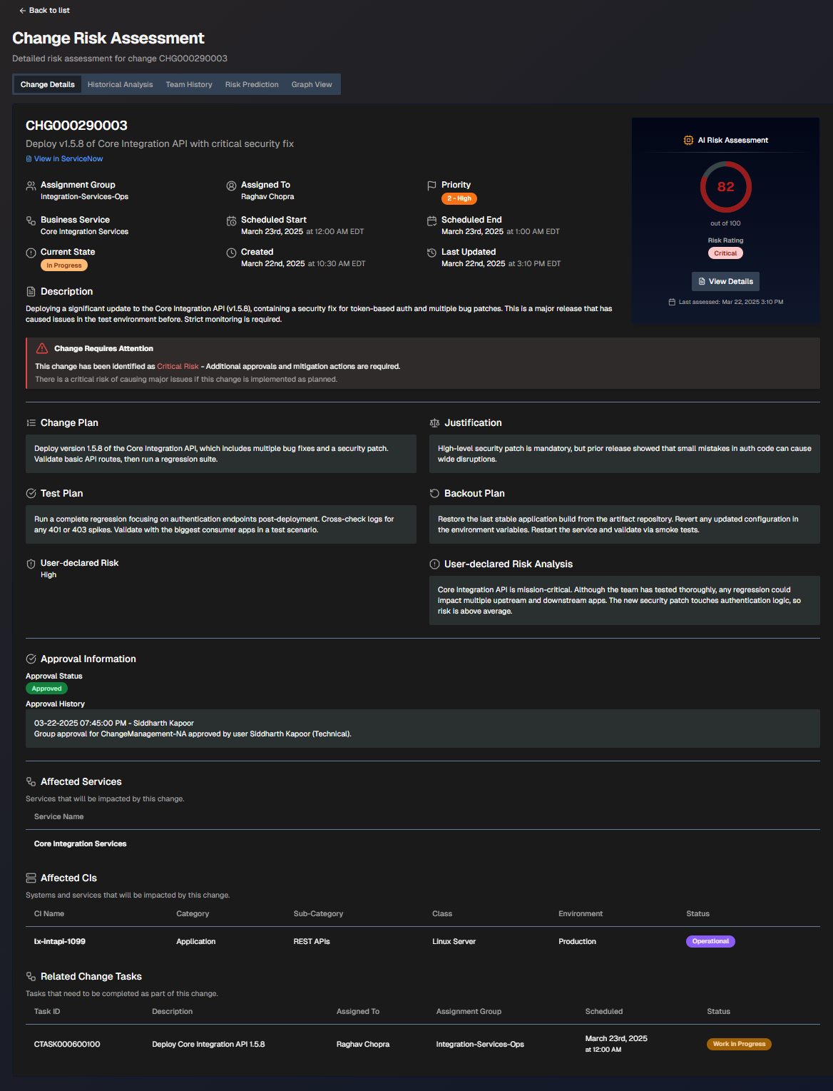
The screen is divided into the following sections:
Section | Description |
|---|---|
Change Information | High-level information about the change. The following details are displayed in this section:
If the change requires attention, a red box with an exclamation point will appear describing the requirements. |
AI Risk Assessment | The risk assessment score and risk rating. Click View Details to open the Risk Prediction tab. |
Change Plan | Steps to take to implement the change. |
Justification | Reasoning behind the change plan. |
Test Plan | Steps to take to test after the change to ensure it was successful. |
Backout Plan | Steps that can be taken if the change needs to be reversed. |
User-Declared Risk | The risk level of the change defined by the user who opened it. |
User-Declared Risk Analysis | The risk analysis of the change defined by the user who opened it. |
Approval Information | People who need to review the change before it can be implemented. The following information about each approver is displayed:
|
Affected Services | Services potentially affected by the change. |
Affected CIs | Systems and services that will potentially be affected by this change. The following information about each CI is displayed:
|
Related Change Tasks | Tasks that need to be completed as part of the change. The following information about each task is displayed:
|
Historical Analysis
The Historical Analysis tab displays similar changes and related incidents that were used as part of the change risk profile. These changes and incidents may provide additional context.
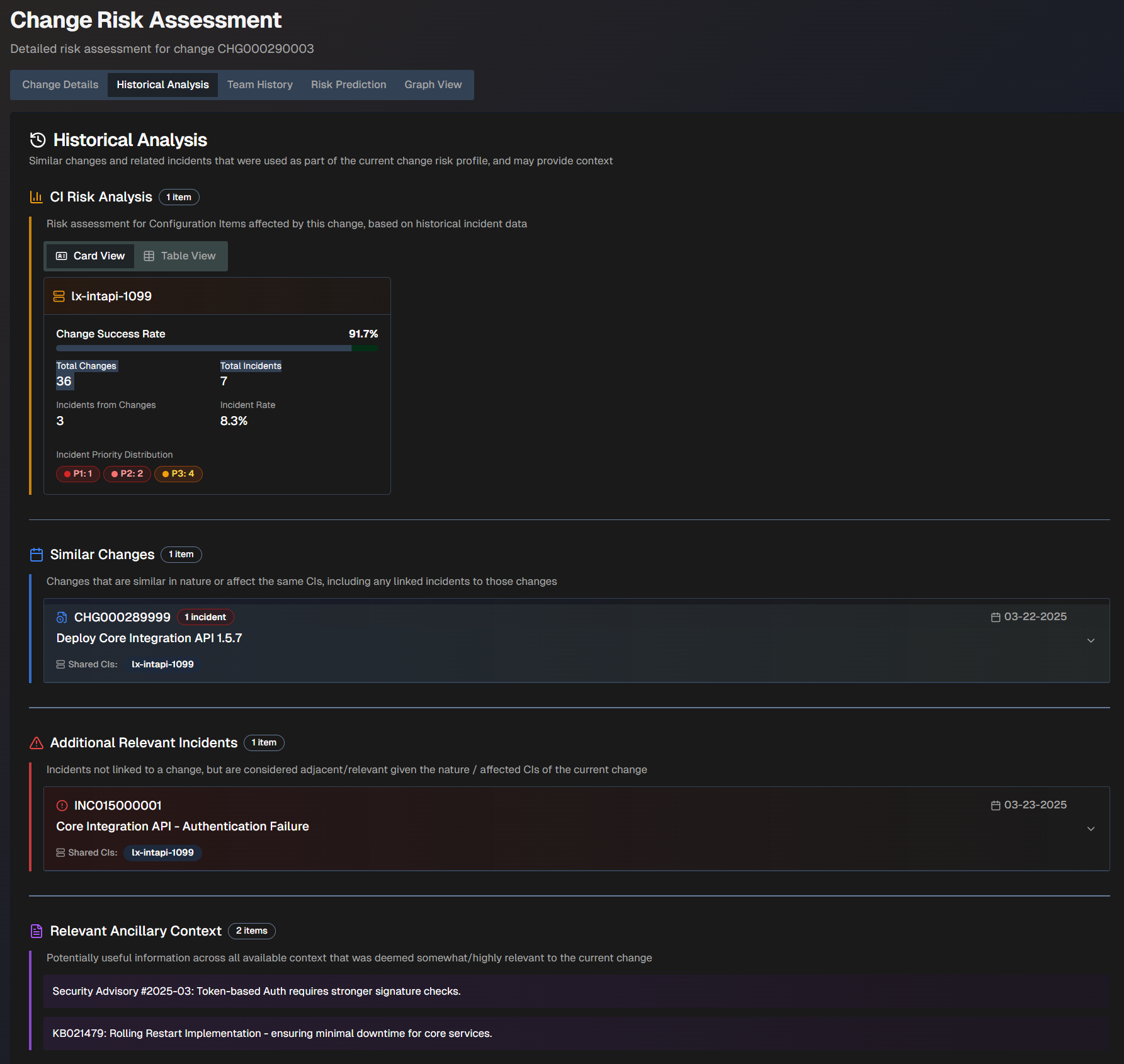
The Historical Analysis screen is divided into the following sections:
Section | Description |
|---|---|
CI Risk Analysis | The risk assessment for configuration items affected by this change, based on historical incident data. This information can be displayed in Card View or Table View. The following information appears for each CI:
|
Similar Changes | Changes that are similar in nature or affect the same CIs. A box displaying the change number, description, and date appears for each similar change. Click a box to view additional information including the full description, similarity reasoning, resolution of the incident (if applicable), and linked incidents. |
Additional Relevant Incidents | Incidents that were not linked to a change, but are considered relevant given the nature or affected CIs of the current change. A box displaying the incident number, description, date, and shared CIs appears for each relevant incident. Click a box to view additional information including the full description, similarity reasoning, and resolution of the incident (if applicable). |
Relevant Ancillary Context | Information across all available contexts that was deemed potentially relevant to the current change. |
Team History
The Team History tab shows the historical performance records of the team and the individual responsible for the change.
You can view history by Team Metrics or Individual Metrics.
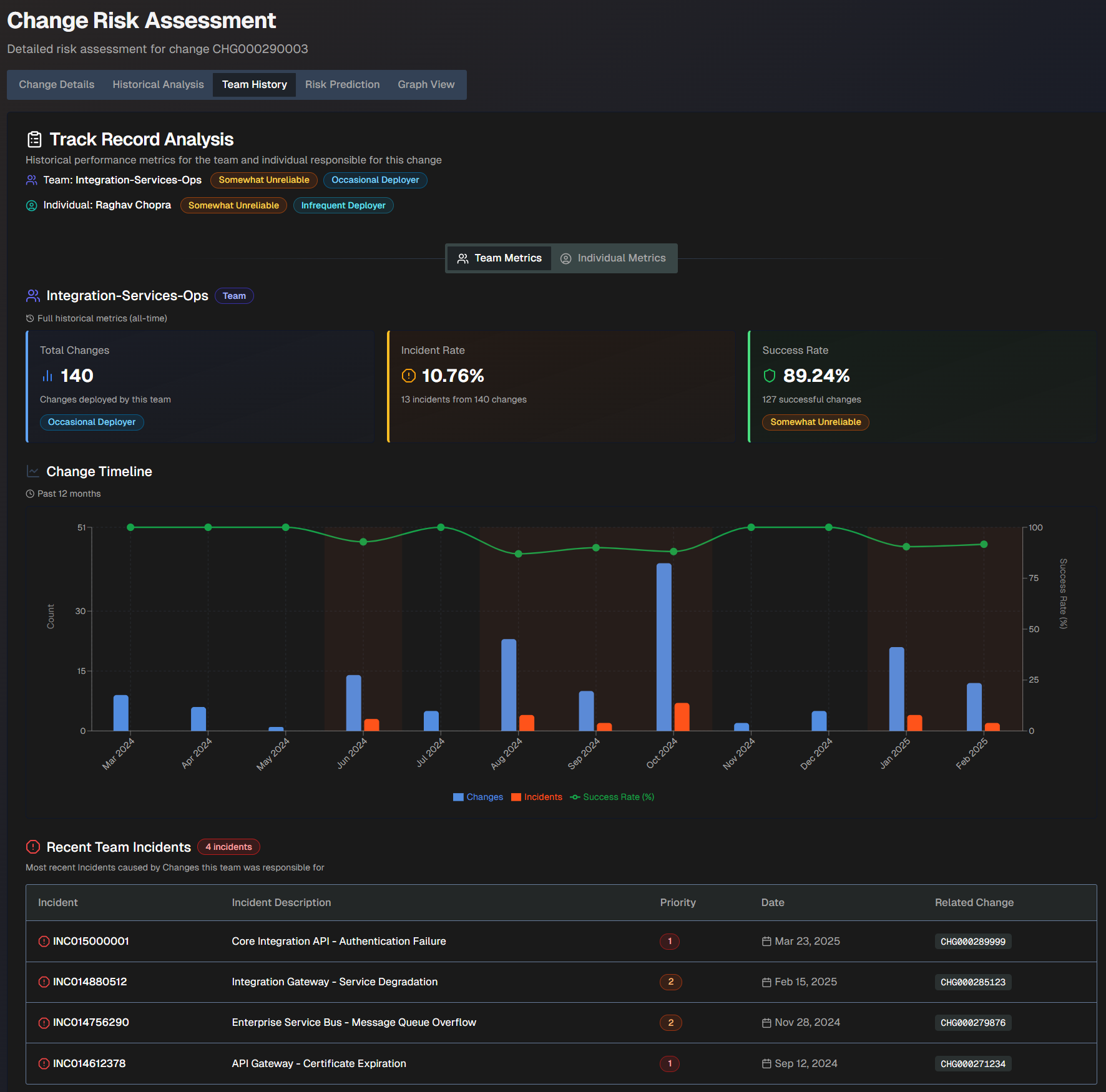
The Team History screen shows the following information:
Field | Description |
|---|---|
Team | The team name, reliability score, and deployment frequency score. |
Individual | The individual's name, reliability score, and deployment frequency score. |
Total Changes | The total number of changes deployed by the team. This number is based on full historical metrics. |
Incident Rate | The incident rate compared to the number of changes the team was responsible for. This rate is based on full historical metrics. For example, if the team was responsible for 10 changes and 2 of them caused incidents, the incident rate would be 80%. |
Success Rate | The percent of successful changes that the team was responsible for. This rate is based on full historical metrics. For example, if the team was responsible for 10 changes and 2 of them caused incidents, the success rate would be 80%. |
Change Timeline | A timeline of changes over the past 12 months. The blue bars represent changes, the orange bars represent incidents, and the green line represents the change success rate. |
Recent Team/Individual Incidents | The most recent incidents caused by changes the team or individual was responsible for. The following information about each incident is displayed:
|
Organization-Specific Risk Evaluation
The Organization-Specific Risk Evaluation tab displays a custom risk evaluation based on factors and context specific to your organization.
Configuration
To view org-specific risk information, you must configure org-specific settings in the Change Risk Prediction action plan.
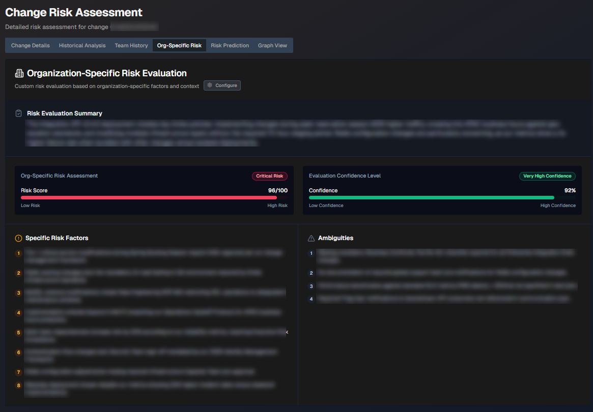
The following information is displayed:
Section | Description |
|---|---|
Risk Evaluation Summary | Short summary of the org-specific risk evaluation. |
Org-Specific Risk Assessment | The risk score. |
Evaluation Confidence Level | How confident AI Incident Prevention is in the evaluation. |
Specific Risk Factors | List of specific factors contributing to the risk score. |
Ambiguities | Ambiguous factors related to the change that contribute to the risk score. |
Risk Prediction
The Risk Prediction tab displays widgets containing information about the predicted risk level of the change.
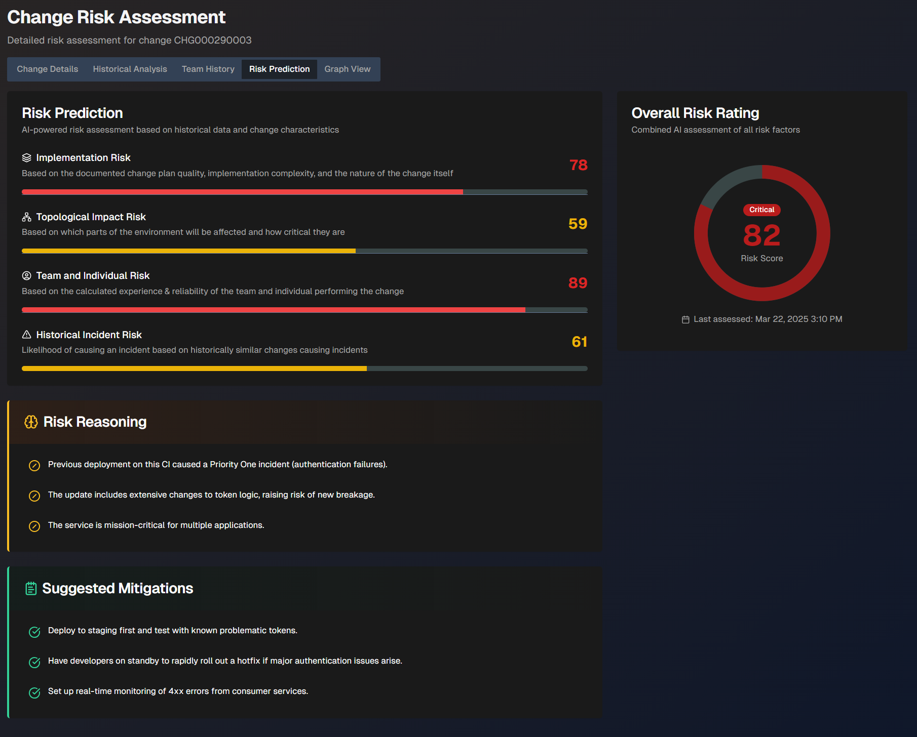
The following widgets are displayed:
Widget | Description |
|---|---|
Risk Prediction | AI-powered risk assessment based on previous changes. The following scores are displayed:
|
Overall Risk Rating | The risk assessment of the change with all factors combined. The date and time of the last assessment appears under the risk rating. |
Risk Reasoning | Explanation of the reasoning behind the risk assessment. |
Risk History | How the change's risk assessment has evolved over time. |
Suggested Mitigations | Suggested steps that can be taken to mitigate risks associated with the change. |
Graph View
The Graph View tab visualizes the relationships between the change, similar changes, and related incidents.
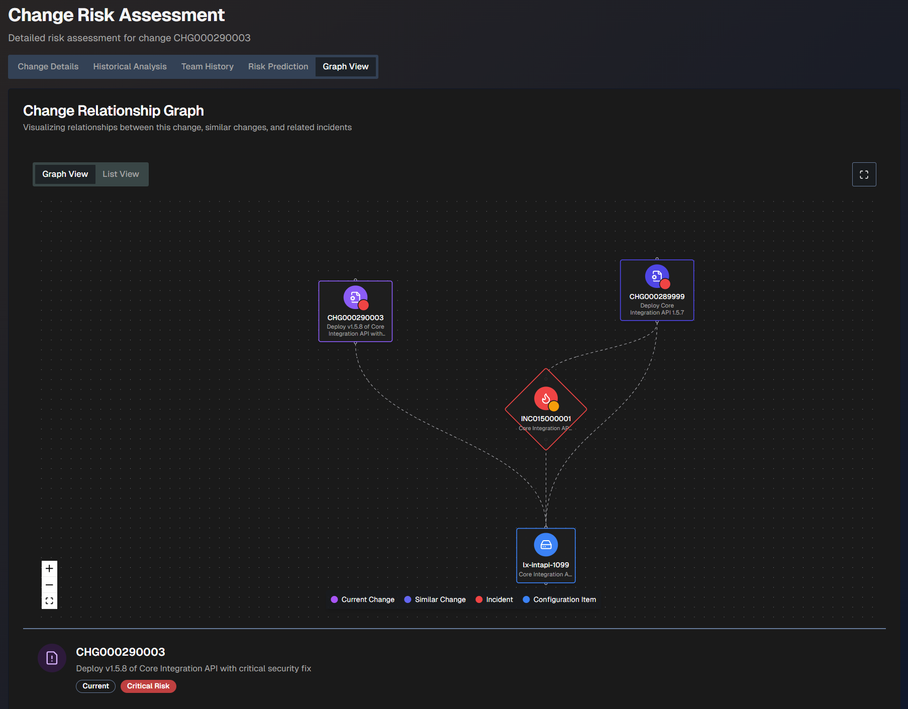
The graph view is coded by color:
Current change - purple
Similar change - purplish blue
Incident - red
Configuration item - blue
Hover over any of the items in the graph to view additional information such as the number, description, and risk level.
To see a larger view, click the Full screen button.
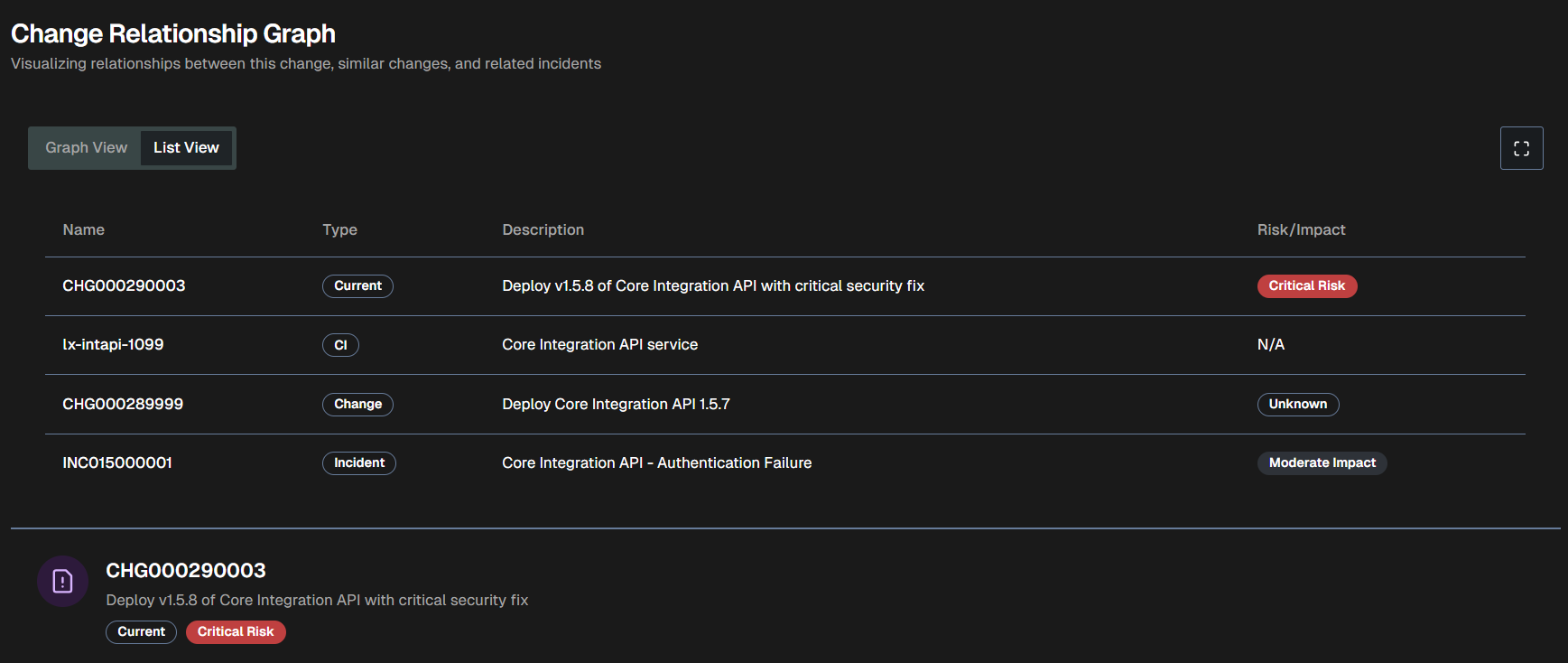
To view a text version of the visualization, click the List View tab.
Problem Management
AI Incident Prevention required
Your organization must have the AI Incident Prevention module to access the Problem Management Dashboard. If you're interested in purchasing the module, contact your BigPanda account team.
Use the Problem Management dashboard to dig deeper into issues in your environments. Proactively identify the top priority problem areas based on historic incidents and root cause so that your team can focus on the most relevant and high-value problems.
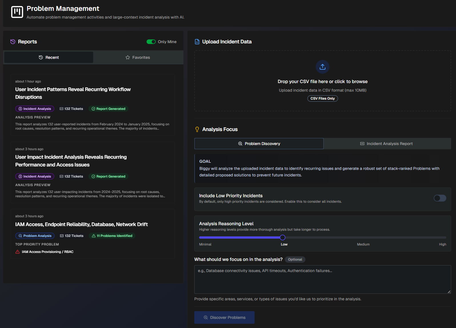
On the Problem Management page, upload a CSV file of your ServiceNow or Jira tickets to create insightful analyses. Use the data to generate Problem Analysis Reports or Incident Analysis Reports.
Problem analysis reports analyze incident data to create a set of ranked problems with clear, actionable solutions to prevent future incidents.
Incident analysis reports provide flexible reporting to uncover trends, recurring themes, and overall performance of your incident management process. Quickly analyze patterns by system, changes, or time; and visualize outcomes with interactive charts that help leaders track progress and drive improvements.
Create a Problem Analysis Report
Problem analysis reports analyze incident data from ServiceNow or Jira to identify recurring issues. This analysis type generates a report containing a set of problems ranked by priority with detailed solutions to help prevent future incidents.
To generate a problem analysis report:
In the Upload Incident Data section, click Choose File and select a CSV file of incidents from ServiceNow or Jira. (Maximum size 10MB.)
Under Analysis Focus, select Problem Discovery.
Populate the following information:
Field
Description
Include Low Priority Incidents
Toggle on to include low-priority incidents in the report. Toggle off to only include high-priority incidents.
If there is a specific way that you'd like the LLM to determine priority, include those instructions in the What should we focus on in the analysis? field.
Analysis Reasoning Level
Select the level of reasoning that should be used to generate the analysis.
Higher reasoning levels provide a more thorough analysis, but take longer to generate.
What should we focus on in the analysis? (Optional)
Enter what you would like to focus on in the analysis.
Provide specific areas, services, or types of issues. (For example, database connectivity issues, API timeouts, authentication failures, etc.)
Click Discover Problems. A link to the report will populate on the left side of the screen in the Reports panel.
Create an Incident Analysis Report
Incident analysis reports analyze incident data using customizable outputs and goals to generate a report detailing incident trends and patterns.
To generate this type of report:
In the Upload Incident Data section, click Choose File and select a CSV file of incidents from ServiceNow or Jira. (Maximum size 10MB)
Under Analysis Focus, select Incident Analysis Report.
Populate the following information:
Field
Description
Include Low Priority Incidents
Toggle on to include low-priority incidents in the report. Toggle off to only include high-priority incidents.
If there is a specific way that you'd like the LLM to determine priority, include that information in the analysis additional instructions.
Generate Interactive Charts (Experimental)
Toggle on to include intelligent visualizations alongside the text report. See Data Charts for more information.
Analysis Type
Select the analysis type to use in the report. The following options are available:
Default Report (Comprehensive Incident Analysis) - Advanced analysis with patterns, trends, and actionable recommendations. Focuses on over-arching themes to prevent future occurrences and improve system reliability.
Optionally, you can include Additional Focus Areas/Goals for the report to include.
Custom Analysis - Create a custom report using prompt instructions, or choose from one of the following quick start presets:
Recurring Patterns - identifies top recurring patterns across incident data
Top Talkers - focuses on systems, CIs, and teams that are frequently impacted by incidents
Vendor Issues - focuses on vendor-related incidents and third-party service failures
Change Issues - examines change-related incidents and assesses change management process effectiveness
Training Needs - surfaces knowledge gaps and training opportunities from incident root causes and resolution patterns
SRE Report - assess overall system reliability and identify the most problematic components, services, or infrastructure elements.
Customer Impact - examines incidents from a customer impact perspective, analyzing customer-facing service disruptions, user experience degradation, and business revenue impact
Quarterly Review - generates a comprehensive quarterly incident management review suitable for executives
Monthly Retro - comprehensive monthly retrospective analysis focusing on lessons learned, process improvements, and team performance insights
Incident Trends - identifies emerging patterns and provides proactive insights for incident prevention
Process Improvements - identifies gaps and opportunities for improving incident management processes
Click Generate Incident Report. The report automatically opens on the page.
Manage Analysis Reports
Reports can be viewed and managed on the Problem Management page.
Reports are listed on the left side of the screen. By default, only reports you created are displayed. To view all reports, toggle off the Only Mine option.
Each report in the list displays the time it was generated, the name of the report, type of report, number of tickets analyzed, and an analysis preview. Click any report in the list to view the full details.
To add a report to your favorites for easy access, click the Star icon on the report.
To permanently delete a report, click the three dots icon on the right side of the report ribbon, and click Delete.
View a Problem Analysis Report
Problem Analysis reports contain details about each problem that was found based on the incidents analyzed.
The report's top section displays the name of the problem analysis, the number of tickets analyzed, the number of problems identified, and the number of tickets deemed eligible for grouping into problems.
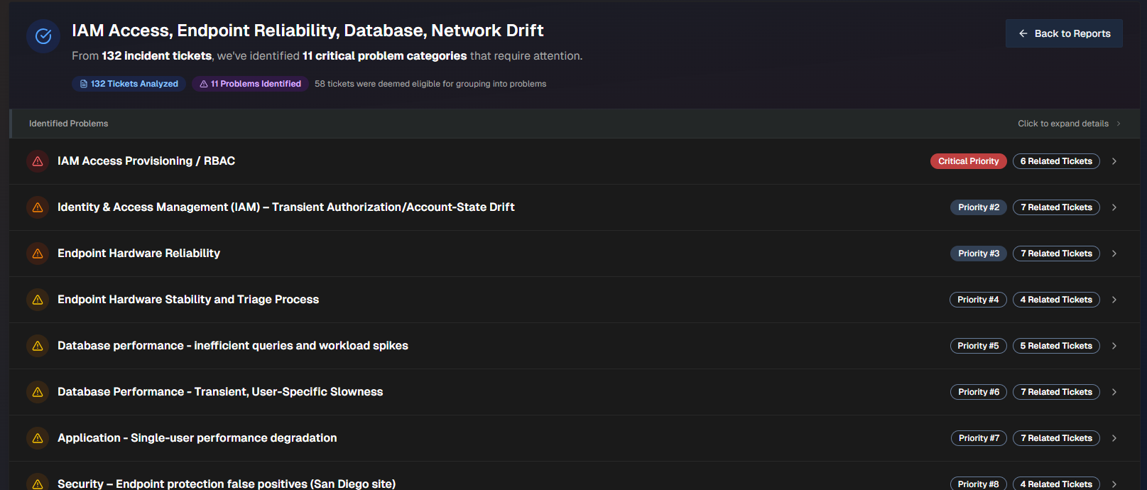
Click any problem in the list to view additional details.
The problem name, priority, number of related tickets, and a short description appears at the top of the report.
To create a ticket, click Create Problem Ticket. To export the problem as a .txt file, click Export Full Problem.
The following information about the problem is available:
Field | Description |
|---|---|
Impact Analysis | Analysis of the Business Impact and Technical Impact of the problem. |
Trend Analysis | Analysis of trends found in the incidents within the problem. |
Key Observations | Summarized list of key observations related to the problem. |
Root Causes | Potential root causes of the problem. Biggy analyzes each incident and derives the potential root cause based on the data available. |
Prevention Questions | A list of questions to ask your team to help prevent similar problems from occurring in the future. |
Related Tickets | List of tickets related to the problem. Click any ticket to open it in the relevant platform. |
Proposed Solutions | List of potential solutions to the problem. The following information for each solution appears:
For each solution, you can Create a PTASK or Export Solution as a .txt file. |
View an Incident Analysis Report
Incident Analysis Reports are divided into three tabs:
At the top of the page, the name of the report, the time the report was generated, and the number of incidents analyzed is displayed. On the top right of the page, you can Copy the report content, Download .md, or Download .docx.
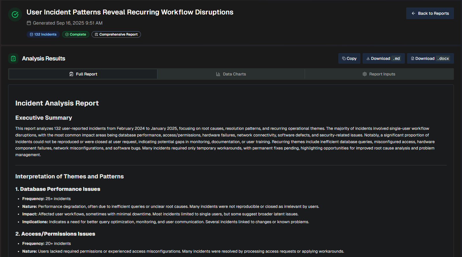
Full Report
The Full Report tab shows a comprehensive review of the incidents analzyed, with a list of themes based on patterns detected in the incidents.
Themes
Each incident can only have one theme, prioritizing the most prominent root cause or operational pattern.
When more than 25 incidents share a theme, only the most impactful are listed. Additional incidents are not shown, but are included in the total count.
The following information is available in the report:
Field | Description |
|---|---|
Executive Summary | A brief, high-level summary geared towards leadership teams. The summary highlights themes and patterns detected in the incidents analyzed. |
Interpretation of Themes and Patterns | An interpretation of each of the themes detected in the report. For each theme, the following information is displayed:
|
Recurring Themes and Associated Incidents | A detailed breakdown of each recurring theme and the incidents that are part of the theme. The table displays the following information:
|
Conclusion | Final summary stating what each of the themes in the report indicates, and what should be focused on to improve operational efficiency. |
Distilled Incident Data | Information about each incident analyzed to create the report. Display full text If a field is too long to fully display in the table, hover over it to view the full text. The following information about each incident is displayed:
To see the complete details, scroll to the right side of the table and click View. |
Data Charts
The Data Charts tab contains charts and graphs that visualize the incident information within the uploaded file.
Data charts content
Content in this tab is only populated if you selected the Generate Interactive Charts option when creating the report.
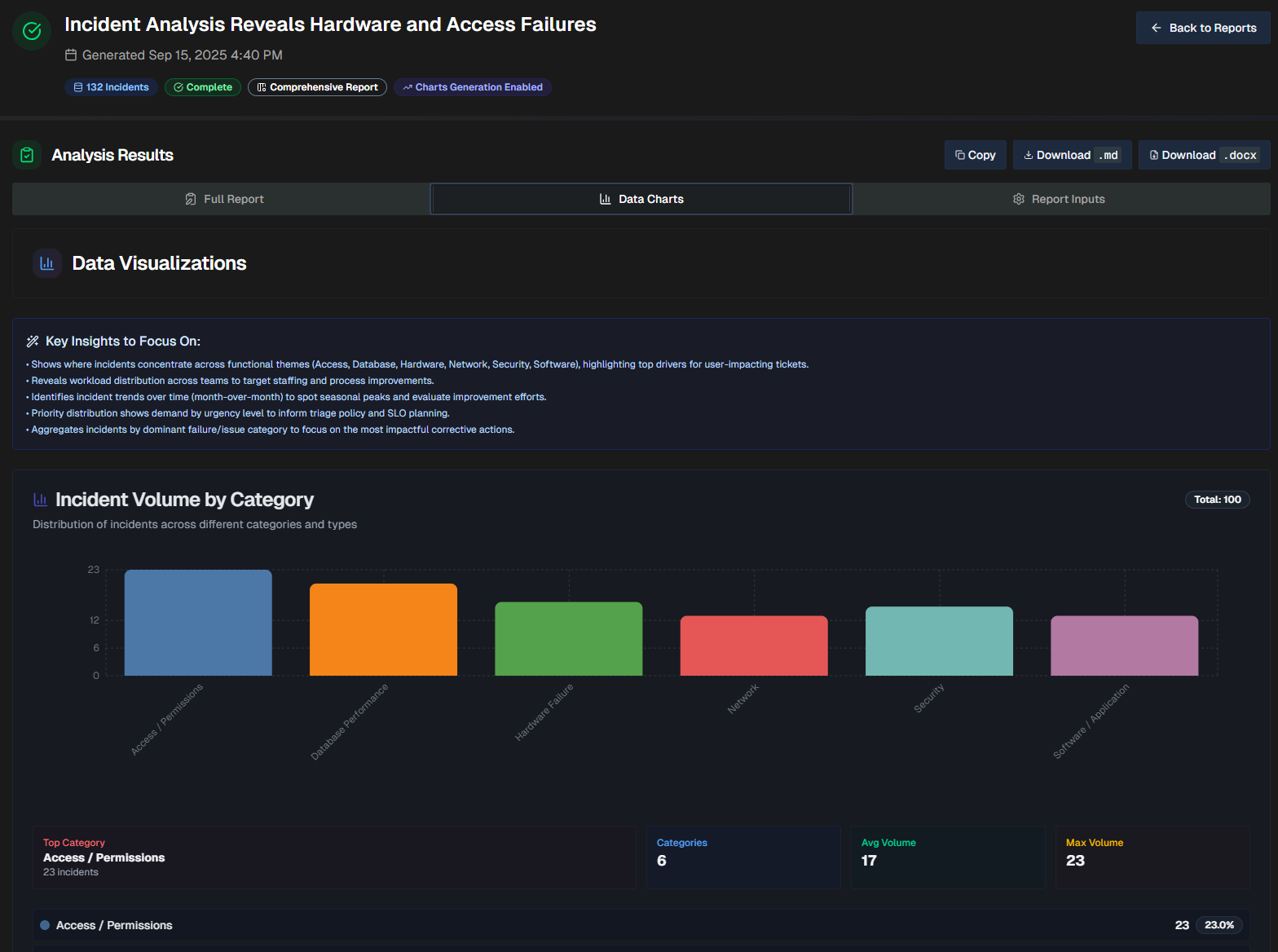
At the top of the page, a list of Key Insights to Focus On shows key points to remember while reviewing the visualizations.
The report will dynamically create visualizations based on the data in your file. Depending on the information available, each report may contain different types of visualizations, including bar graphs, line graphs, and pie charts.
Report Inputs
The Report Inputs tab displays information about how the report was configured, and the source data that was used to build the report.
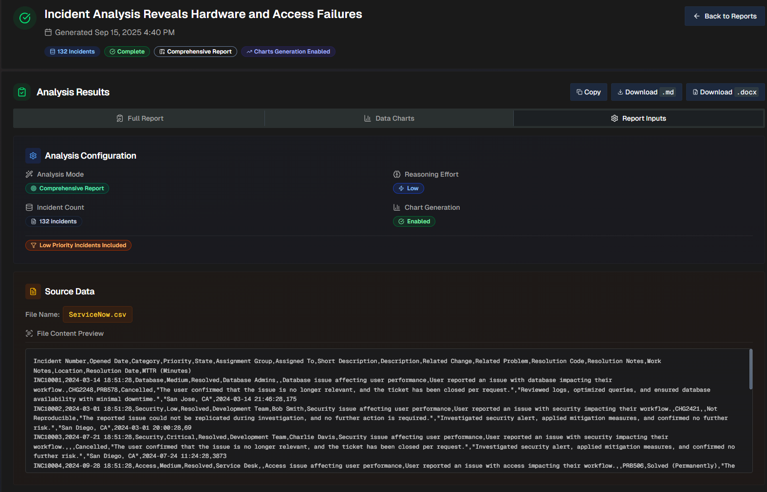
The Analysis Configuration section shows which options were selected when the report was created.
The Source Data section shows the file name, and a preview of the file.