AI Incident Prevention Analytics and Dashboards
AI Incident Prevention Required
Your organization must have the AI Incident Prevention module to access the features on this page If you're interested in purchasing this module, contact your BigPanda account team.
The AI Incident Prevention module helps you assess and analyze the risk associated with proposed changes in your IT environment. It calculates a risk score based on specific change fields and compares the current planned change details with data from your change integrations to identify potential risks.
Use the Change Analytics and Change Risk Prediction dashboards to find risk prediction information for change requests.
Change Risk Analytics
The Change Risk Analytics page provides a high-level analysis of changes in your IT environment for a specific time period. You can access this page within the web app in the Analytics section.
Use the drop-down menus at the top right of the screen to adjust the selected time period, Change Risk Profile, or time zone.
The page is separated into three tabs:
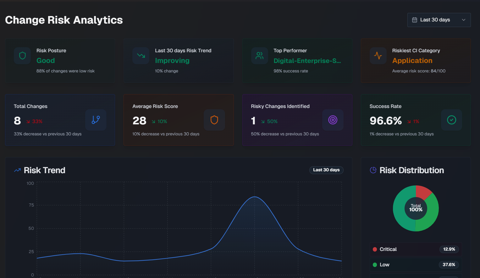
Overview
The following widgets are available in the Overview tab:
Widget | Description |
|---|---|
Risk Posture | How well your organization is doing from a change risk perspective. This score is based on the percentage of changes that were considered low risk. |
Risk Trend | Whether your organization's change risk scores are getting better or worse, and the percent change over the selected time period. |
Top Performer | The team that deployedchanges with the lowest average risk score, and their success percentage. |
Riskiest CI Category | The configuration item (CI) category with the highest average risk score. |
Total Changes | The total number of changes, and the percent change for the selected time period. |
Average Risk Score | The average risk score across all changes, and the risk score percent change for the selected time period. |
Risky Changes Identified | The percent of changes that were identified as high risk, and the risk score percent change for the selected time period. |
Success Rate | The average success rate of changes, and the risk score percent change for the selected time period. |
Risk Trend | A graph displaying therisk scorechange over the selected time period. Hover over a specific day on the graph to see the average risk score for that day. |
Risk Distribution | A pie chart displaying the distribution of change risk levels. |
Team Change Health | A comparison of each team's percentage of successful changes, and the number of risky changes. The calculation for success rate is (total changes - incidents caused) / total changes. |
Risk by CI Category | Risk information for changes grouped by the category of their affected CIs. For each CI, the number of changes, incidents, success percentage, average risk score, and number of incidents that were either critical or high severity. |
Riskiest Times to Deploy | The riskiest times to deploy, broken down by Riskiest Day and Riskiest Time. Riskiest Day shows the average risk score by day of the week for changes scheduled in the selected time period. The riskiest day and safest day are highlighted below the full week. Riskiest Time is an hourly risk analysis shown in your local time zone. The riskiest time and safest time are highlighted below the full day. |
Risk Score Averages and Weights | Shows the average risk score for each risk component across all analyzed changes, and the component's relative importance (weight). |
Causality and Prediction Quality
The Causality & Prediction Quality tab of the Change Risk Analytics dashboard displays data on incidents caused by changes.
The following widgets are available in this tab:
Widget | Description |
|---|---|
Prediction Accuracy | The percentage of risk predictions that accurately identified the outcome of the change. Prediction accuracy is measured using the following calculations:
The formula is (True positives + True negatives) / Total Changes x 100 Medium risk changes are excluded from the calculation. |
Incident Rate | Displays the percent of changes that caused an incident, the number of changes that resulted in an incident out of the total number of changes, and the total number of incidents caused by changes. |
False Negatives | The percent of low-risk changes that resulted in an incident. |
False Positives | The percent of high-risk changes that didn't cause an incident. |
Multi-Incident Change Rate | The percent and number of changes out of the total that led to two or more incidents. |
Average Time to First Incident | The average amount of time it took for a change to cause an incident. |
Risk Rating vs. Actual Incidents | A bar chart showing how well risk ratings predict incidents, broken down by the risk level. Hover over a section of the chart to see the number of changes with or without incidents for that risk level. |
Incident Severity | A pie chart showing the distribution of incident priorities for all incidents caused by changes. |
Incident Timeline | A line graph showing a daily view of changes vs. incidents caused by the change over the selected time period. Hover over a specific day to see the number of changes that were implemented and the number of incidents that occurred on that day. |
Teams Causing the Most Incidents | Assignment groups causing the most incidents from their changes. |
Changes that Caused the Most Incidents | Changes that directly caused incidents, showing change details and related incident information. |
Flow Analysis
Use the Flow Analysis tab to explore how changes flow through dimensions with an interactive Sankey diagram.
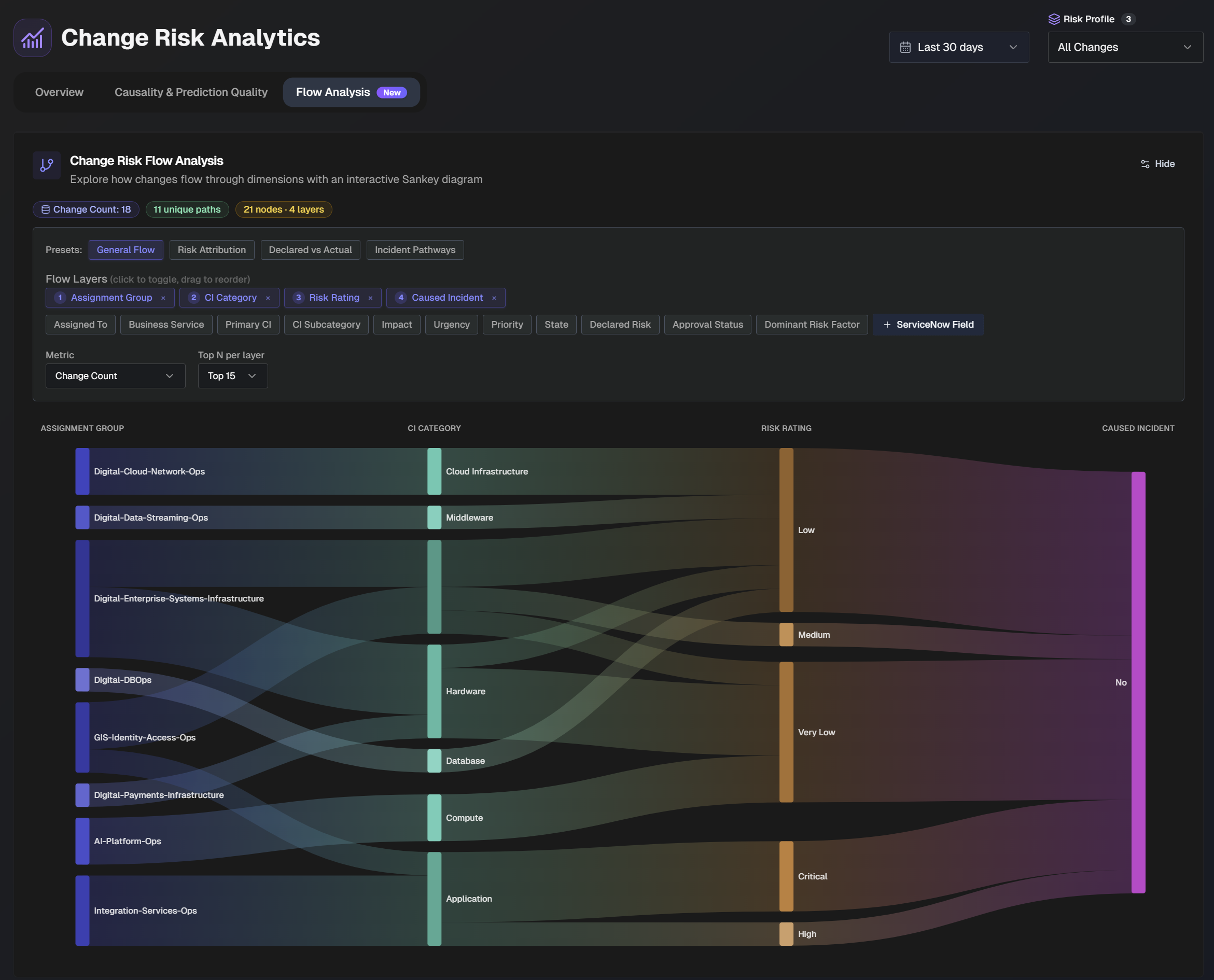
In the top section of the page, adjust the flow layers and metrics in the diagram.
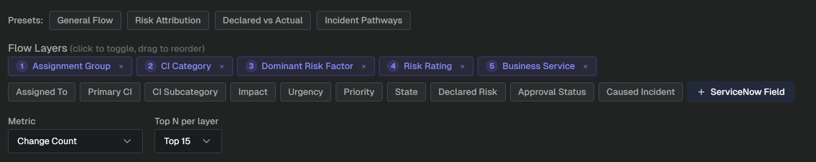
Several preset flow layers are available with common use cases:
General Flow - see how changes flow from teams, through CI categories, to outcomes
Risk Attribution - understand which risk factors drive the highest ratings
Declared vs. Actual - compare human-declared risk to AI-assessed risk ratings
Incident Pathways - trace organizational and technical pathways that lead to incidents.
You can also manually adjust flow layers. Click a field to add it to the flow layer, or drag and drop the fields to change the order they appear in the flow.
Select a Metric from the drop-down menu to choose what metric the diagram should be based on. Select from:
Change count
Average risk score
Incidents caused
Use the Top N per layer drop-down to select the number of layers to display in the diagram.
Hover over a section of the diagram to highlight the flow layer. Additional information about the layer, including the number of changes that match the path appears.
Prediction Tuning
Use the Prediction Tuning tab to optimize your change risk configuration.
AI Incident Prevention uses historical change outcomes to suggest change risk category weight distributions that better identify incident-causing changes.
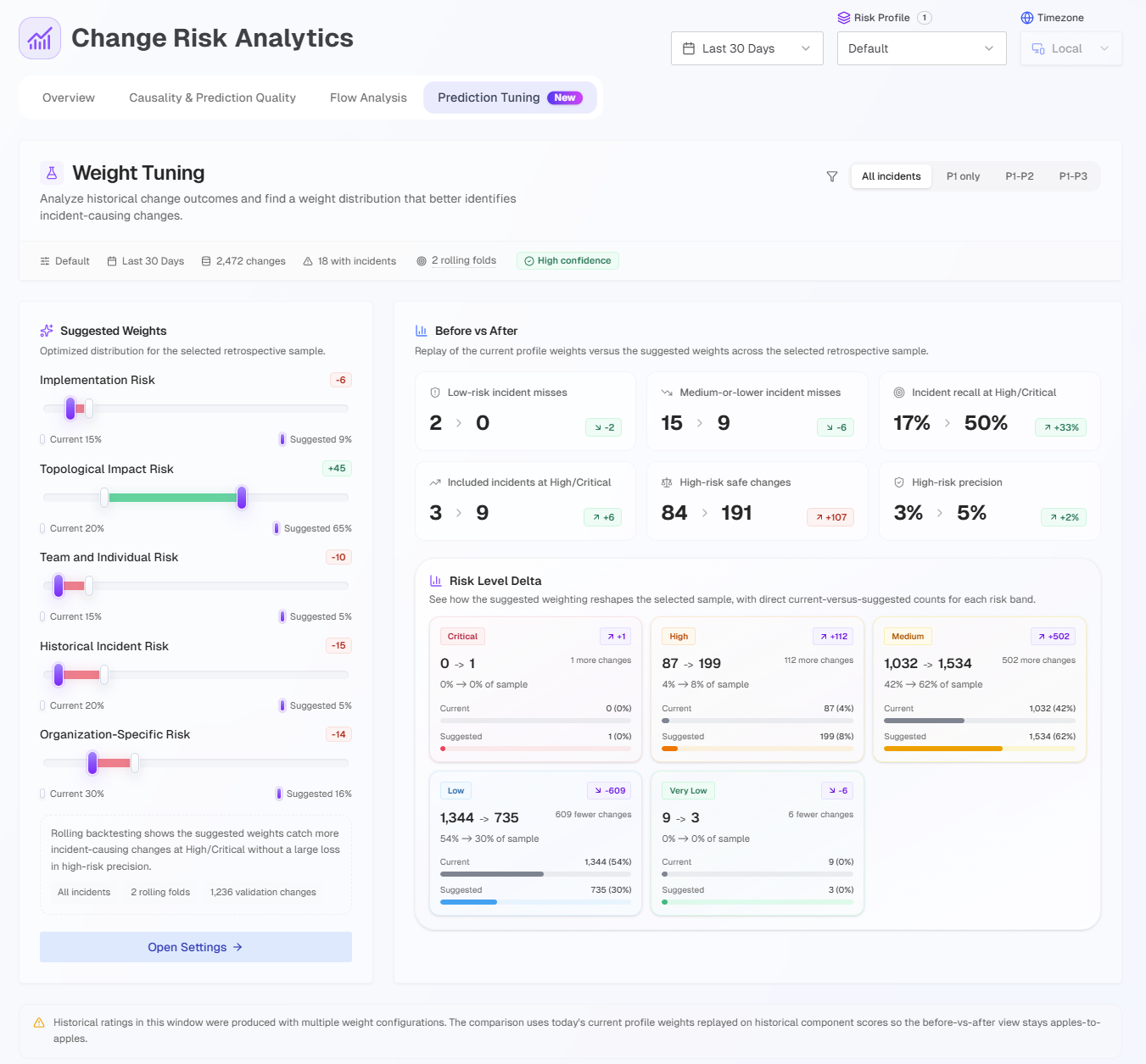
To view suggestions, go to the right corner of the page and select a Risk Profile from the drop-down menu.
After selecting a profile, you can filter the page to only include P1, P2, or P3 incidents in the analysis.
At the top of the page, basic information about the changes in the selected risk profile is displayed. The following information is available:
Change profile name
Time period filtered
Total number of changes
Number of changes with incidents
Number of rolling folds
Rolling folds
Rolling folds are time-ordered validation slices.
They run when the selected window has enough changes and incident-causing outcomes to test the recommendation on newer history rather than the same rows it learned from.
The Prediction Tuning analytics is divided into the following sections:
Section | Description |
|---|---|
Suggested Weights | Displays the current weight for each change risk category, and the suggested weight, based on the sample of changes. At the bottom of this section click Open Settings to adjust your change risk categories. |
Before vs. After | Replay of current profile weights vs. the suggested weights across the sample. |
Risk Level Delta | An overview of how suggested weights reshape the sample of changes. For each risk level, the number of changes for the current weights and the suggested weights is displayed. |
Recovered incident-causing changes | Changes that caused incidents that moved into high or critical risk, and the new suggested weights. |
Remaining incident misses | Incident causing changes that were rated as medium or lower, even after tuning. |
Safe changes promoted upward | Changes currently marked as safe that would move into high or critical risk levels under the new suggested weights. |
Change Risk Dashboard
Within the Change Risk Dashboard, view all change requests and their associated risk, predicted by AI Incident Prevention.
Risk score rating frequency
The Change Risk Dashboard assigns a risk score to upcoming changes. The risk score is based on specific change fields and compares the current planned change details with data from your change integrations to identify potential risks.
Changes are typically risk rated every 25-35 minutes, but can take up to an hour depending on the number of changes queued. To request an ad-hoc risk rating, use the Change Risk Analysis API.
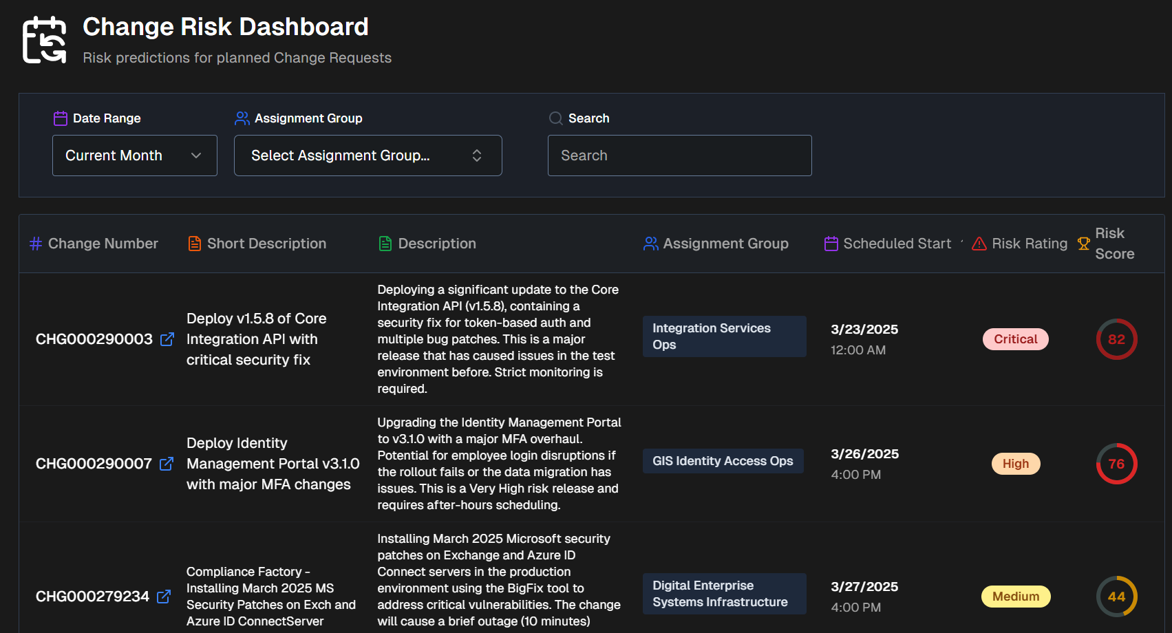
The Change Risk Dashboard is divided into two tabs:
Risk Prediction
The Risk Prediction tab displays upcoming change requests and their associated risks.
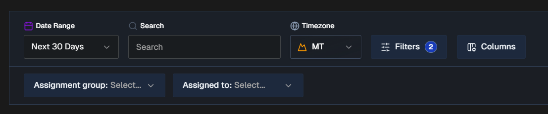
By default, all changes for the next 30 days appear in the Risk Prediction tab. You can filter the list using Risk Profiles, Date Range, Time Zone, or click Filters to select one or more ServiceNow fields to filter on. Selected ServiceNow fields will appear as dropdowns in the bar below where you can choose specific values.
To find a specific change, use the Search bar. You can search for a change number or keyword.
Click Columns to customize the columns that appear in the changes table. You can choose from default columns, or select ServiceNow fields. Reorder columns by dragging and dropping them.
The following columns appear in the Change Risk table by default:
Change number
Short description
AI Change Summary (Full description)
Assignment group
Scheduled start
Risk rating
Risk score
Filter and column persistence
All filters and column selections persist on a user-level basis. Your selections will not affect other users' view of the dashboard.
When you exit the dashboard or web app, your selections will be retained and appear the next time you access the dashboard using your account.
Export CSV
To download the table, scroll to the bottom of the page and select Export CSV. The exported CSV file contains the following columns:
Change Number
Short Description
AI Change Summary
Assignment Group
Scheduled Start
Risk Rating
Risk Score
Last Assessed
Risk Reasoning
Suggested Mitigations
Change Volume by Risk Level
Below the filters and search bar is the Change Volume by Risk Level graph. This displays the total number of changes over time broken down by risk level.
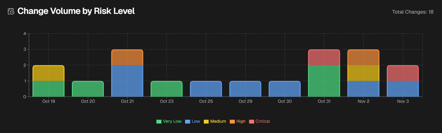
Hover over a specific day to see the numer of changes in each risk level that occurred on that day.
Change Risk Assessment
Click any change in the dashboard to open the Change Risk Assessment screen.
The Change Risk Assessment screen shows you details about the potential risk associated with the selected change.
The assessment screen is divided into the following tabs:
To send an assessment to an external system, go to the upper right corner of the screen and click the Arrow icon. Assessments can be sent to Email, Slack, MS Teams, or ServiceNow.
File analysis
AI Incident Prevention can analyze files attached to change tasks. Supported file types include pdf, csv, xlsx, xls, txt, doc, docx, msg.
Change Details
The Change Details tab displays high-level information about the selected change.
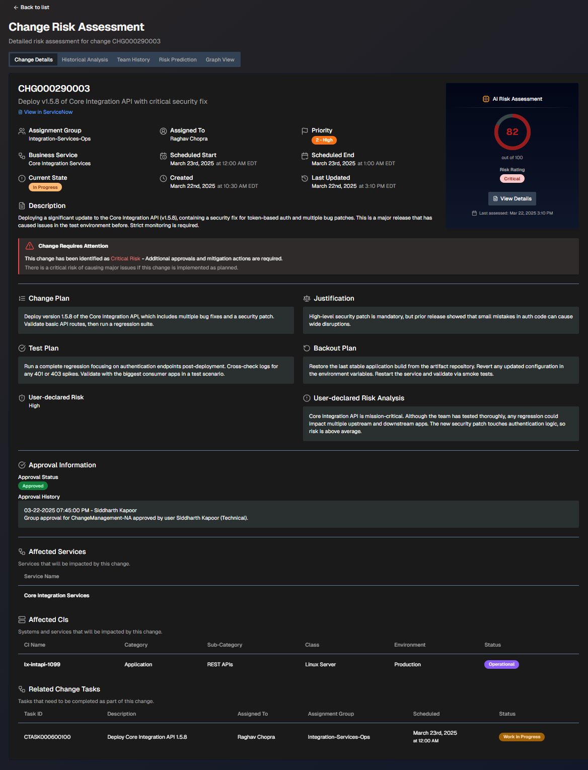
To adjust which ServiceNow fields appear on the screen, select Display Settings. Choose additional fields and click Apply Changes.
The screen is divided into the following sections:
Section | Description |
|---|---|
Change Information | High-level information about the change. The following details are displayed in this section:
If the change requires attention, a red box with an exclamation point will appear describing the requirements. |
AI Risk Assessment | The risk assessment score and risk rating. Click View Details to open the Risk Prediction tab. |
Change Plan | Steps to take to implement the change. |
Justification | Reasoning behind the change plan. |
Test Plan | Steps to take to test after the change to ensure it was successful. |
Backout Plan | Steps that can be taken if the change needs to be reversed. |
User-Declared Risk | The risk level of the change defined by the user who opened it. |
User-Declared Risk Analysis | The risk analysis of the change defined by the user who opened it. |
Approval Information | People who need to review the change before it can be implemented. The following information about each approver is displayed:
|
Affected Services | Services potentially affected by the change. |
Affected CIs | Systems and services that will potentially be affected by this change. The following information about each CI is displayed:
|
Related Change Tasks | Tasks that need to be completed as part of the change. The following information about each task is displayed:
|
Historical Analysis
The Historical Analysis tab displays similar changes and related incidents that were used as part of the change risk profile. These changes and incidents may provide additional context.
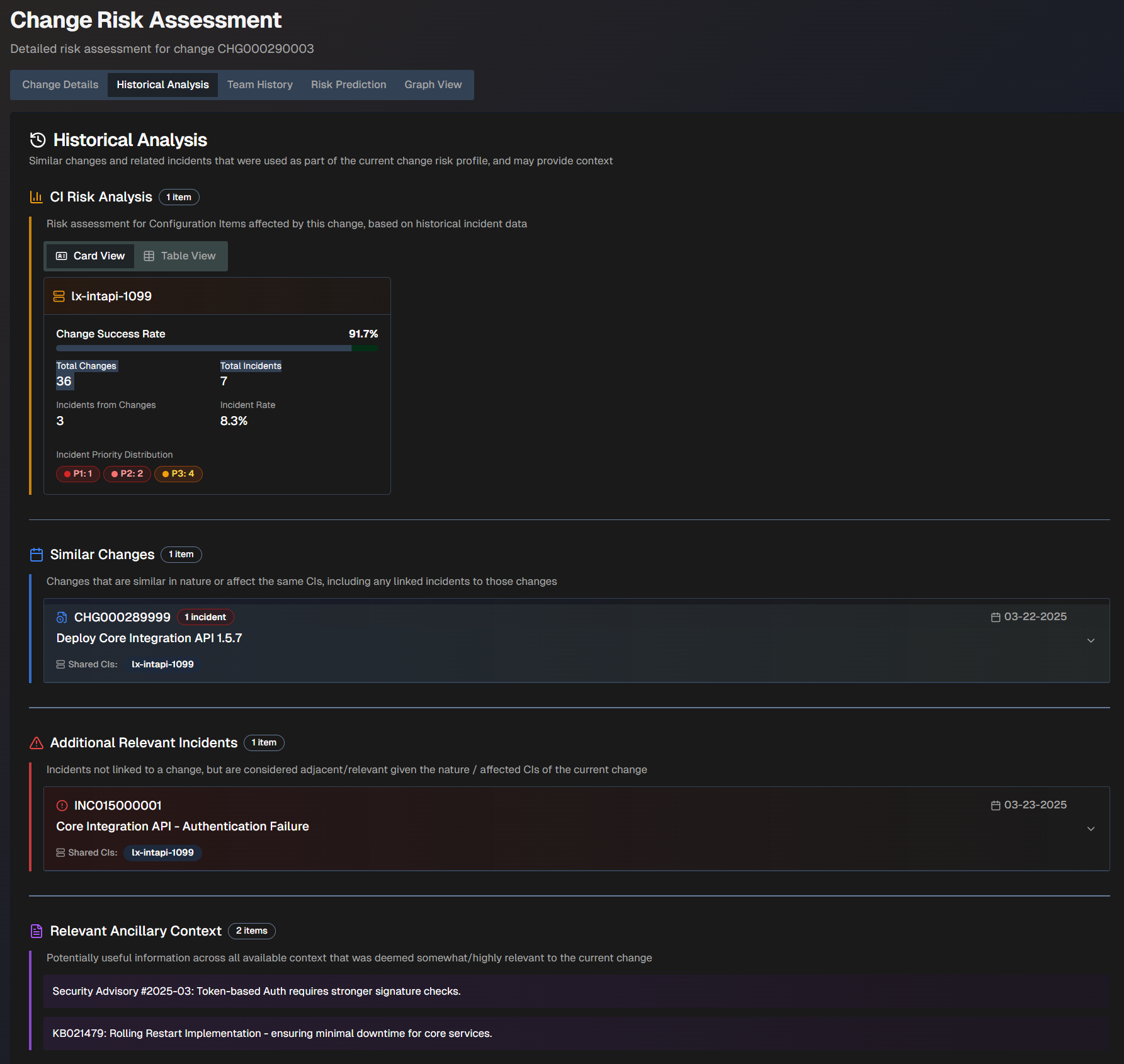
The Historical Analysis screen is divided into the following sections:
Section | Description |
|---|---|
CI Risk Analysis | The risk assessment for configuration items affected by this change, based on historical incident data. This information can be displayed in Card View or Table View. The following information appears for each CI:
|
Similar Changes | Changes that are similar in nature or affect the same CIs. A box displaying the change number, description, and date appears for each similar change. Click a box to view additional information including the full description, similarity reasoning, resolution of the incident (if applicable), and linked incidents. |
Additional Relevant Incidents | Incidents that were not linked to a change, but are considered relevant given the nature or affected CIs of the current change. A box displaying the incident number, description, date, and shared CIs appears for each relevant incident. Click a box to view additional information including the full description, similarity reasoning, and resolution of the incident (if applicable). |
Relevant Ancillary Context | Information across all available contexts that was deemed potentially relevant to the current change. |
Team History
The Team History tab shows the historical performance records of the team and the individual responsible for the change.
You can view history by Team Metrics or Individual Metrics.
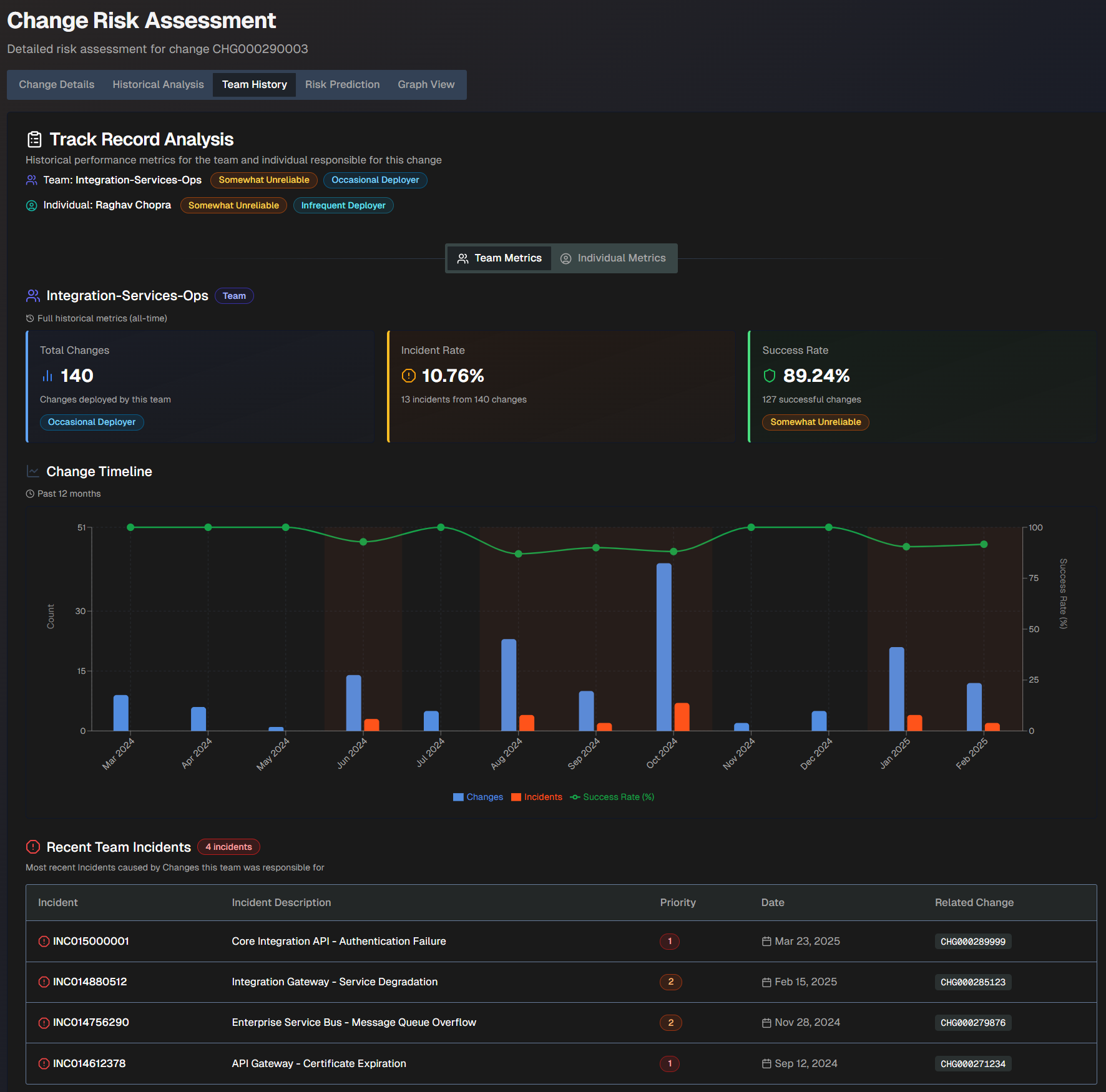
The Team History screen shows the following information:
Field | Description |
|---|---|
Team | The team name, reliability score, and deployment frequency score. |
Individual | The individual's name, reliability score, and deployment frequency score. |
Total Changes | The total number of changes deployed by the team. This number is based on full historical metrics. |
Incident Rate | The incident rate compared to the number of changes the team was responsible for. This rate is based on full historical metrics. For example, if the team was responsible for 10 changes and 2 of them caused incidents, the incident rate would be 80%. |
Success Rate | The percent of successful changes that the team was responsible for. This rate is based on full historical metrics. For example, if the team was responsible for 10 changes and 2 of them caused incidents, the success rate would be 80%. |
Change Timeline | A timeline of changes over the past 12 months. The blue bars represent changes, the orange bars represent incidents, and the green line represents the change success rate. |
Recent Team/Individual Incidents | The most recent incidents caused by changes the team or individual was responsible for. The following information about each incident is displayed:
|
Organization-Specific Risk Evaluation
The Organization-Specific Risk Evaluation tab displays a custom risk evaluation based on factors and context specific to your organization.
Configuration
To view org-specific risk information, you must configure org-specific settings in the Change Risk Prediction action plan.
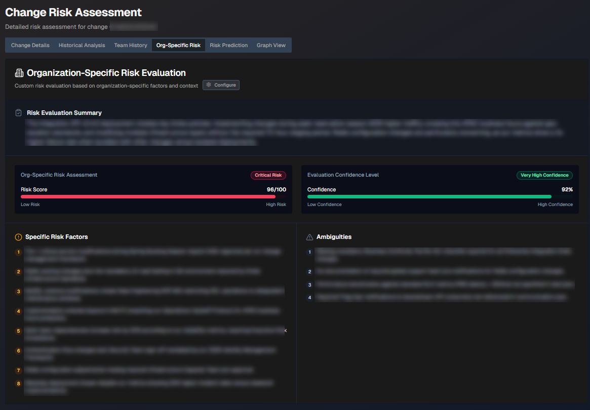
The following information is displayed:
Section | Description |
|---|---|
Risk Evaluation Summary | Short summary of the org-specific risk evaluation. |
Org-Specific Risk Assessment | The risk score. |
Evaluation Confidence Level | How confident AI Incident Prevention is in the evaluation. |
Specific Risk Factors | List of specific factors contributing to the risk score. |
Ambiguities | Ambiguous factors related to the change that contribute to the risk score. |
Risk Prediction
The Risk Prediction tab displays widgets containing information about the predicted risk level of the change.
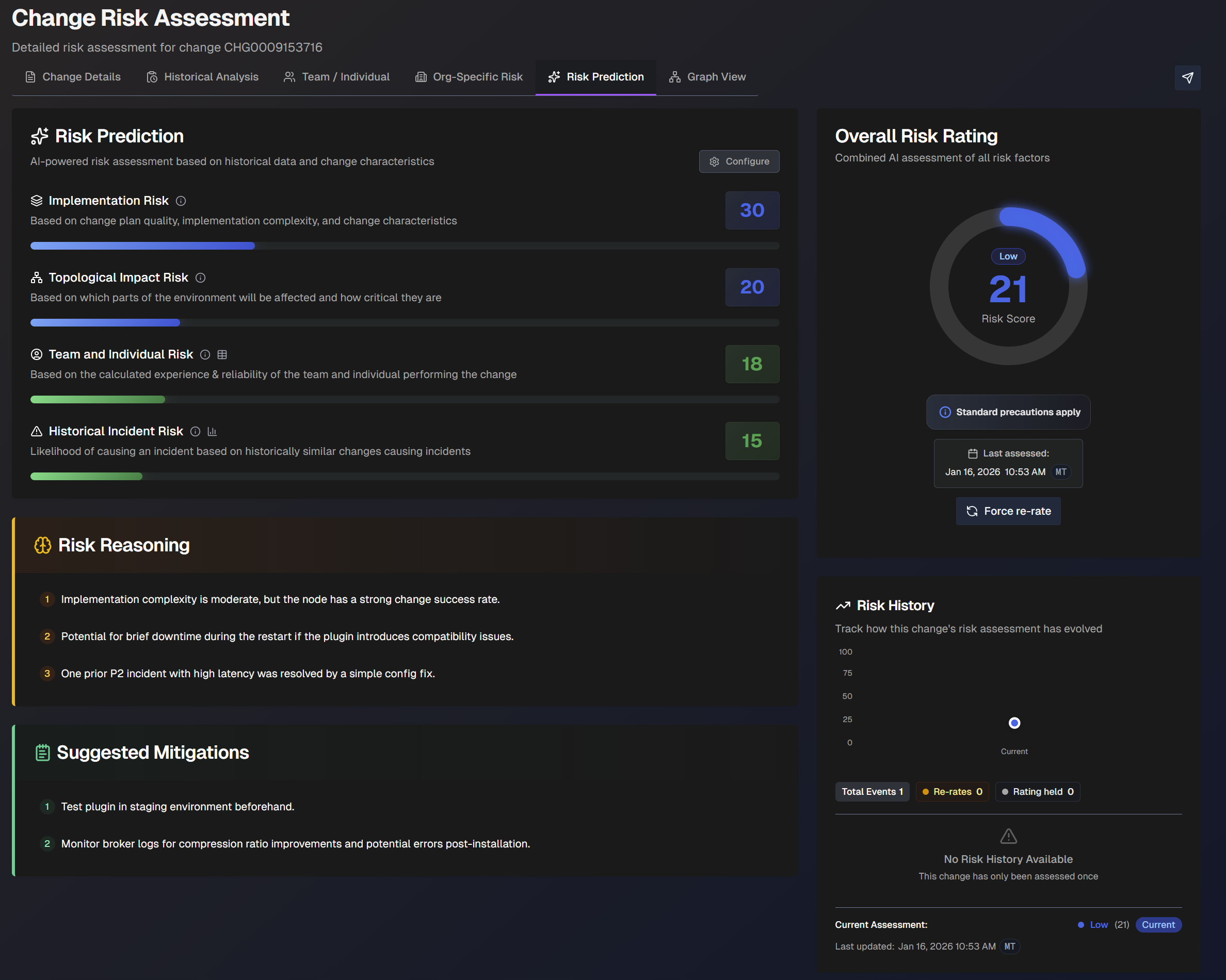
The following widgets are displayed:
Widget | Description |
|---|---|
Risk Prediction | AI-powered risk assessment based on previous changes. The following scores are displayed:
|
Overall Risk Rating | The risk assessment of the change with all factors combined. The date and time of the last assessment appears under the risk rating. To re-assess the risk rating, click Force Re-Rate. |
Risk Reasoning | Explanation of the reasoning behind the risk assessment. |
Risk History | How the change's risk assessment has evolved over time. |
Suggested Mitigations | Suggested steps that can be taken to mitigate risks associated with the change. |
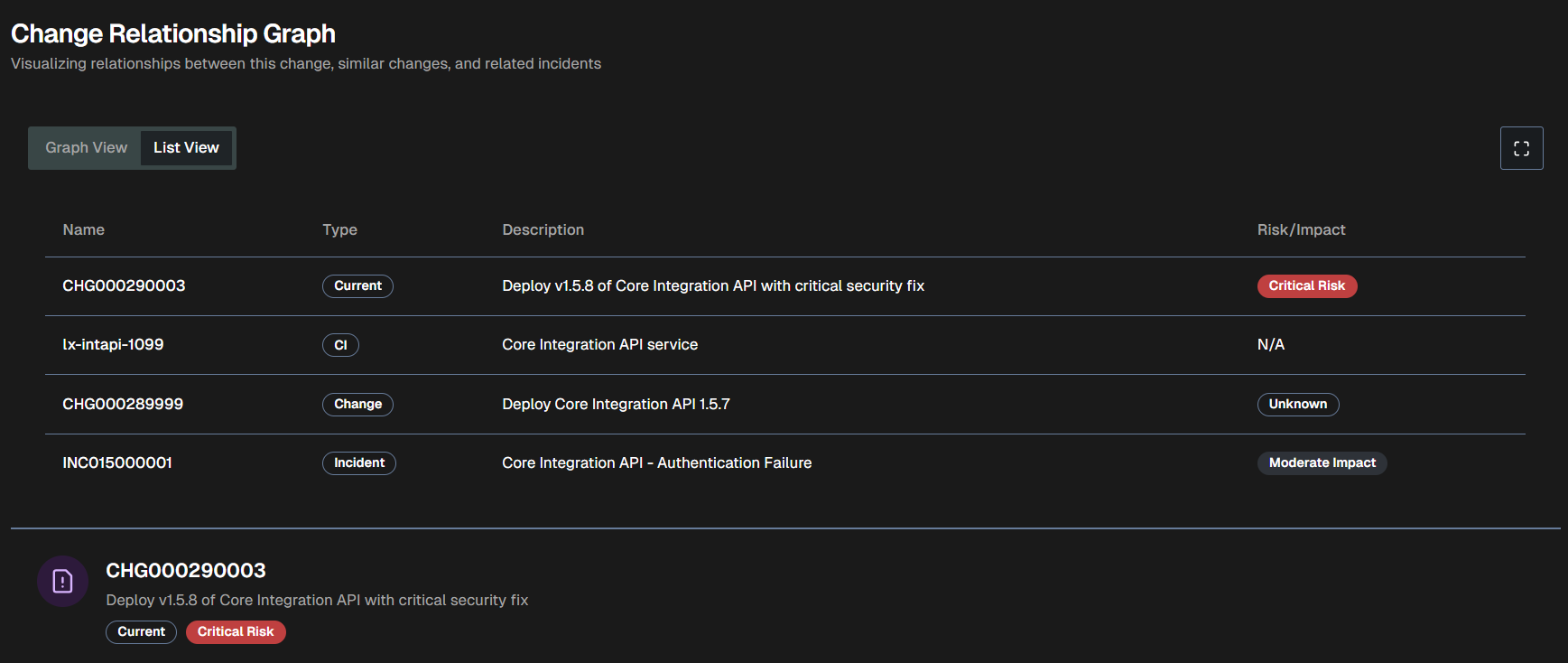
Graph View
The Graph View tab visualizes the relationships between the change, similar changes, and related incidents.
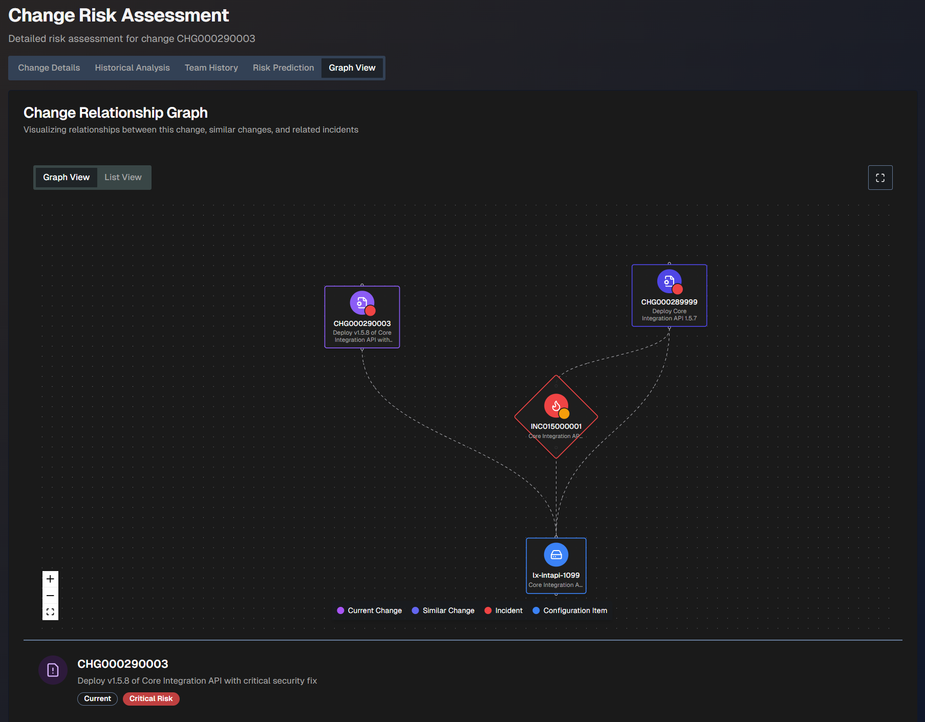
The graph view is coded by color:
Current change - purple
Similar change - purplish blue
Incident - red
Configuration item - blue
Hover over any of the items in the graph to view additional information such as the number, description, and risk level.
To see a larger view, click the Full screen button.
To view a text version of the visualization, click the List View tab.
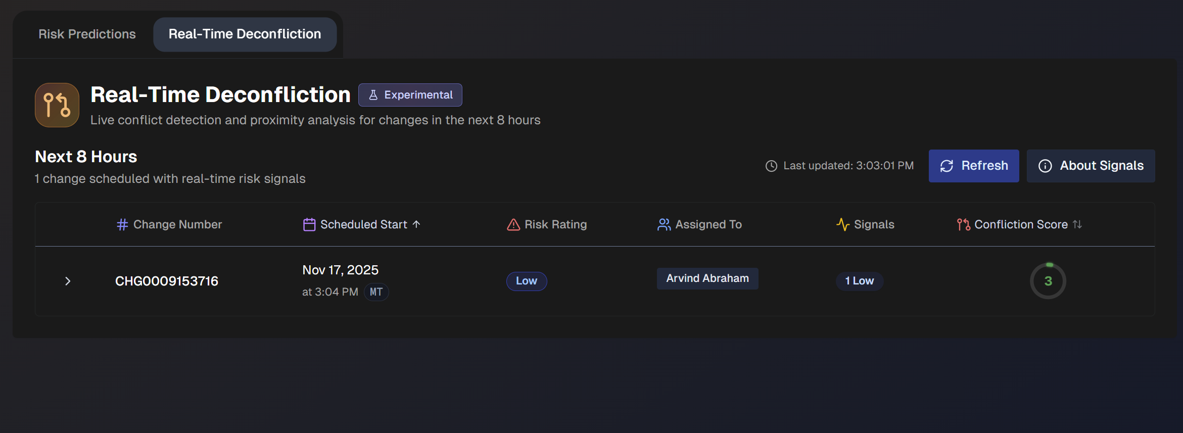
Real-Time Deconfliction
Use the Real-Time Deconfliction tab to identify conflict-based risks associated with upcoming changes.
By default, Real-Time Deconfliction displays data for the next 8 hours from all change risk profiles. You can filter the dashboard by Risk Profile or Time Range.
Real-Time Deconfliction Signals
AI Incident Prevention analyzes several different incident and change events to look for signals of conflict-based risks. The types of possible signals are:
Active incidents - Open incidents related to affected CIs or business services.
Recent incidents - Incidents resolved in the past 48 hours that may indicate instability.
Change conflicts - Changes affecting the same owner or CIs scheduled near the same time
Failed changes - Changes failed on the same CIs over the past 30 days.
Open problems - Active problem tickets related to affected CIs or business service.
Conflict risk rating is determined by the conflict type and timing proximity:
Conflict type | Overlapping (Concurrent) | Within 4 hours (Near) | Same day (Within 24 hours) |
|---|---|---|---|
Same CI (different owners) | Critical | High | Medium |
Same owner and same CI | High | Medium | Low |
Same owner only | Medium | Low | High |
Signal refresh
When you open the Real-Time Awareness tab, signals are refreshed and then cached for the session. You can also use the Refresh button at the top of the page to manually refresh.
Each signal includes detailed metadata and links to ServiceNow records when available.
Change Information
If a change has one or more real-time risk signals, it will appear on the dashboard. Each of these changes lists the following details:
Field | Description |
|---|---|
Change Number | Unique identifier of the change. |
Scheduled Start | Date and time when the change is scheduled to begin. |
Risk Rating | Projected risk level associated with the change. |
Assigned To | Person to whom the change is assigned. |
Signals | Number of real-time signals identified that contributed to the risk rating. |
Confliction Score | Score associated with the conflict. Higher scores indicate more conflicts. The highest possible score is 100. |
Click any change in the list to view the Deconfliction Assessment.
Deconfliction Assessment
The Deconfliction Assessment displays conflict details to help you avoid any potential risks.
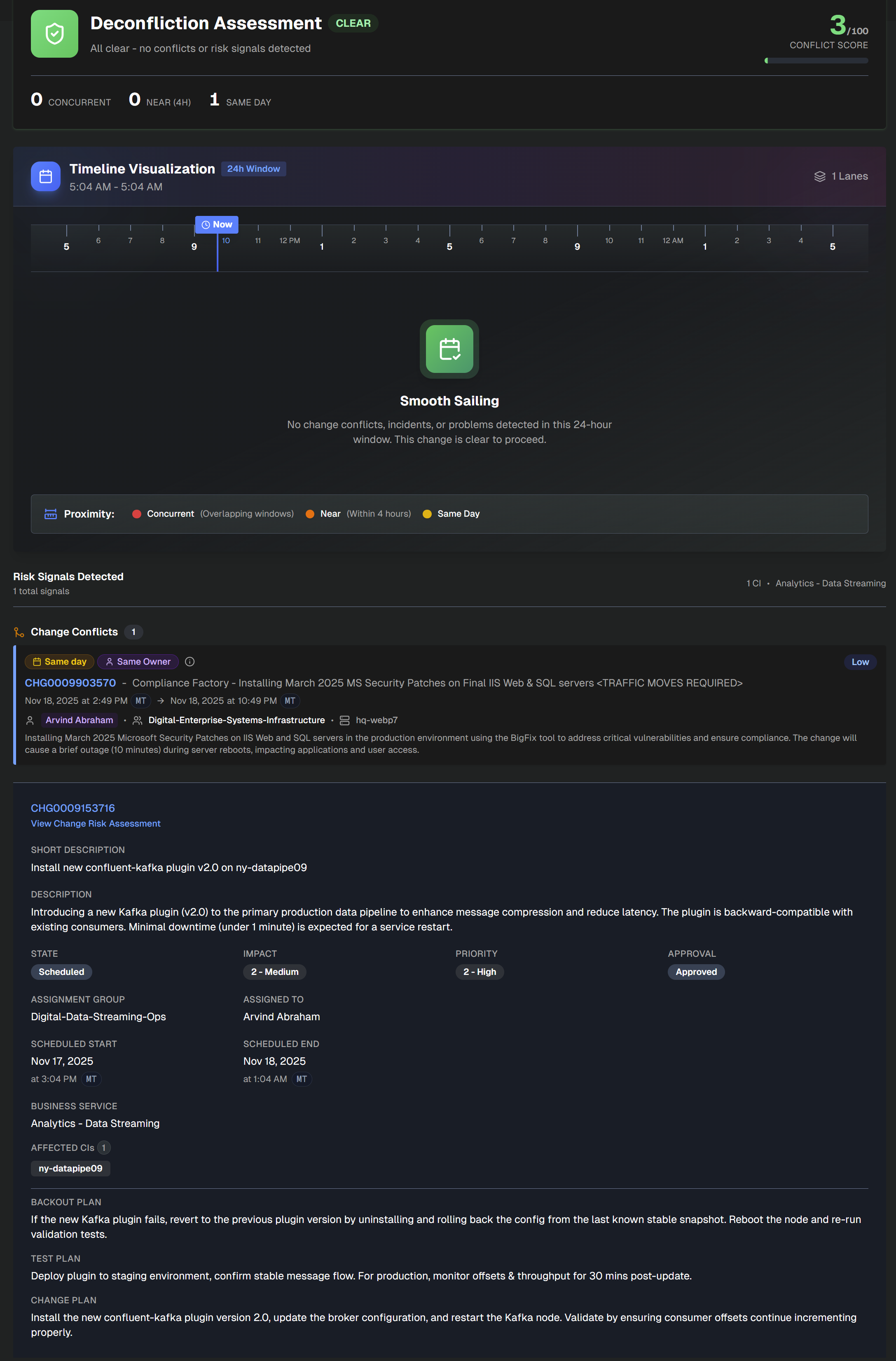
At the top left side of the assessment, the number of Concurrent, Near (within 4 hours), and Same Day changes appears. At the top right side, the Conflict Score is available.
The assessment is divided into the following sections:
Section | Description |
|---|---|
Timeline Visualization | Timeline of conflicting changes over the next 24 hours. Concurrent change windows are red, changes within 4 hours are orange, and same-day changes are yellow. |
Risk Signals Detected | Details about each of the risk signals that contributed to the conflict. Information such as signal type, conflict type, change proximity, and other details are displayed. |
Change Details | Information about the assessed change. Click the change number at the top of the section to open it in ServiceNow. Click the link below the change number to open the full change risk assessment. The Change Details section contains the following information:
|
Large Context Analysis
Use the Large Context Analysis dashboard to conduct comprehensive incident and data analysis, problem discovery, and trend identification with AI Incident Prevention's specialized deep research pipeline. Proactively identify the top priority problem areas based on historic incidents and root cause so that your team can focus on the most relevant and high-value problems.
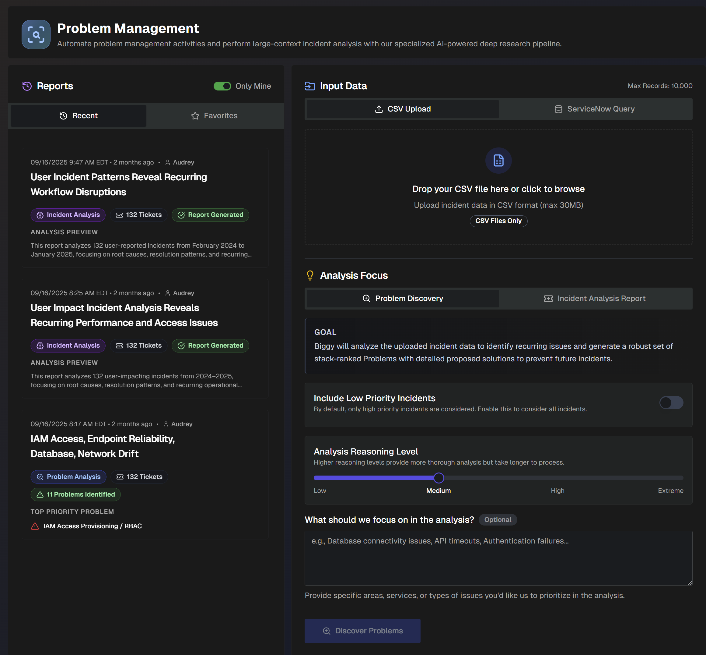
Create Large Context Analysis Reports
On the Large Context Analysis page, upload a CSV file (maximum size of 30MB) of your ServiceNow or Jira tickets or data, or use a ServiceNow query to create insightful analyses.
Use the data to generate Problem Analysis, Incident Analysis, or Dataset Insights Reports.
Problem Analysis
Problem Analysis reports analyze incident data to create a set of ranked problems with clear, actionable solutions to prevent future incidents. Create Problem Analysis reports using a CSV file or ServiceNow query.
Create a Problem Analysis Report using a CSV File
Problem analysis reports analyze incident data to identify recurring issues. This analysis type generates a report containing a set of problems ranked by priority with detailed solutions to help prevent future incidents.
To generate a problem analysis report using a CSV file:
In the Input Data section, select CSV Upload. Drop in a CSV file of incidents from ServiceNow or Jira, or click to browse your computer for a file. (Maximum size 30MB.)
Under Analysis Focus, select Problem Discovery.
Populate the following information:
Field
Description
Include Low Priority Incidents
Toggle on to include low-priority incidents in the report. Toggle off to only include high-priority incidents.
If there is a specific way that you'd like the LLM to determine priority, include those instructions in the What should we focus on in the analysis? field.
Analysis Reasoning Level
Select the level of reasoning that should be used to generate the analysis.
Higher reasoning levels provide a more thorough analysis, but take longer to generate.
What should we focus on in the analysis? (Optional)
Enter what you would like to focus on in the analysis.
Provide specific areas, services, or types of issues. (For example, database connectivity issues, API timeouts, authentication failures, etc.)
Click Discover Problems. A link to the report will populate on the left side of the screen in the Reports panel.
Create a Problem Analysis Report using a ServiceNow query
Problem analysis reports identify recurring issues using incident data. Generate a report containing a set of problems ranked by priority with detailed solutions to help prevent future incidents.
You can create the analysis for a specific set of incidents by querying ServiceNow. For example, query to find incidents from within a specific date range, incidents caused by a specific change, or incidents associated with a specific assignment group.
To generate a problem analysis report using a ServiceNow query:
In the Input Data section, select ServiceNow Query.
Previous Queries
If you've used ServiceNow queries in the past, you can select one in the Previous Queries drop-down menu rather than creating a query from scratch.
Under ServiceNow Table, click the drop-down menu and select a ServiceNow table to query.
Under Filter Conditions, build your ServiceNow query. The following query building options are available:
Add Condition - select a Field, Operator, and Value. If you enter more than one condition, you can adjust the root level operator between conditions to AND or OR.
Create Group - add a group of conditions. You can adjust the root-level operator between conditions or groups to AND or OR.
Record limit
Queries must yield fewer than 10,000 records.
Best practice
We recommend adding a condition to limit the query to a specific date range whenever possible.
Under Fields to Retrieve, select all of the fields necessary for your analysis. We recommend avoiding unnecessary fields to improve report quality.
Click Validate Query to test your query. If the query results in more than 10,000 records, you'll need to adjust the filters to have fewer records.
Once the query has been validated, click Confirm & Pull Records to retrieve the records from ServiceNow.
Under Analysis Focus, select Problem Discovery.
Populate the following information:
Field
Description
Include Low Priority Incidents
Toggle on to include low-priority incidents in the report. Toggle off to only include high-priority incidents.
If there is a specific way that you'd like the LLM to determine priority, include those instructions in the What should we focus on in the analysis? field.
Analysis Reasoning Level
Select the level of reasoning that should be used to generate the analysis.
Higher reasoning levels provide a more thorough analysis, but take longer to generate.
What should we focus on in the analysis? (Optional)
Enter what you would like to focus on in the analysis.
Provide specific areas, services, or types of issues. (For example, database connectivity issues, API timeouts, authentication failures, etc.)
Click Discover Problems. A link to the report will populate on the left side of the screen in the Reports panel.
Incident Analysis
Incident Analysis reports provide flexible reporting to uncover trends, recurring themes, and overall performance of your incident management process. Quickly analyze patterns by system, changes, or time; and visualize outcomes with interactive charts that help leaders track progress and drive improvements. Create Incident Analysis reports using a CSV file or ServiceNow query.
Create an Incident Analysis Report using a CSV File
Incident analysis reports analyze incident data using customizable outputs and goals to generate a report detailing incident trends and patterns.
To generate this type of report using a CSV file:
In the Upload Incident Data section, click Choose File and select a CSV file of incidents from ServiceNow or Jira. (Maximum size 30MB)
Under Analysis Focus, select Incident Analysis Report.
Populate the following information:
Field
Description
Include Low Priority Incidents
Toggle on to include low-priority incidents in the report. Toggle off to only include high-priority incidents.
If there is a specific way that you'd like the LLM to determine priority, include that information in the analysis additional instructions.
Analysis Reasoning Level
Select the level of reasoning that should be used to generate the analysis.
Higher reasoning levels provide a more thorough analysis but take longer to generate.
Generate Interactive Charts (Experimental)
Toggle on to include intelligent visualizations alongside the text report. See Data Charts for more information.
Analysis Type
Select the analysis type to use in the report. The following options are available:
Default Report (Comprehensive Incident Analysis) - Advanced analysis with patterns, trends, and actionable recommendations. Focuses on over-arching themes to prevent future occurrences and improve system reliability. Optionally, you can include Additional Focus Areas/Goals for the report to include.
Custom Analysis - Create a custom report using prompt instructions, a quick start preset, or a custom preset. The following quick start presets are available:
Recurring Patterns - identifies top recurring patterns across incident data
Top Talkers - focuses on systems, CIs, and teams that are frequently impacted by incidents
Vendor Issues - focuses on vendor-related incidents and third-party service failures
Change Issues - examines change-related incidents and assesses change management process effectiveness
Training Needs - surfaces knowledge gaps and training opportunities from incident root causes and resolution patterns
SRE Report - assess overall system reliability and identify the most problematic components, services, or infrastructure elements.
Customer Impact - examines incidents from a customer impact perspective, analyzing customer-facing service disruptions, user experience degradation, and business revenue impact
Quarterly Review - generates a comprehensive quarterly incident management review suitable for executives
Monthly Retro - comprehensive monthly retrospective analysis focusing on lessons learned, process improvements, and team performance insights
Incident Trends - identifies emerging patterns and provides proactive insights for incident prevention
Process Improvements - identifies gaps and opportunities for improving incident management processes
You can also create a custom preset for reuse. Custom presets can be visible to just you, or to everyone in your organization.
To create a custom preset, click Create Preset and populate the following information:
Preset name - descriptive name for the custom preset.
Visibility - select who can use the preset. Private presets are only visible to you, Public presets are visible to all users.
Preset Instructions - enter custom incident analysis instructions. Click Generation Mode to allow the AI to generate a prompt based on your input.
Click Generate Incident Report. The report automatically opens on the page.
Create an Incident Analysis Report using a ServiceNow Query
Incident analysis reports use customizable outputs and goals to generate a report detailing incident trends and patterns.
You can create the analysis for a specific set of incidents by querying ServiceNow. For example, query to find incidents from within a specific date range, incidents caused by a specific change, or incidents associated with a specific assignment group.
To generate this type of report:
In the Input Data section, select ServiceNow Query.
Previous Queries
If you've used ServiceNow queries in the past, you can select one in the Previous Queries drop-down menu rather than creating a query from scratch.
Under ServiceNow Table, click the drop-down menu and select a ServiceNow table to query.
Under Filter Conditions, build your ServiceNow query. The following query building options are available:
Add Condition - select a Field, Operator, and Value. If you enter more than one condition, you can adjust the root level operator to AND or OR.
Create Group - add a group of conditions. You can adjust the root-level operator between conditions to AND or OR.
Best practice
We recommend adding a condition to limit the query to a specific date range whenever possible.
Record limit
Queries must yield fewer than 10,000 records.
Under Fields to Retrieve, select all of the fields necessary for your analysis. We recommend avoiding unnecessary fields to improve report quality.
Click Validate Query to test your query. If the query results in more than 10,000 records, you'll need to adjust the filters to have fewer records.
Once the query has been validated, click Confirm & Pull Records to retrieve the records from ServiceNow.
Under Analysis Focus, select Incident Analysis Report.
Populate the following information:
Field
Description
Include Low Priority Incidents
Toggle on to include low-priority incidents in the report. Toggle off to only include high-priority incidents.
If there is a specific way that you'd like the LLM to determine priority, include that information in the analysis additional instructions.
Analysis Reasoning Level
Select the level of reasoning that should be used to generate the analysis.
Higher reasoning levels provide a more thorough analysis but take longer to generate.
Generate Interactive Charts (Experimental)
Toggle on to include intelligent visualizations alongside the text report. See Data Charts for more information.
Analysis Type
Select the analysis type to use in the report. The following options are available:
Default Report (Comprehensive Incident Analysis) - Advanced analysis with patterns, trends, and actionable recommendations. Focuses on over-arching themes to prevent future occurrences and improve system reliability. Optionally, you can include Additional Focus Areas/Goals for the report.
Custom Analysis - Create a custom report using prompt instructions, a quick start preset, or a custom preset.
The following quick start presets are available:
Recurring Patterns - identifies top recurring patterns across incident data
Top Talkers - focuses on systems, CIs, and teams that are frequently impacted by incidents
Vendor Issues - focuses on vendor-related incidents and third-party service failures
Change Issues - examines change-related incidents and assesses change management process effectiveness
Training Needs - surfaces knowledge gaps and training opportunities from incident root causes and resolution patterns
SRE Report - assess overall system reliability and identify the most problematic components, services, or infrastructure elements.
Customer Impact - examines incidents from a customer impact perspective, analyzing customer-facing service disruptions, user experience degradation, and business revenue impact
Quarterly Review - generates a comprehensive quarterly incident management review suitable for executives
Monthly Retro - comprehensive monthly retrospective analysis focusing on lessons learned, process improvements, and team performance insights
Incident Trends - identifies emerging patterns and provides proactive insights for incident prevention
Process Improvements - identifies gaps and opportunities for improving incident management processes
You can also create a custom preset for reuse. Custom presets can be visible to just you, or to everyone in your organization.
To create a custom preset, click Create Preset and populate the following information:
Preset name - descriptive name for the custom preset.
Visibility - select who can use the preset. Private presets are only visible to you, Public presets are visible to all users.
Preset Instructions - enter custom incident analysis instructions. Click Generation Mode to allow the AI to generate a prompt based on your input.
Click Generate Incident Report. The report automatically opens on the page.
Dataset Insights
Dataset Insights reports perform free-form analysis on any tabular data with dynamic calculation and visualization capabilities. Select this type of report to handle any type of tabular dataset not limited to incidents, or if the schema is unknown. Dataset Insights reports deliver evidence-driven pattern discovery with real calculations.
Create Dataset Insights reports using a CSV file or ServiceNow query.
Create a Dataset Insights Report Using a CSV File
Dataset Insights reports analyze any tabular dataset and produce an insights-first report. Provide a goal, and AI Incident Prevention will infer schema, summarize patterns, and surface actionable findings.
To generate this type of report using a CSV file:
In the Upload Incident Data section, click Choose File and select a CSV file. (Maximum size 30MB)
Under Analysis Mode, select Dataset Insights.
Populate the following information:
Field
Description
Analysis Reasoning Level
Select the level of reasoning that should be used to generate the analysis.
Higher reasoning levels provide a more thorough analysis, but take longer to generate.
Analysis Type
Select the analysis type to use in the report. The following options are available:
Insights Report - Based on a goal, AI Incident Prevention infers the dataset’s shape, summarizes patterns, quantifies drivers, and produces a report designed for decision-making. Select a Suggested Goal, or enter a custom goal in the What do you want to learn from this dataset? field. You can also optionally add Additional Context if there is additional information that would help AI Incident Prevention understand the data.
Custom Analysis - Create a custom report using prompt instructions, a quick start preset, or a custom preset. The following quick start presets are available:
Executive Overview - polished, insights-first summary aimed at an executive audience.
Data Quality Audit - assesses schema, inconsistencies, duplicates, and outliers. Recommends clean-up steps.
Drivers & Segments - identifies the biggest deltas between groups and what likely drives them. Quantifies and recommends actions.
Time Trends - analyzes trends over time. Identifies spikes, seasonality, leading indicators, and what to monitor.
Outliers & Anomalies - detects unusual patterns and explains likely causes.
KPI Scorecard - creates an operational KPI scorecard containing throughput, backlog, durations, and SLA metrics when applicable.
Structure Discovery - when the dataset is unfamiliar, this preset infers entities, relationships, and the best lenses to analyze.
You can also create a custom preset for reuse. Custom presets can be visible to just you, or to everyone in your organization.
To create a custom preset, click Create Preset and populate the following information:
Preset name - descriptive name for the custom preset.
Visibility - select who can use the preset. Private presets are only visible to you, Public presets are visible to all users.
Preset Instructions - enter custom incident analysis instructions. Click Generation Mode to allow the AI to generate a prompt based on your input.
Click Generate Dataset Insights. The report automatically opens on the page.
Create a Dataset Insights Report Using a ServiceNow Query
Dataset Insights reports analyze any tabular dataset and produce an insights-first report. Provide a goal, and AI Incident Prevention will infer schema, summarize patterns, and surface actionable findings.
You can create the analysis by querying data from ServiceNow. For example, query to find data from within a specific date range.
To generate this type of report:
In the Input Data section, select ServiceNow Query.
Previous Queries
If you've used ServiceNow queries in the past, you can select one in the Previous Queries drop-down menu rather than creating a query from scratch.
Under ServiceNow Table, click the drop-down menu and select a ServiceNow table to query.
Under Filter Conditions, build your ServiceNow query. The following query building options are available:
Add Condition - select a Field, Operator, and Value. If you enter more than one condition, you can adjust the root level operator to AND or OR.
Create Group - add a group of conditions. You can adjust the root-level operator between conditions to AND or OR.
Best practice
We recommend adding a condition to limit the query to a specific date range whenever possible.
Record limit
Queries must yield fewer than 10,000 records.
Under Fields to Retrieve, select all of the fields necessary for your analysis. We recommend avoiding unnecessary fields to improve report quality.
Click Validate Query to test your query. If the query results in more than 10,000 records, you'll need to adjust the filters to have fewer records.
Once the query has been validated, click Confirm & Pull Records to retrieve the records from ServiceNow.
Under Analysis Mode select Dataset Insights.
Populate the following information:
Field
Description
Analysis Reasoning Level
Select the level of reasoning that should be used to generate the analysis.
Higher reasoning levels provide a more thorough analysis, but take longer to generate.
Analysis Type
Select the analysis type to use in the report. The following options are available:
Insights Report - Based on a goal, AI Incident Prevention infers the dataset’s shape, summarizes patterns, quantifies drivers, and produces a report designed for decision-making. Select a Suggested Goal, or enter a custom goal in the What do you want to learn from this dataset? field. You can also optionally add Additional Context if there is additional information that would help AI Incident Prevention understand the data.
Custom Analysis - Create a custom report using prompt instructions, a quick start preset, or a custom preset. The following quick start presets are available:
Executive Overview - polished, insights-first summary aimed at an executive audience.
Data Quality Audit - assesses schema, inconsistencies, duplicates, and outliers. Recommends clean-up steps.
Drivers & Segments - identifies the biggest deltas between groups and what likely drives them. Quantifies and recommends actions.
Time Trends - analyzes trends over time. Identifies spikes, seasonality, leading indicators, and what to monitor.
Outliers & Anomalies - detects unusual patterns and explains likely causes.
KPI Scorecard - creates an operational KPI scorecard containing throughput, backlog, durations, and SLA metrics when applicable.
Structure Discovery - when the dataset is unfamiliar, this preset infers entities, relationships, and the best lenses to analyze.
You can also create a custom preset for reuse. Custom presets can be visible to just you, or to everyone in your organization.
To create a custom preset, click Create Preset and populate the following information:
Preset name - descriptive name for the custom preset.
Visibility - select who can use the preset. Private presets are only visible to you, Public presets are visible to all users.
Preset Instructions - enter custom incident analysis instructions. Click Generation Mode to allow the AI to generate a prompt based on your input.
Click Generate Dataset Insights. The report automatically opens on the page.
Manage Analysis Reports
Reports can be viewed and managed on the Large Context Analysis page.
Reports are listed on the left side of the screen. By default, only reports you created are displayed. To view all reports, toggle off the Only Mine option.
Each report in the list displays the time it was generated, the name of the report, type of report, number of tickets analyzed, and an analysis preview. Click any report in the list to view the full details.
To add a report to your favorites for easy access, click the Star icon on the report.
To permanently delete a report, click the three dots icon on the right side of the report ribbon, and click Delete.
View a Problem Analysis Report
Problem Analysis reports detail problems that were found based on the incidents analyzed.
The report's top section displays the name of the problem analysis, the number of tickets analyzed, the number of problems identified, and the number of tickets deemed eligible for grouping into problems.
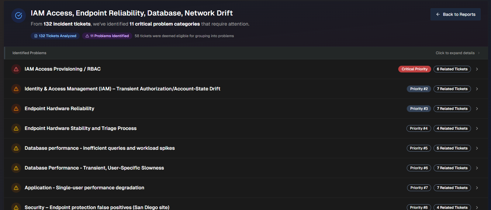
Click any problem in the list to view additional details.
The problem name, priority, number of related tickets, and a short description appears at the top of the report.
To create a ticket, click Create Problem Ticket. To export the problem as a .txt file, click Export Full Problem.
The following information about the problem is available:
Field | Description |
|---|---|
Impact Analysis | Analysis of the Business Impact and Technical Impact of the problem. |
Trend Analysis | Analysis of trends found in the incidents related to the problem. |
Key Observations | Summarized list of key observations related to the problem. |
Root Causes | Potential root causes of the problem. AI Incident Prevention analyzes each incident and derives the potential root cause based on the data available. |
Prevention Questions | List of questions to ask your team to help prevent similar problems from occurring in the future. |
Related Tickets | List of tickets related to the problem. Click any ticket to open it in the relevant platform. |
Proposed Solutions | List of potential solutions to the problem. The following information for each solution appears:
For each solution, you can Create a PTASK or Export Solution as a .txt file. |
View an Incident Analysis Report
Incident Analysis Reports are divided into three tabs:
At the top of the page, the name of the report, the time the report was generated, and the number of incidents analyzed is displayed. On the top right of the page, you can Copy the report content, Download .md, or Download .docx.
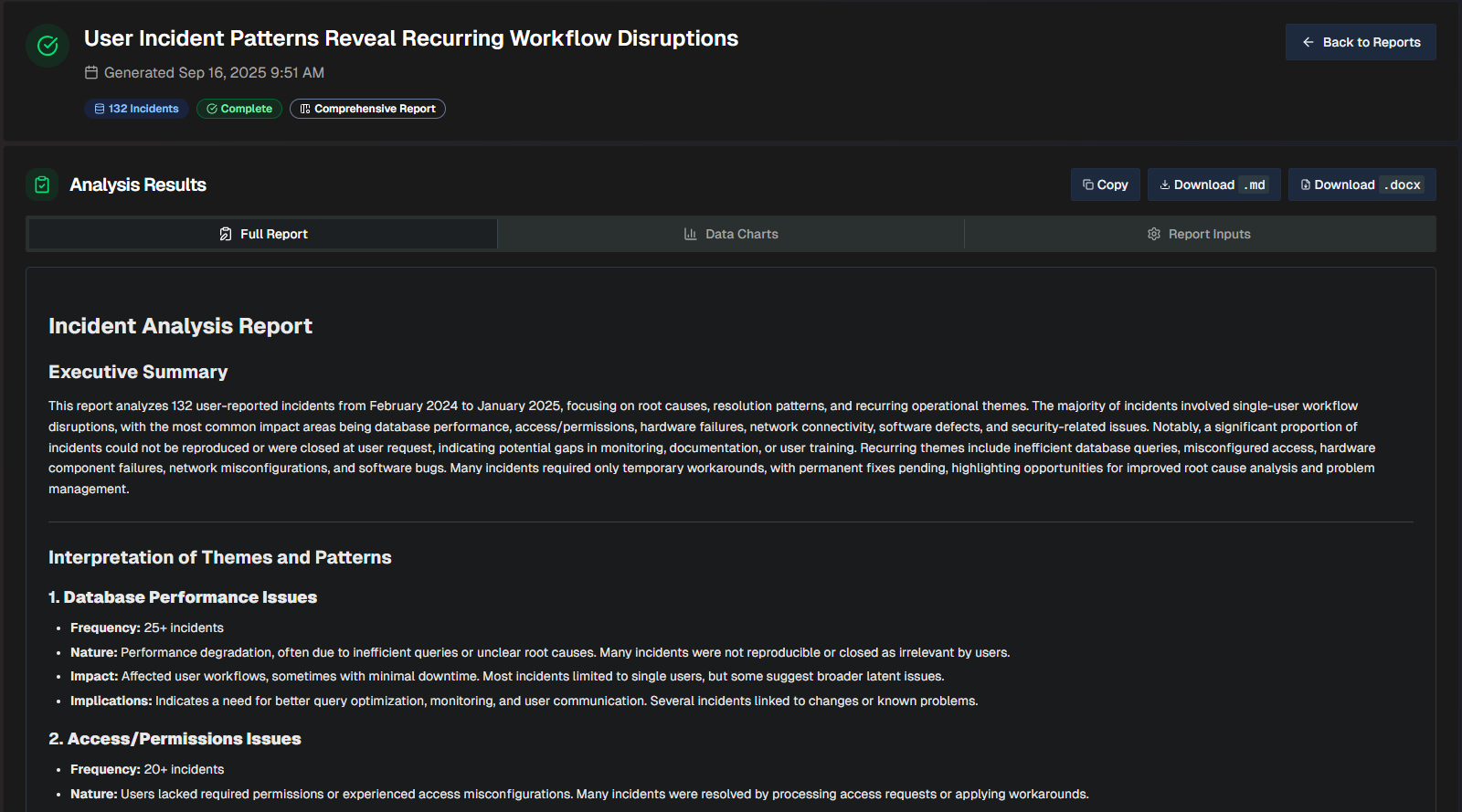
Full Report
The Full Report tab shows a comprehensive review of the incidents analzyed, with a list of themes based on patterns detected in the incidents.
Themes
Each incident can only have one theme, prioritizing the most prominent root cause or operational pattern.
When more than 25 incidents share a theme, only the most impactful are listed. Additional incidents are not shown, but are included in the total count.
The following information is available in the report:
Field | Description |
|---|---|
Executive Summary | Brief, high-level summary geared towards leadership teams. The summary highlights themes and patterns detected in the incidents analyzed. |
Interpretation of Themes and Patterns | An interpretation of each of the themes detected in the report. For each theme, the following information is displayed:
|
Recurring Themes and Associated Incidents | A detailed breakdown of each recurring theme and the incidents that are part of the theme. The table displays the following information:
|
Conclusion | Final implication summary for each of the themes in the report, with emphasis on focus areas to improve operational efficiency. |
Distilled Incident Data | Information about each incident analyzed to create the report. Display full text If a field is too long to fully display in the table, hover over it to view the full text. The following information about each incident is displayed:
To see the complete details, scroll to the right side of the table and click View. |
Data Charts
The Data Charts tab visualizes the incident information within the uploaded file.
Data charts content
Content in this tab is only populated if you selected the Generate Interactive Charts option when creating the report.
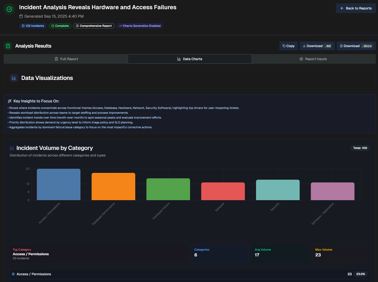
At the top of the page, a list of Key Insights to Focus On shows key points to remember while reviewing the visualizations.
The report will dynamically create visualizations based on the data in your file. Depending on the information available, each report may contain different types of visualizations, including bar graphs, line graphs, and pie charts.
Report Inputs
The Report Inputs tab displays information about how the report was configured, and the source data that was used to build the report.
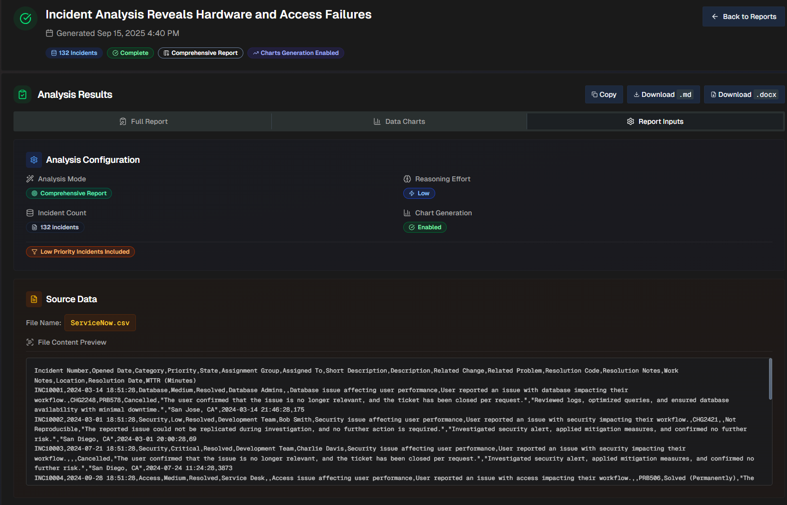
The Analysis Configuration section shows which options were selected when the report was created.
The Source Data section shows the file name, and a preview of the file.
View a Dataset Analysis Report
The Dataset Analysis report is divided into three tabs: Full Report, Data Charts, and Report Inputs.
The Full Report tab will vary depending on what Goal or Analysis Type you selected during the configuration. See the Create a Dataset Insights Report documentation for a full description of each goal and analysis type.
The Data Charts tab visualizes the incident information within the uploaded file. The report will dynamically create visualizations based on the data in your file. Depending on the information available, each report may contain different types of visualizations, including bar graphs, line graphs, and pie charts.
The Report Inputs tab displays information about how the report was configured, and the source data that was used to build the report.