View Dashboards
Use the Dashboards tab to view and build dashboards and analyze BigPanda data.
Select a dashboard, apply filters, and explore individual widgets for a more detailed analysis.
Required role
To view Dashboards, the Unified Analytics role is required. See the Roles documentation for more information.
AI-powered analytics preview
We're actively making improvements. Specific features, limits, and availability may change as the product matures.
Key Features
Browse, search, and favorite dashboards from the Analytics workspace panel.
Filter any dashboard by date range, time zone, and dashboard-specific parameters.
Explore, drill into, and compare the data behind individual widgets.
View the underlying rows behind an aggregated widget and choose which columns to display.
Download a widget as an image or a data file, or export the whole dashboard.
Create KPI alerts to be notified when a metric crosses a threshold, changes unexpectedly, or on a regular schedule.
Navigate the Dashboards tab
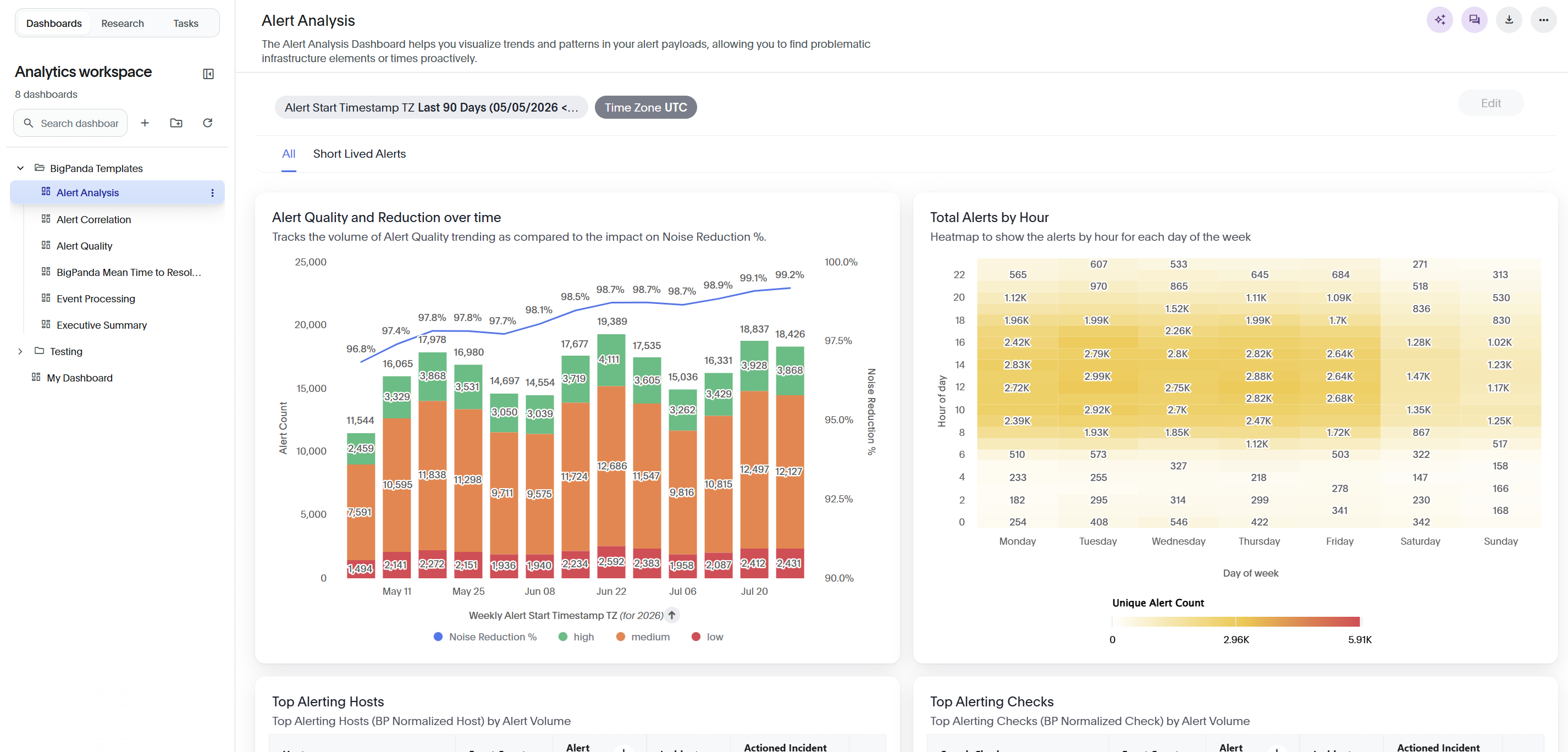
The Dashboards tab panel on the left lists the dashboards available to your organization. The panel header shows the total number of dashboards.
In the top navigation bar, click Dashboards.
In the Dashboards panel, browse the folder tree to find a dashboard. Folders group related dashboards, and you can expand or collapse each folder.
Select a dashboard to open it in the main panel.
To find a dashboard quickly, enter a name in the Search dashboards field at the top of the panel. Click the collapse icon to hide the panel and provide more space for the dashboard.
Work with a dasboard
When you open a dashboard, the main panel shows its title, an optional description, and its widgets. Widgets include KPIs, trend charts, tables, and funnels.
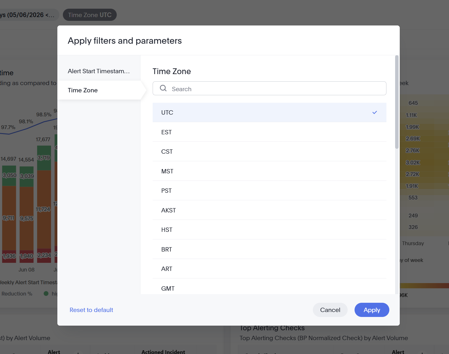
Filters near the top of the dashboard show currently applied values. Examples include, Connection Name (Select), User Name (Select), and Org Name (Select), date-range filters such as Incident Start Timestamp TZ Last 90 Days , and Time Zone UTC. Click a filter to change its value.
Each widget has its own actions. Hover over a widget to reveal its controls, then select the More menu (the ... icon) in the top-right corner of the widget.
The More menu includes Rename, Explore, and Show underlying data. The sections below describe each action.
Filter a dashboard
Use filters and parameters to scope a dashboard to the data you want to see.
Near the top of the dashboard, select a filter chip to open the Apply filters and parameters page.
In the Apply filters and parameters page, select the filter you want to edit from the list on the left.
Date filters
For a date filter, select Rolling for a relative range or Fixed to specify dates. For a rolling range, select the interval values, such as Last,
90, and Days. Turn on Include this day to include the current day. The Preview field shows the resolved range, such asLast 90 Days (04/25/2026 < 07/24/2026).Select Apply to update the dashboard, or select Reset to default to restore the original filters. To close the page without saving, select Cancel.
Explore and drill into a widget
Use Explore examine and modify the data shown in a widget without leaving the dashboard.
Hover over a widget, open its More menu, and select Explore.
In the Explore view, use the tabs on the right to refine the widget. Each tab offers a field where you can enter your own value and a set of suggestions you can apply with one click:
Filter: Limit the widget to specific values. Enter a filter in the Add your own filter field, or choose a suggestion.
Add: Add a column to the widget. Enter a column in the Add your own column field, or choose a suggested attribute.
Replace: Replace the current column. Choose a column from Select a column to replace, or select a suggestion.
Compare: Compare the widget with entered values or a suggested comparison. When no comparisons are available, the view shows
No suggestions to display.
Select Close to return to the liveboard.
View underlying data
View underlying data displays the individual rows used to calculate an aggregated widget.
Hover over a widget and open the More options menu, then click Show underlying data.
In the Show underlying data page, review the rows in the table. A banner displays
Aggregated data is unavailable when viewing underlying data, and a row count such asShowing 1,000 of 1,000 rowsappears below the table.To change which columns display, select Edit columns. In the Edit columns page, search for a column by name and select the columns to display. Turn on Show only selected to hide unselected columns. Select Done to apply your choices.
To export the rows, select Download CSV.
Select Done to close the page.
Download and export
You can download an individual widget or export a whole liveboard.
To download a single widget:
Hover over a widget and click the three dots icon (…) to open its More menu.
Click Download.
On the Download Answer page, select a format — PNG for an image, XLSX for a spreadsheet, or CSV for raw data.
Click Download.
To export the entire dashboard, select the download icon at the top right of the dashboard.
Generate Analyst insights
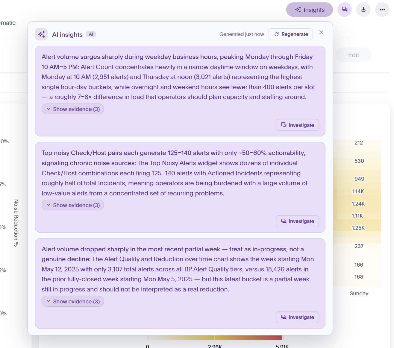
Analyst insights use AI to automatically highlight notable patterns in a dashboard, such as spikes, dips, and unusual values.
In the upper-right corner of the dashboard, select the Analyst insights icon.
In the Analyst insights panel, review each generated insight. The panel shows when the insights were generated.
To see the data behind an insight, select Show evidence. Select Hide evidence to collapse it again.
To dig deeper into an insight, select Investigate to open the AI Assistant panel.
To produce a fresh set of insights, select Regenerate.
Analyst chat
The Analyst answers questions about the data behind the current liveboard, including trends, drivers, and comparisons using AI.
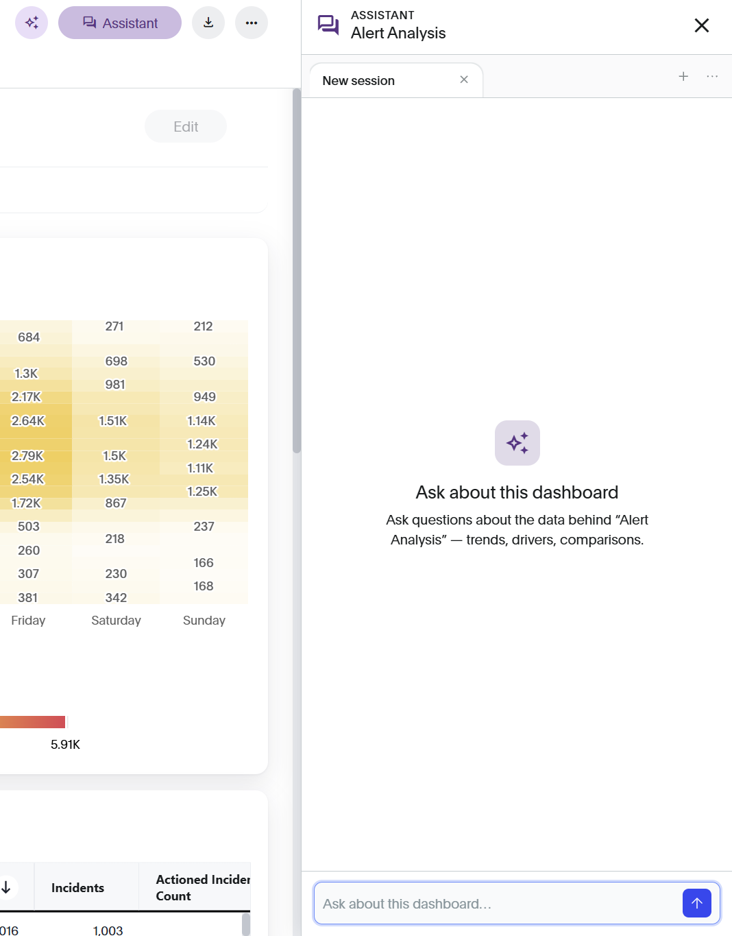
In the upper right corner of the dashboard, select the Analyst chat icon.
In the Analyst panel, enter a question in the Ask about this dashboard field. For example, ask about how a metric is calculated or which factors may be associated with a change.
Review the response, then enter a follow-up question to continue the conversation.
To start a new session, click the plus icon (+) at the top right of the Analyst panel.