Change Risk Analytics
The Change Risk Analytics page provides a high-level analysis of changes in your IT environment for a specific time period.
You can access this page within the web app at Operate > Change & Risk > Change Risk Analytics.
Use the drop-down menus at the top right of the screen to adjust the selected time period, Change Risk Profile, or time zone.
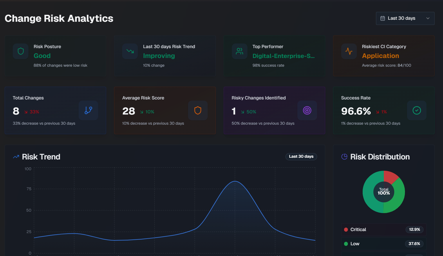
The page is separated into three tabs:
Overview
The following widgets are available in the Overview tab:
Widget | Description |
|---|---|
Risk Posture | How well your organization is doing from a change risk perspective. This score is based on the percentage of changes that were considered low risk. |
Risk Trend | Whether your organization's change risk scores are getting better or worse, and the percent change over the selected time period. |
Top Performer | The team that deployedchanges with the lowest average risk score, and their success percentage. |
Riskiest CI Category | The configuration item (CI) category with the highest average risk score. |
Total Changes | The total number of changes, and the percent change for the selected time period. |
Average Risk Score | The average risk score across all changes, and the risk score percent change for the selected time period. |
Risky Changes Identified | The percent of changes that were identified as high risk, and the risk score percent change for the selected time period. |
Success Rate | The average success rate of changes, and the risk score percent change for the selected time period. |
Risk Trend | A graph displaying therisk scorechange over the selected time period. Hover over a specific day on the graph to see the average risk score for that day. |
Risk Distribution | A pie chart displaying the distribution of change risk levels. |
Team Change Health | A comparison of each team's percentage of successful changes, and the number of risky changes. The calculation for success rate is (total changes - incidents caused) / total changes. |
Risk by CI Category | Risk information for changes grouped by the category of their affected CIs. For each CI, the number of changes, incidents, success percentage, average risk score, and number of incidents that were either critical or high severity. |
Riskiest Times to Deploy | The riskiest times to deploy, broken down by Riskiest Day and Riskiest Time. Riskiest Day shows the average risk score by day of the week for changes scheduled in the selected time period. The riskiest day and safest day are highlighted below the full week. Riskiest Time is an hourly risk analysis shown in your local time zone. The riskiest time and safest time are highlighted below the full day. |
Risk Score Averages and Weights | Shows the average risk score for each risk component across all analyzed changes, and the component's relative importance (weight). |
Causality and Prediction Quality
The Causality & Prediction Quality tab of the Change Risk Analytics dashboard displays data on incidents caused by changes.
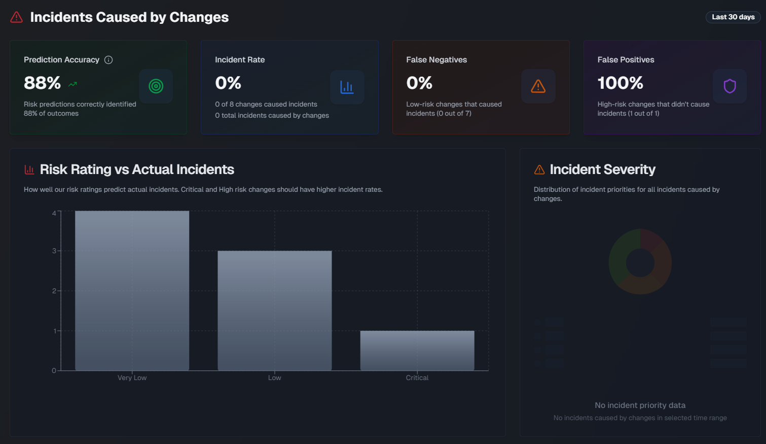
The following widgets are available in this tab:
Widget | Description |
|---|---|
Prediction Accuracy | The percentage of risk predictions that accurately identified the outcome of the change. Prediction accuracy is measured using the following calculations:
The formula is (True positives + True negatives) / Total Changes x 100 Medium risk changes are excluded from the calculation. |
Incident Rate | Displays the percent of changes that caused an incident, the number of changes that resulted in an incident out of the total number of changes, and the total number of incidents caused by changes. |
False Negatives | The percent of low-risk changes that resulted in an incident. |
False Positives | The percent of high-risk changes that didn't cause an incident. |
Multi-Incident Change Rate | The percent and number of changes out of the total that led to two or more incidents. |
Average Time to First Incident | The average amount of time it took for a change to cause an incident. |
Risk Rating vs. Actual Incidents | A bar chart showing how well risk ratings predict incidents, broken down by the risk level. Hover over a section of the chart to see the number of changes with or without incidents for that risk level. |
Incident Severity | A pie chart showing the distribution of incident priorities for all incidents caused by changes. |
Incident Timeline | A line graph showing a daily view of changes vs. incidents caused by the change over the selected time period. Hover over a specific day to see the number of changes that were implemented and the number of incidents that occurred on that day. |
Teams Causing the Most Incidents | Assignment groups causing the most incidents from their changes. |
Changes that Caused the Most Incidents | Changes that directly caused incidents, showing change details and related incident information. |
Flow Analysis
Use the Flow Analysis tab to explore how changes flow through dimensions with an interactive Sankey diagram.
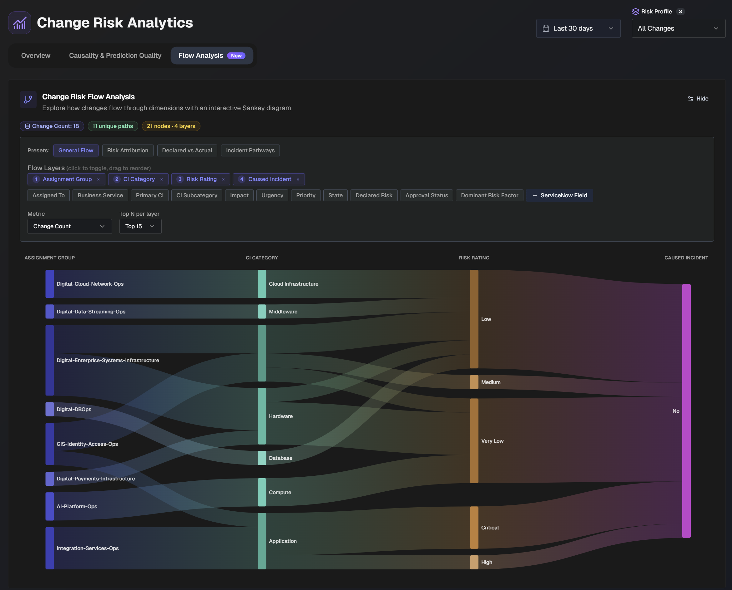
In the top section of the page, adjust the flow layers and metrics in the diagram.

Several preset flow layers are available with common use cases:
General Flow - see how changes flow from teams, through CI categories, to outcomes
Risk Attribution - understand which risk factors drive the highest ratings
Declared vs. Actual - compare human-declared risk to AI-assessed risk ratings
Incident Pathways - trace organizational and technical pathways that lead to incidents.
You can also manually adjust flow layers. Click a field to add it to the flow layer, or drag and drop the fields to change the order they appear in the flow.
Select a Metric from the drop-down menu to choose what metric the diagram should be based on. Select from:
Change count
Average risk score
Incidents caused
Use the Top N per layer drop-down to select the number of layers to display in the diagram.
Hover over a section of the diagram to highlight the flow layer. Additional information about the layer, including the number of changes that match the path appears.
Prediction Tuning
Use the Prediction Tuning tab to analyze historical change outcomes and find a weight distribution that better identifies incident-causing changes. The tuner replays a change risk profile against a sample of past changes, then recommends an optimized weight for each risk component so that changes that caused incidents are more likely to land in the High or Critical risk bands.
Select a profile to tune
To start an analysis, select a profile from the Risk Profile drop-down. The tuner analyzes the profile's historical outcomes and suggests an optimized weight distribution. Selecting a profile from the Change Risk Profile filter at the top of the page does the same thing.
The filters at the top right of the page define the retrospective sample the tuner learns from. Use them to adjust the time period, the Change Risk Profile, and the time zone.
Use the priority filter at the top right of the Weight Tuning section to limit the analysis to incidents of a given priority. Select from All incidents, P1 only, P1-P2, or P1-P3. A broader priority filter gives the tuner more historical failures to learn from.
The summary row below the section header describes the current sample, including the selected profile, the time window, the number of changes, the number of changes with incidents, whether rolling backtesting ran, and a confidence indicator for the recommendation.
Suggested Weights
The Suggested Weights panel shows the optimized distribution for the selected retrospective sample. Each risk component displays its Current weight, the Suggested weight, and a change indicator that shows how much the tuner recommends adjusting it.
The tuner suggests a weight for each risk component in the profile:
Implementation Risk
Topological Impact Risk
Team and Individual Risk
Historical Incident Risk
Organization-Specific Risk
To apply a recommendation, click Open Settings to open the profile in Change Risk Settings, where you can review and save the new weights.
Confidence rating
When the selected window does not contain enough included incident-causing changes, the tuner marks the recommendation as low confidence and advises against trusting it strongly. Widen the time window or broaden the priority filter to give the tuner more historical failures to learn from.
Before vs After
The Before vs After section replays the current profile weights against the suggested weights across the selected retrospective sample. Each metric shows the current value, the suggested value, and the change between them.
The following metrics are available in this section:
Metric | Description |
|---|---|
Low-risk incident misses | The number of incident-causing changes that are rated Low or Very Low. |
Medium-or-lower incident misses | The number of incident-causing changes that are rated Medium or lower. |
Incident recall at High/Critical | The percentage of incident-causing changes that land in the High or Critical risk bands. |
Included incidents at High/Critical | The number of included incident-causing changes that land in the High or Critical risk bands. |
High-risk safe changes | The number of changes that did not cause incidents but are rated High or Critical. |
High-risk precision | The percentage of High or Critical changes that actually caused incidents. |
Risk Level Delta
The Risk Level Delta section shows how the suggested weighting reshapes the selected sample, with direct current vs. suggested counts for each risk band. Each band displays the net change in the number of changes, the share of the sample it represents, and a bar comparing the Current and Suggested counts.
The section breaks down the sample across five risk bands:
Critical
High
Medium
Low
Very Low
Example groups
The example groups at the bottom of the tab show individual changes that move between risk bands when the suggested weights are applied. Each group lists the total number of matching changes and displays sample changes for the selected window.
Group | Description |
|---|---|
Recovered incident-causing changes | Changes that caused included incidents and move into High or Critical risk with the suggested weights. These are the best wins: changes that caused incidents but were rated Low or Medium would move into High or Critical. |
Remaining incident misses | Incident-causing changes that still land in Medium or lower even after tuning. These gaps show where weight tuning alone falls short and may need better source data or category scoring upstream. |
Safe changes promoted upward | Safe changes that would move into High or Critical risk under the suggested weights. This is the tradeoff: some safe changes get promoted upward as the model becomes more conservative about incident-causing patterns. |
Feedback
Use the Feedback tab to review the ratings that reviewers submit on individual change risk assessments. The tab summarizes how often reviewers agree with the assigned risk rating, the reasons they flag assessments, and the corrections they propose. This feedback appears here and influences future risk ratings of similar changes.
Reviewers submit this feedback from the Risk Prediction tab of a change, by rating an assessment.
The filters at the top right of the page define the sample shown on the tab. Use them to adjust the time period, the Change Risk Profile, and the time zone.
Feedback improves future ratings
Reviewer feedback appears on this tab and influences the risk ratings of similar changes going forward, so the model gets more accurate as reviewers rate more assessments.
Widgets
The following widgets are available in the Feedback tab:
Card | Description |
|---|---|
Feedback received | The total number of feedback entries reviewers submitted in the selected period. |
Agreement rate | The percentage of feedback entries in which the reviewer agreed with the assigned rating. |
Accurate | The number of assessments reviewers marked as accurate and inaccurate. |
Rating corrections | The number of feedback entries proposing a different rating. |
Feedback by reason | Shows what reviewers flag most often. Each reason displays the number of feedback entries that selected it, ranked by frequency. Reviewers can flag an assessment for the following reasons:
|
Suggested rating corrections | The Suggested rating corrections panel shows the direction of reviewer-proposed rating changes, so you can see whether reviewers tend to raise or lower the assigned ratings. |
Recent feedback | The Recent Feedback list shows reviewer feedback on individual assessments. Each entry represents a single reviewer rating. To remove an entry, reject it. Rejecting an entry removes it from analytics and from future rating influence. |
Usage
The Usage tab tracks your organization's adoption of Change Risk. The tab tracks how often people view the dashboards, drill into individual change assessments, and run reports, then breaks that activity down by user and by change.
Usage widgets
The following widgets are available in the Usage tab:
Card | Description |
|---|---|
Total Page Views | The total number of dashboard, drill-down, and analytics views. |
Unique Viewers | The number of distinct users who were active. |
Change Drill-downs | The number of individual change assessments that were opened. |
CAB Reports Generated | The number of completed Change Advisory Board (CAB) reports that were run. |
Usage trend | Activity over the selected period, split into three series:
Hover over a point on the chart to see the values for that day. |
User activity | Breaks down activity by user. Use the search box to find a user by name, email, or team, and use the All teams drop-down to filter the table to a single team. Click the arrow at the start of a row to expand it for more detail. The table includes the following columns:
|
Viewed changes | Ranks the change assessments that people opened the most. Use the search box to find a change by change number. Each entry shows the change number, date it was last viewed, the number of views, and the number of distinct viewers. Click the arrow to expand an entry, or click the open icon to go to the change. |