Analytics Research Tab
AI-powered analytics preview
We're actively making improvements. Specific features, limits, and availability may change as the product matures.
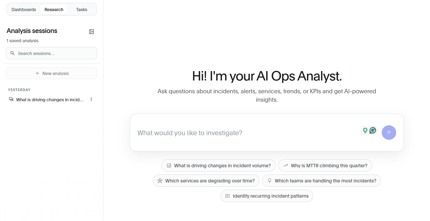
Use the Research tab in Analytics to explore your BigPanda operational data by asking questions in plain language. Describe what you want to know without building a dashboard or writing a query. The Analyst returns an AI-generated written response and a supporting visualization.
Within the Research tab, you can:
Ask questions about your incidents, alerts, services, trends, and KPIs in natural language.
Review AI-generated answers with a written summary and a supporting chart or metric.
Open a result as an interactive visualization to adjust the analytics, change the chart type, or pin it to a dashboard.
Start broad, then refine
Begin with a high-level question, then use follow-up questions to break the result by day, week, status, or another dimension. You can refine the wording as the analysis develops.
Ask a question
In the investigation field, enter your question. For example, enter
How many incidents have occurred in the last 30 days?Click the send button, or press Enter. To use a starting point instead of typing, select one of the suggested questions.
The Analyst analyzes your data and returns two things: a written summary that explains the finding in context, and a result widget that visualizes it. The written response summarizes the result, explains the calculation, and suggests follow-up analyses. The result widget displays the metric title, value, and applied filters. For example, it may show [Incident Count] with the filter [Incident Start Timestamp (UTC)] = 'last 30 days'.
Data in widgets
If you exit a conversation and return to it later, the generated widgets will display the data that was present when you first had the conversation. Widgets in the research tab are not updated in real time.
If you export the widget or expand the view of it, it will be updated in real time.
The suggested questions give you ready-made starting points such as:
What is driving changes in incident volume?Why is MTTR climbing this quarter?Which services are degrading over time?Which teams are handling the most incidents?Identify recurring incident patterns
Ask a follow-up question
After you receive an answer, the question box changes to Reply or ask a follow-up… at the bottom of the analysis.
Enter a follow-up question to refine or further analyze the previous answer.
For example, after asking for a total incident count, ask to break it down by day, week, or status. Follow-up questions remain in the same analysis session, allowing the Analyst to use the earlier questions and results as context.
Explore a result as a live visualization
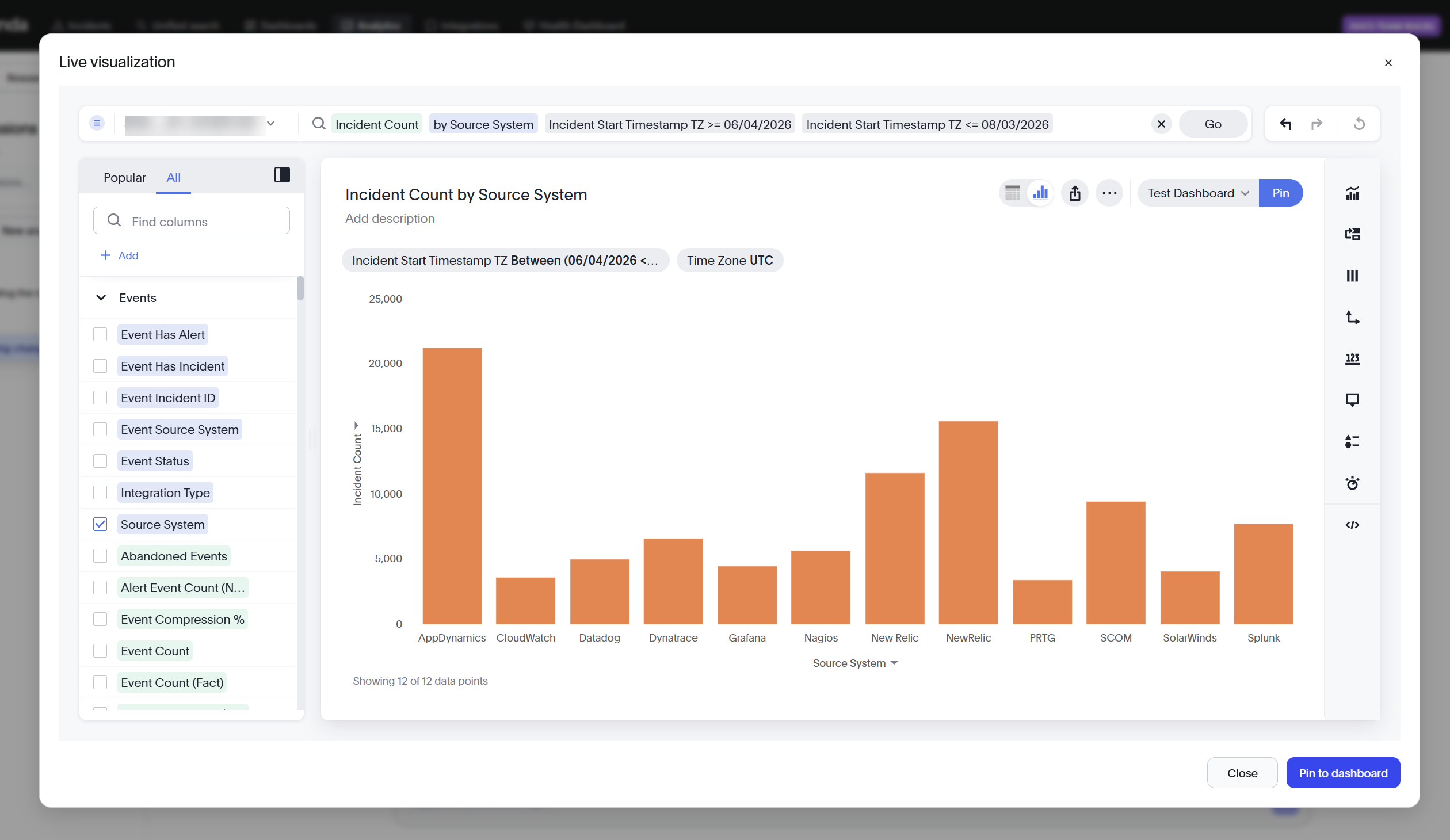
Every result widget can be opened as an interactive visualization for deeper analysis.
On a result widget, click View live widget. The Live visualization page opens.
Adjust the analysis using the query bar at the top. The query bar shows the selected metric and any filters. Change the metric or filters, then click Go to update the analysis. Use the Undo, Redo, and Reset controls to review or revert changes.
In the column panel, use the Popular and All tabs to browse available fields. Search by using Find columns, then click Add to include a field in the analysis. Fields are grouped by category, such as Events.
On the right, select a visualization type from the toolbar to change how the result is displayed.
Pin a visualization
When a visualization is useful beyond a single question, click Pin to add it to a dashboard. The pinned visualization becomes a dashboard widget that updates with the dashboard data.
To leave the Live visualization page, click Close.
Manage analysis sessions
The Analysis sessions panel on the left maintains a history of your work. Analyses are saved as sessions in the Analysis sessions panel.
To start a new analysis, click New analysis.
To find a saved analysis, enter a term in the Search sessions field.
To reopen an analysis, select it from the list. Each session is named automatically based on the initial question, such as
Incidents in last 30 daysorWhy incident volume changed.You can continue an existing session from where it left off.