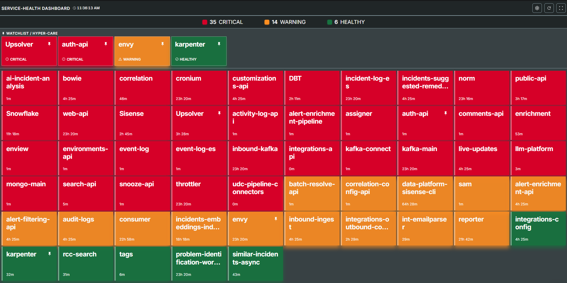
Service Health Dashboard
The Service Health Dashboard provides a near real-time overview of your operational health metrics in a consolidated view. Within the Dashboard tab, you can:
See overall service health at a glance.
Understand which services and applications are affected by current incidents.
Visualize business impact to prioritize team efforts.
Focus your teams on incidents affecting critical infrastructure and applications.
The color coding and simple format of the Service Health Dashboard is designed for a NOC wall or extra monitor display to make passive monitoring of key services easy.
Service Health Dashboard
Configured services only
The Service Health Dashboard is configured for services that may have the highest business impact, based on specific incident tags. Which services are visible and how they are escalated is managed directly in your organization's dashboard configuration. See the Manage the Service Health Dashboard section for details on configuring service settings.
View the Service Health Dashboard
The Service Health Dashboard can be accessed from the BigPanda Console Pane. At the top right, click Service Health Dashboard.
At the top of the dashboard is a summary of the total number of affected tracked services, sorted by impact.
Each tracked service appears as a single tile on the dashboard. Tile size is automatically calculated by the number of services in the critical impact state, and the impact state of that specific service.
By default, critical services are sorted to the top of the dashboard, and healthy services are sorted to the bottom. You can configure which risk tiers and priorities are shown on the dashboard, and which order to sort services.
Services can be pinned to a watchlist. Watchlist services always appear at the top of all other tiles.
The data on the dashboard refreshes automatically every 15 seconds. Click the Circle Arrow Refresh button to manually update the data.

Each tile includes additional information, including:
Service name
Business Risk
Highest associated incident Priority
Number of current incidents associated with the service
Length of time the service has been in the current impact state
Business Impact calculation & color
Tiles are color coded to represent business impact.
Service health impact is calculated by comparing the business risk that a specific service represents, compared against the number and severity of incidents associated with that service.
Red: Services experiencing issues with potentially severe business impact
Orange: Services that may require investigation
Green: Low business impact or no outages
Adjust view settings for the Service Health Dashboard
The Service Health Dashboard can be adjusted to better fit the needs of your team. Click the Settings icon on the top right of the dashboard to adjust the view.
View setting | Description |
|---|---|
Configuration settings | Adjust sort type and order, filter visible priorities and risk levels. |
Full screen toggle | Click to switch the Service Health Dashboard in and out of Full screen view. |
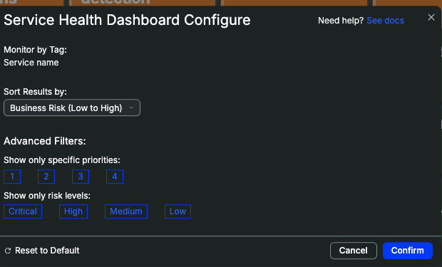
Configure Dashboard View
Services on the watchlist
By default, tiles are sorted first by business impact level and then the order services were configured. The watchlist helps your team remain focused on key services even as situations change.
To add a service to the watchlist, hover over the tile and click the Pin icon.
Manage the Service Health Dashboard
The Service Health Dashboard is configured specifically to represent business risk and impact for an organization.
Close coordination with BigPanda
As the mapping of business impact will directly impact the visibility of individual services, it is important to coordinate closely with the BigPanda team to configure Service Health Dashboard settings.
Service Health Dashboard Configuratoion Fields
Field Name | Description |
|---|---|
organization_name | Name of the organization. |
incident_tags | Incident tag where the values represent the services to track. |
impact_score | Calculation rules that affect visualized impact and service ordering. See the Impact Score table for details. |
business_risk | Risk levels for mapping service risk and service grouping. By default, there are 4 levels of business risk, with 1 representing the highest impact, and 4 representing a lower impact. The display_name for each risk level can be configured individually. |
services | List of all services that can possibly appear on the dashboard. Each service must have:
|
Impact Score Fields
Service health impact is calculated by comparing the business risk that a specific service represents, compared against the number and severity of incidents associated with that service.
For example:
A service with 4 total incidents: 1 P1, 2 P3, and 1 P5, with a High service business risk would mean a 120 Priority score * 1.5 risk weight = Critical impact state.
A service with 11 total incidents: 3 P4, 8 P5, and a High service business risk would mean a 30 Priority score * 1.5 risk weight = Healthy impact state.
Field name | Description |
|---|---|
status_thresholds | Risk calculations and visual settings for the 3 severity levels.
|
business_risk_multiplier | Modifier to adjust degree of escalation for services with higher business risks. |
priority weight | Weighting for incident priorities when calculating impact. |
  "impact_score": {
    "status_thresholds": [
      {
        "display_name": "CRITICAL",
        "min_threshold": 80.0
      },
      {
        "display_name": "WARNING",
        "min_threshold": 30.0
      },
      {
        "display_name": "HEALTHY",
        "min_threshold": 0.0
      }
    ],
    "business_risk_multiplier": [
      {
        "order": 1,
        "multiplier": 1.5
      },
      {
        "order": 2,
        "multiplier": 1.2
      },
      {
        "order": 3,
        "multiplier": 1.0
      }
    ],
    "priority_weight": [
      {
        "order": 1,
        "weight": 80.0
      },
      {
        "order": 2,
        "weight": 60.0
      },
      {
        "order": 3,
        "weight": 20.0
      },
      {
        "order": 4,
        "weight": 10.0
      },
      {
        "order": 5,
        "weight": 5.0
      }
    ]
  },
  "business_risk": [
    {
      "display_name": "Tier 1",
      "order": 1
    },
    {
      "display_name": "Tier 2",
      "order": 2
    },
    {
      "display_name": "Tier 3",
      "order": 3
    },
    {
      "display_name": "Tier 4",
      "order": 4
    }