View Unified Analytics Dashboards
Unified Analytics offers your team the insight and visualizations that it needs to take your IT Operations to the next level. Metrics are displayed in visually clear, color-coded metrics to make it easy to gain insights into hot spots in your environment and see how BigPanda is correlating alerts into actionable incidents.
The dashboards that are available to you are configured and designed by your team’s Analytics Dashboard Designers. Each of the dashboards will be designed to help you recognize trends and patterns in your ITOps monitoring space. To learn more about configuring analytics dashboards, see the Manage Unified Analytics documentation, or reach out to your team’s Dashboard Designer.
BigPanda University training
Learn how to maximize your Unified Analytics dashboards with the BPU Unified Analytics Course. Learn best practices and advanced dashboard management, and test your knowledge to receive the official BigPanda Unified Analytics Credly badge.
To start the course, you may need to register for or log in to BPU.
Navigate Analytics Dashboards
Unified Analytics organizes your data into focused dashboards, making it easy to see an overview of monitoring impacts, drill down into specific tools, or identify actionable incident trends. Each dashboard offers an on-demand snapshot of your data for a specific period of time, helping you visualize historical trends in your monitoring data and identify problem areas in your infrastructure.
Users with access to view the Analytics tab are able to toggle between dashboards with a single click. All dashboards can be filtered by Date Granularity, or by additional filters such as source system and incident start time.
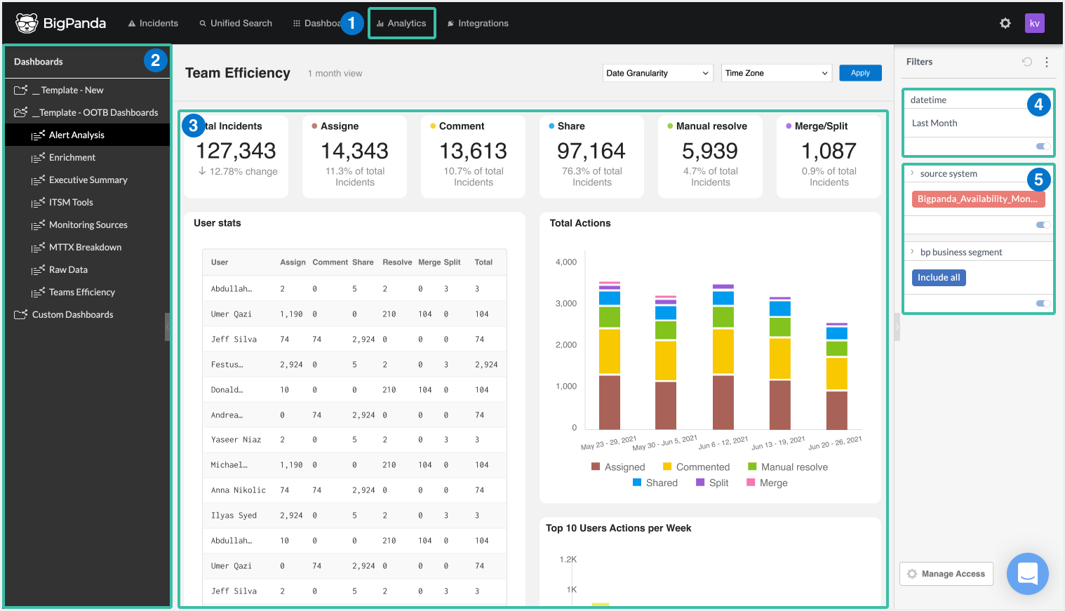 |
Unified Analytics Navigation
Analytics tab
Left navigation pane
Dashboard
Date Filters
Data Filters
Dashboard folders
Your dashboards may be organized into folders in the left pane. Simply click a folder name to expand the list of dashboards in that folder. Click the folder name again to hide the individual report names.
Data refresh
Data within Unified Analytics dashboards refreshes once a day.
Data retention
Unified Analytics retains data for the past 400 days.
Widgets
Dashboards are made up of widgets, or individual data visualizations. Widgets are easy to read, individually managed components within Unified Analytics. Widgets may include charts, graphs, and tables. Each dashboard is configured to show a specific group of widgets to make visualizing business impact easy.
 |
Visualization Widget
Widgets enable you to visualize specific data sets individually and together. Each widget functions both separately and together with the other widgets of the report. Depending on the widget, you may be able to drill down into widget data, open the widget in full screen, download a snapshot of widget data, view when the widget data was last updated, and see any relevant automatic data analysis within the BigPanda UI.
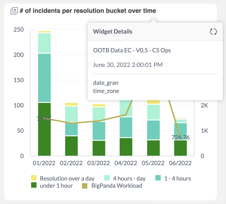
Widget Details
For widgets with headers, you are able to see additional details by selecting the i icon in the header. The latest time the data module was refreshed will be listed. See the Unified Analytics documentation for details on how the data models are configured.
Some widgets may include additional information on the specific data fields that are represented in the visualization. Information about available fields and what they represent can be found in the Standard Data Model.
Trend Analysis
For some data sets, Unified Analytics offers automatic trend analysis based on existing and historical data. Trend Analysis enables you to see at a glance the change over time for even complex data sets.
 |
Trend Analysis
To view trend analysis of a widget:
Click Analyze It in the header of the widget. If the Analyze It option does not appear, no automatic analysis is currently available for that widget.
Select Trend.
Select the data field to analyze. Available fields depend on the data sets of the visualization.
In the Trend dialogue box, use the Show Trend toggle to add or remove the trending line from the graph.
(Optional) Select Trend Settings to adjust the way the trend is calculated, or to add a comparative trending line from previous months or years.
(Optional) Select Trend Information for a displayed trend line to see specific calculation details.
Filter Dashboards
Dashboards can be filtered to help your team hone in on the most relevant information. Filter a dashboard by date granularity or time zone using the dropdown options at the top right of the dashboard. Select the date or time zone setting, and click Apply.
Default filter
All dashboards display data from the past 90 days by default.
Some dashboards can also be filtered by incident elements or custom tags such as incident start date/time and source system. These additional filters are controlled in the filters pane to the right of the dashboard. In the filters pane, toggle filters on or off or adjust their settings. To collapse the filters pane, click the grey arrow at the left edge of the pane. Filtering settings will still be applied when the Filters pane is collapsed.
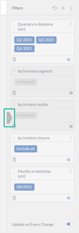 |
Expand Filter Button
Filter options are configured by your dashboard designers. See the Manage Unified Analytics documentation for more information on customizing filter options.
Reset filter
To reset a dashboard back to the original filter and visibility settings, click the three dots icon in the top right of the report and select Restore Dashboard. Click the green checkmark to confirm.
Drill Down into Dashboard Data
Widgets are designed to be interactive data visualizations. The widgets on your dashboard may have been configured to have interactive fields. Hover over data points on tables or charts to see exact numbers, or select chart and table elements to filter the entire report by that data set.
 |
Expanded Widget Details
To remove a selection filter, select Clear Selection in the widget header. The dashboard will return to the previous filter and visibility settings.
Some widgets may enable you to open the widget in full-screen mode using the full-screen icon in the widget header. Full-screen mode is ideal for complex data sets or charts with multiple data fields. You may be able to toggle visualization elements on or off in the left-hand screen, or select data elements in the visualization to drill down onto that data set. To apply the drilled down settings to the full dashboard, select Apply. You will be returned to the dashboard, with the widget filters applied.
Others data
Some data visualizations include an Others data group to account for small data sets. Select the Others visualization element to filter that visualization to just that data group.
Download Widgets
Some widgets can be downloaded as an image or CSV file. Widgets can be downloaded by both dashboard designers and read-only users.
To download a widget:
Click the three dots icon in the widget header. If no header appears, this widget cannot be downloaded individually.
Select Download.
Select the desired file type for the download. The file types available are determined by the widget type.
Next Steps
Learn how to Manage Unified Analytics Reports
Find definitions of key metrics for Unified Analytics
Find a full list of all Unified Analytics Dashboards
Dive into potential reporting fields in the Standard Data Model documentation.