Unified Analytics
Analytics is a vital tool to validate and measure the effectiveness of your monitoring systems and your BigPanda configuration. BigPanda provides both standard and custom dashboards to help you identify and visualize trends within your monitoring process.
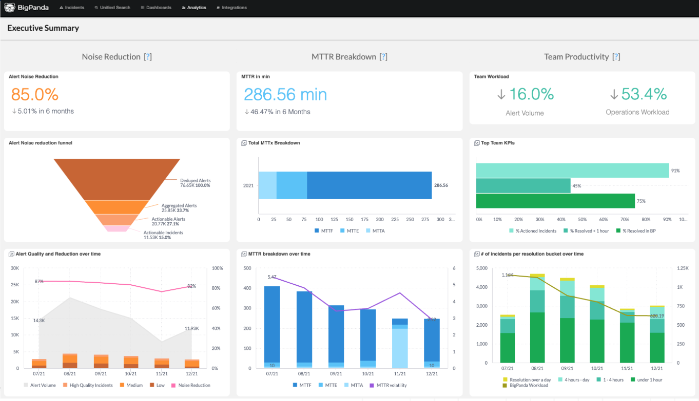
Unified Analytics organizes your data into focused dashboards, making it easy to see an overview of monitoring impacts, drill down into specific tools, or identify actionable incident trends. Each dashboard offers an on-demand snapshot of your data for a specific period of time, helping you visualize historical trends in your monitoring data and identify problem areas in your infrastructure.
Use Unified Analytics to understand and proactively monitor your infrastructure for increased up-time and reduced mean time to resolve (MTTR).
BigPanda University training
Learn how to maximize your Unified Analytics dashboards with the BPU Unified Analytics Course. Learn best practices and advanced dashboard management, and test your knowledge to receive the official BigPanda Unified Analytics Credly badge.
To start the course, you may need to register for or log in to BPU.
Key Features
Give designers across your company the ability to design, filter, and share information on your own design terms.
Design your own widgets
Slice data using your own filters
Share dashboard reports via the Report Manager
Visualize key monitoring metrics across all monitoring tools together
Metrics are displayed in visually clear, color-coded widgets
Filters enable you to drill down into specific metrics based on team, tool, or time
Standard dashboards are available from day-one that can be customized to your needs
 |
Unified Analytics
Reporting Fields and Key Metrics
Unified Analytics uses standard fields and terminology to describe elements and stages of the incident management process.
BigPanda’s specific definition of these terms is based on industry standards and best practices to help you measure and track business and operational metrics.
Read more about specific terminology and how to best leverage analytics metrics in the Unified Analytics Key Metrics documentation.
Unified Analytics Standard Dashboards
By default, BigPanda offers standard dashboards on key elements such as Mean Time to Resolve, User Actions, and Reporting Tool Efficacy. Each of these dashboards is designed around the unique reporting needs of a busy ITOps team and focuses on data vital to maintaining monitoring efficacy.
Users with access to view the Analytics tab can toggle between dashboards with a single click. All dashboards can be filtered by Date Granularity, or by additional filters such as source system and incident start time.
If the standard dashboards do not reflect your organizational needs, an administrator can create custom dashboards to reflect the unique tags and configuration settings you use in BigPanda. These custom dashboards can be created using existing standard dashboards as a template, or from scratch. Learn more about adjusting custom reports in the Manage Unified Analytics documentation.
Additional custom dashboards
The BigPanda team has additional pre-made custom dashboards that can be shared and edited to meet the needs of your organization.
The top-used custom dashboards are consistently evaluated by the BigPanda team to inform our standard product roadmap. Contact your BigPanda Account Team to request access to these dashboards.
Dashboards tab
In addition to the Unified Analytics dashboards, BigPanda provides users with a Dashboards tab. The BigPanda Dashboards tab offers a single, dynamic live view ideal for monitoring operational health in real time. To learn more about the BigPanda Dashboards tab, see the BigPanda Dashboards documentation.
An Analytics Dashboard Designer controls the dashboards visible on the Analytics tab, and not those visible in the Dashboard tab.
Dashboards in Unified Analytics are available divided into the Platform Summary, Product Adoption, and Product Outcomes folders.
Platform Summary Dashboards
The following dashboards are available in the Platform Summary folder:
Dashboard | Description |
|---|---|
Provides an overview of alert and compression metrics for leadership. | |
Provides a clear line of sight into the volume of events and incidents within the BigPanda platform |
Product Adoption Dashboards
Product Adoption dashboards focus on key product features, such as data ingestion, alert intelligence, and incident intelligence.
Within the Product Adoption folder, dashboards are clustered by area in the Data Ingestion, Alert Intelligence, or Incident Intelligence folders.
Data Ingestion Dashboards
Data Ingestion dashboards show details about the data BigPanda ingested from your inbound integrations.
The following dashboards are available in the Data Ingestion folder:
Dashboard | Description |
|---|---|
Provides a detailed view of trends in change data sent to BigPanda. | |
Provides detailed metrics on inbound integrations sending event data to BigPanda. | |
Provides detailed metrics on inbound integrations sending alert data to BigPanda. |
Alert Intelligence Dashboards
Alert Intelligence dashboards provide insight into alert payloads from your inbound monitoring tools, alert correlation, and alert enrichment.
The following dashboards are available in the Alert Intelligence folder:
Dashboard | Description |
|---|---|
Gives you a deep dive into alert payloads sent to BigPanda from inbound tools. | |
Provides an overview of correlation and enrichment trends within your incidents. | |
Shows you all of your reporting data in a simple table format. |
Incident Intelligence Dashboards
Incident Intelligence dashboards provide insight into your alert quality, correlation patterns, and suspected root cause changes.
The following dashboards are available in the Incident Intelligence folder:
Dashboard | Description | Duplicable? |
|---|---|---|
Provides a visualization of trends in alert correlation, and measures correlation effectiveness across your monitoring sources. | Yes | |
Provides an analysis of the quality of alerts sent to BigPanda, which allows you to find opportunities for improvement. | Yes | |
Provides insight into the effectiveness and trends of your correlation patterns. | Yes | |
Provides data on suspected root cause changes in BigPanda. | No |
Product Outcomes Dashboards
Product Outcomes dashboards show you BigPanda’s impact on your noise reduction and overall operational efficiency.
Within the Product Adoption folder, dashboards are categorized in the Noise Reduction or Operational Efficiency folders.
Noise Reduction Dashboards
Noise reduction dashboards give insight into how well BigPanda is reducing repetitive events to help improve your overall efficiency.
The following dashboards are available in the Noise Reduction folder:
Dashboard | Description |
|---|---|
Provides early insight into the success of your BigPanda configurations, even if you just recently started using the platform. | |
Provides an in-depth analysis of outbound integrations that are receiving BigPanda incidents. |
Operational Efficiency Dashboards
The following dashboards are available in the Operational Efficiency folder:
Dashboard | Description |
|---|---|
Provides an analysis of trends and patterns in your organization’s BigPanda MTTR metrics. | |
Provides a detailed deep dive into trends and statistics for organizational MTTx measures. | |
Provides detailed records of user actions and behavior within BigPanda. |
How Dashboards are Generated
BigPanda Unified Analytics uses transformed data tables for dashboard metrics and data relationship mapping. These data tables may have been adjusted to fit the custom tags of your organization.
Tags
To add additional tags to Unified Analytics, contact the BigPanda support team.
The alert tag limit is 100 unique tags, but the limit can be increased with an additional charge. Contact BigPanda support for assistance.
Unified Analytics tables are built on the life cycle of incidents within BigPanda.
For more information on the relationships and data within the data tables, please see the Manage Unified Analytics or Reporting Data Tables documentation.
Next Steps
View Unified Analytics dashboards
Learn how to Manage Unified Analytics
Find definitions of Unified Analytics Key Metrics
Dive into potential reporting fields in the Standard Data Model documentation.