Manage Unified Analytics
Analytics are a vital tool to validate and measure the effectiveness of your monitoring systems and your BigPanda configuration. BigPanda provides standard dashboards built around common reporting needs. To learn more about the default dashboards, see the View Unified Analytics Dashboards documentation.
If the standard dashboards do not reflect your organizational needs, a dashboard designer is able to create custom dashboards to reflect the unique tags and configuration settings you use in BigPanda. These custom dashboards can be created using existing standard dashboards as a template, or from scratch.
Dashboard Designers are able to:
Create custom dashboards using any field within the Unified Analytics Standard Data Model tables
Create reusable formulas and data calculations
Design your own widgets
Slice data by your own filters
Share dashboards to the BigPanda UI
Email dashboard reports using Report Manager
BigPanda University training
Learn how to maximize your Unified Analytics dashboards with the BPU Unified Analytics Course. Learn best practices and advanced dashboard management, and test your knowledge to receive the official BigPanda Unified Analytics Credly badge.
To start the course, you may need to register for or log in to BPU.
Dashboards
Unified Analytics Reports are called Dashboards within the Analytics management pages. When navigating within Unified Analytics design view or documentation, dashboard refers to a single-pane analytics report.
Tags
To add new tags to Unified Analytics, contact the BigPanda support team.
The alert tag limit is 100 unique tags, but the limit can be increased with an additional charge. Contact BigPanda support for assistance.
The BigPanda live-stream dashboard is a separate tool and is not managed through Unified Analytics. For more information about the live dashboard, see the Live Dashboards documentation.
Relevant Permissions
Roles with the following permissions can access Unified Analytics:
Role Name | Description |
|---|---|
Unified Analytics | View, edit, and create new dashboards in Analytics and assign the Dashboard Designer role. |
Permission access levels can be adjusted by selecting either View or Full Access. To learn more about how BigPanda's permissions work, see the Roles Management guide.
To modify or create Unified Analytics Dashboards, you must also be assigned as the Dashboard Designer. The Designer is a variable role that ensures only one team member is making changes to your dashboards at a time.
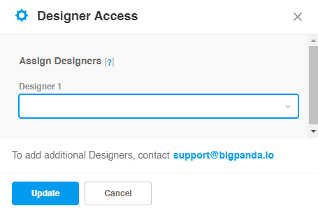
A user with the Analytics_Full_Access role can assign the Dashboard Designer role. To assign the role, navigate to the bottom right corner of the Unified Analytics page and click the Manage Access button.
In the Designer Access prompt, you will see a list of currently assigned Designers. To change which user is assigned the Designer role, select their username from the dropdown.
 |
Designer Access Management
Refresh
After updating, you may need to refresh the tab to see the changes.
The Dashboard Designer role is a shared role. Any changes the previous designer made will be saved upon changing assigned user. All users assigned as a designer will see all dashboards in progress. Dashboards cannot be private, but are shared across all users.
Coordination is key
We recommend coordinating with the other analytics admins from your organization before changing the assigned designer, so as to not interrupt anyone's work in progress.
If you would like access to additional Designer roles, contact us at [email protected].
Default Dashboards
BigPanda provides dashboard templates configured to cover the most common analytics needs. If the standard dashboards do not reflect your organizational needs, a dashboard designer is able to create custom dashboards to reflect the unique tags and configuration settings you use in BigPanda. These custom dashboards can be created using existing standard dashboards as a template, or from scratch.
See the Unified Analytics Standard Dashboards documentation for a full list of the available dashboards.
Reporting Fields
BigPanda Unified Analytics uses transformed data tables for dashboard metrics and data relationship mapping. These data tables may have been adjusted to fit the custom tags of your organization.
Unified Analytics tables are built on the life cycle of incidents within BigPanda:
Alerts enter BigPanda
Alerts are enriched with metadata and enrichment tags
Alerts are correlated into BigPanda Incidents (Incidents)
Alerts are further enriched automatically and manually with Incident Tags (Incident Tags)
The system and users take action on the incident, such as commenting, sharing, and entering or ending the flapping state (Incident Activities)
The Date table is provided in our data model to enable multiple time zone support and is based on Incident Start Date. Customers can request other data fields in their time zone as needed. See the Standard Data Model documentation for a list of available time zones.
For more information on the relationships and data within the data tables, please see the Unified Analytics Standard Data Model documentation.
Data refresh
Data within Unified Analytics dashboards refreshes once a day.
To view data in real-time, please see the Live Dashboards documentation.
Data retention
Unified Analytics retains data for the past 400 days
Data model fields
The fields in the data model are configured during your migration or implementation and cannot be changed by Designers. Reach out to your BigPanda Support and request a product change to add or change any data columns, for example to change time zones, concatenate tag fields, or whitelist specific fields.
Formulas
Dashboards use reusable formulas based on the field within the data model. BigPanda’s default dashboards include several pre-created formulas using the data columns available. These formulas can be edited or replaced as needed to fit your needs. New formulas can be supported as needed to fit your custom dashboards.
Organize Your Dashboards
 |
Dashboard in Dashboard Designer view
Dashboards appear on the left navigation pane in alphabetical order. To make navigation and management easier, Dashboards can be grouped into folders and subfolders.
Click the name of a folder to expand or condense the list of dashboards within the folder.
To move a dashboard to a different folder, drag and drop the dashboard name into the desired folder in the left navigation pane. A yellow outline appears around the destination folder to make it easy to see where the dashboard will be moved.
Manage Folders
Dashboards can be grouped into folders. Every customer will get a folder called Template Reports - Your Org Name. These are the templates from BigPanda and can be copied/edited but not changed directly. Designers may choose to show these to their users or not. Any dashboards created by the designers are encouraged to be grouped under folders with the naming convention of Folder Name - Customer Name.
Designers are able to rename, delete, hide, or create folders.
To rename, delete, or hide a folder:
In the left navigation pane, click the three dots menu icon next to the desired folder.
Select the desired option from the menu.
Click the green checkmark to confirm and complete, or the red X to cancel.
Hiding folders
Hiding a folder removes it from the view of all other users, including other Dashboard Designers. All dashboards and subfolders within the folder will automatically be unshared with all other users.
To create a folder:
At the top of the left Navigation Pane, click +.
Select New Folder. The new folder is added to the dashboards list.
Enter a name for the folder and click the green checkmark.
To create a subfolder:
In the left navigation pane, click the three dots menu icon next to the desired folder.
Select New Folder.
Enter a name for the folder and click the green checkmark.
Manage Existing Dashboards
In the Unified Analytics page, Designers are able to see all dashboards currently visible to them. This includes any default dashboards created by the BigPanda team. If your organization has a secondary designer role, you'll also be able to see the folders and dashboards created by other designers.
Private and Shared dashboard versions
When you own or co-own a dashboard, you'll see the Private and Shared versions. Edits made to the Private copy of a dashboard do not affect any other user's copy of the dashboard. Dashboards are only updated publicly when the Shared version is edited.
See Private and Shared Dashboards for more information.
Designers are able to rename, duplicate, export, and download any dashboard they can view. Designers are also able to edit the widgets, filters, and settings of any dashboard, but those changes will only be visible to other users if the shared version of the dashboard is published.
For custom dashboards, designers are able to delete, share (sometimes called publish), and hide dashboards.
All Dashboards can be downloaded in a PDF or Image format. Unified Analytics will attempt to automatically adjust the widgets and data for best export, but users are able to configure page settings to improve visibility.
Downloading dashboards
Dashboards can be downloaded by both designers and users with read-only permissions.
To take action on a dashboard:
In the left navigation pane, click the three dots menu icon next to the desired dashboard.
Select the desired option from the menu. If you do not see the option to delete, share, or hide the dashboard, you may not have permission to adjust this dashboard.
Click the green checkmark to confirm and complete, or the red X to cancel.
Deleted dashboards
Once confirmed, a deleted dashboard cannot be recovered.
Private and Shared Dashboards
When you own or co-own a dashboard, you'll see the private and shared versions.
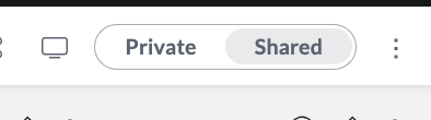
Private-Shared toggle
The private version of a dashboard is only visible to you. You can use it to test dashboard changes without affecting the version visible to other users. Edits made to the private copy of a dashboard do not affect any other user's copy of the dashboard or the shared version of the dashboard.
The shared version of a dashboard is visible to other users. When a user edits the shared version of a dashboard, the toggle to edit the shared version is locked to all other users until the user switches back to the private copy or after a 4-hour period of inactivity.
Changes made to shared dashboards are visible to other users.
Dashboard updates
When changes are made to the shared version of a dashboard, those updates are not reflected in the private version.
Create a New Dashboard
Dashboards are designed to give users visibility and insight into patterns and trends that shape their day-to-day workflow. Creating dashboards specific to user roles, teams, and regions can empower your users to use analytics faster and more effectively.
Unified Analytics enables you to create unique dashboards to cover all of your needs. For best performance and ease of management, we don't recommend creating more than 20 dashboards.
Any Dashboard Designer can create a new dashboard by copying an existing dashboard or from scratch.
From a Copy
Copying an existing dashboard enables you to use the settings of that dashboard as a template when creating a new dashboard. Copying a dashboard will duplicate all of the widgets, filters, and data settings into the new dashboard, allowing you to edit existing settings instead of creating widgets from scratch.
To copy a dashboard:
In the left navigation pane, click the three dots menu icon next to the folder to copy.
Select Duplicate.
The new dashboard appears directly below the original dashboard in the left navigation pane.
Dashboard organization
We recommend renaming and organizing new dashboards upon creation to prevent confusion for other designers.
From Scratch
When no existing dashboards fit the type of widget and data visualizations you need, you can always create a dashboard from scratch. Creating a dashboard from scratch creates only the dashboard itself, you will need to configure widgets, filters, and data settings for the dashboard.
When creating a new dashboard from scratch, you can choose to create it inside a folder. Folder visibility rules will automatically apply to the new dashboard.
To create a new dashboard from scratch
At the top of the left navigation pane, click the + icon, or select the three dots icon beside the desired folder.
Select New Dashboard.
In the Data Source popup, select your ElastiCube cached model.
Name your dashboard in the Title field.
Click Create.
The new dashboard appears in the left navigation pane.
When you create a dashboard from scratch, your dashboard is initially empty.
Click + Select Data to begin building widgets, click + Filter Your Dashboard in the right pane to start building filters, or navigate to other dashboards to copy existing widgets to the new dashboard.
Manage Dashboard Filters
Users can use filters to hone in on the most relevant information and data sets.
Filters can be configured for the dashboard as a whole, or for individual widgets.
Dashboard filters affect the data represented in all widgets for the Dashboard. Each default dashboard includes filters based on the available tags and enrichment data for the dashboard. Additional filters can be added or modified to enable your users to focus on specific data.
 |
Filter pane in the Dashboard editor
Default filter
All dashboards display data from the past 90 days by default.
Filters
The default Unified Analytics Dashboards also include custom date and time zone filter widgets. These widgets can be copied over to any custom dashboard using the Copy a Widget steps.
Individual widgets can be excluded from dashboard filters, or may have widget-specific filters configured. See the Widget Filters section for details on managing individual widgets.
By default, all changes to filters automatically update the dashboard view. To turn on or off this setting, use the Update on Every Change toggle at the bottom of the filters pane.
Manage Existing Dashboard Filters
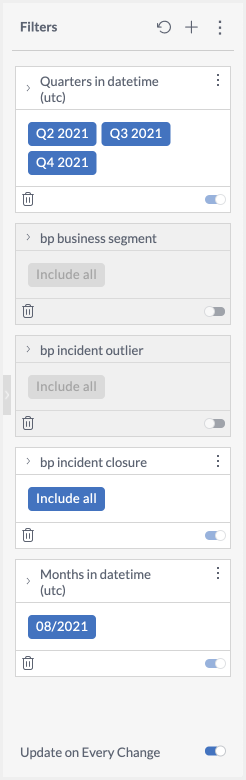
Dashboard Designers are able to toggle on or off, delete, rearrange, edit, rename, or lock filters. Changes are only visible to the designer until the dashboard has been published or shared.
Filters are managed in the right Filters pane. All filters currently configured for the dashboard appear in the filters list. Each filter shows the configured settings that will apply when the dashboard is published or shared.
Toggle filters on or off to make them available or remove them from reader-view. When toggled off, filters appear dark grey in the Dashboard Designer view and cannot be edited or changed. To permanently remove a filter from a dashboard, click the trash icon on the filter. Filters cannot be recovered once deleted and will need to be recreated.
Filters can be rearranged in the right pane by clicking the filter header and dragging the filter to the desired location. The filters will move to demonstrate the location when the filter is released. Rearranging filters changes only the order the filters appear for users, but does not affect the data results. To create dependent filters, see the Creating Dependent Filters section.
To edit a dashboard filter:
Click the pencil icon on the filter header
In the Edit Filters window, adjust included fields or filter type
Click OK to apply the filter to the dashboard
To rename a dashboard:
Click the three dots icon in the filter header.
Select Rename from the dropdown.
Enter the filter name in the filter header. This name will appear when users view the filter in the Dashboard.
Click the green checkmark to confirm, or the red x to cancel.
To lock or unlock a filter:
Click the three dots icon in the filter header.
Select Lock or Unlock from the dropdown.
While locked, a filter cannot be edited or renamed but can be rearranged or deleted.
Create a Dashboard Filter
Adding additional dashboard filters enables you or your users to quickly hone in on the most relevant data. Filters are an easy option to create custom dashboards for similar teams or purposes.
To create a dashboard filter:
If there are no existing filters: click Filter Your Dashboard in the dashboard’s right pane. If there are existing filters: click + in the top right of the filters pane.
In the Add Filter window, select the field to filter. You can search for fields by name, or browse by table.
Select the type of filter from the pane on the left. The options available in this window will vary according to the selected field type (Date, Numeric, or Descriptive).
Configure the filtering details according to the filter type by adding and removing fields, conditions, and settings. You can also create a custom filter using Sisense JAQL.
Custom JAQL filters
When switching to custom filters, any currently configured parameters will be converted to Sisense JAQL syntax and prepopulated in the custom field. You are able to manually edit the custom JAQL syntax to add, remove, or change configured parameters.
(Optional) Click the star icon to bring up a list of previously saved filters. Note: Your favorite filters are visible to shared users.
Click OK to filter the data in the dashboard and add this filter to the Filters panel on the right of the dashboard.
Case sensitivity
Dashboard filters are case-sensitive. If you have two columns with the same name, but one is uppercase and the other is lowercase, a dashboard filter applied to one will not be applied to the other.
Create Dependent Filters
Dependent Filters combine multiple dashboard filters into a hierarchy of filters where each filter shows only the options relevant to its parent filter settings.
To add a dependent filter:
At the bottom of the parent filter, click +
Define the filter settings. The available options for selection in the child filter are automatically narrowed down by the selections in the parent filter.
Click OK to apply the filter settings and add the filter.
The child filter appears below and attached to the parent filter.
Additional dependent filters can be added to the child filter. Each filter can only be the parent of one dependent filter.
Manage Widgets
Dashboards are made up of widgets, or individual data visualizations. While filters and data model settings are configured for the whole dashboard, each widget is individually configurable. Adjust the data fields, visualization type, and design elements to best represent your data.
Designers are able to add, edit, copy, delete, and rearrange dashboard widgets.
Changes to dashboard widgets are only visible to other users after the dashboard has been shared or published.
For additional details on available widgets and widget customization, see the Sisense help documentation.
Add Widgets
Each dashboard is made up of individual widgets. As with all data visualization, we recommend focusing on quality over quantity in creating dashboard widgets. For best performance, we recommend no more than 8 widgets per dashboard. See the BigPanda University Unified Analytics course for help on creating meaningful data visualization centered in actionable data.
Widgets can be added through the Widget Wizard, or through the Widget Designer.
The Widget Wizard automatically guides you through the process of creating a widget, making automatic formatting recommendations for displaying the data that you select.
The Widget Designer gives you additional control over the widget’s appearance and behavior. When editing existing widgets, you’ll automatically be taken to the Widget Designer screen.
 |
Widget Wizard
To add a widget using the Widget Wizard:
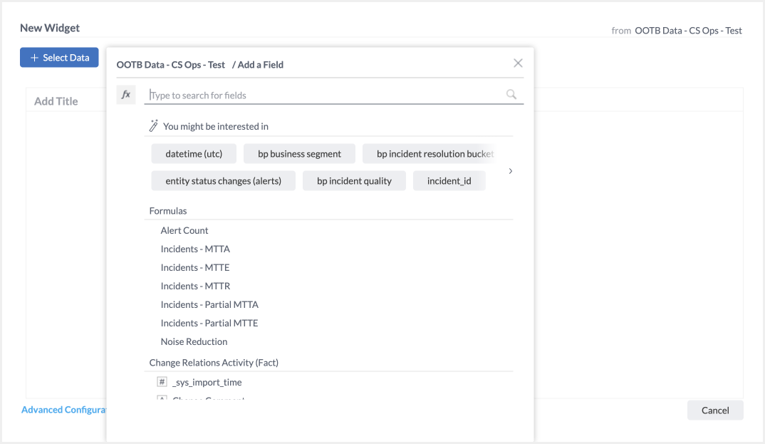
If this is the first widget on a dashboard, click + Select Data. If there are existing widgets on the dashboard, click + Widget, then +Select Data.
Select a data field to visualize. Available fields can be searched by name in the field at the top of the popup, or browse by table.
(Optional) To report on a simple formula, click More beside the desired data field and select a formula function to apply to the field.
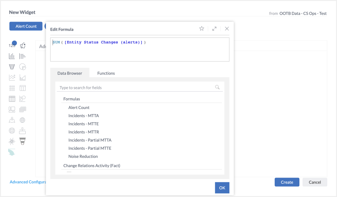
(Optional) To report on a complex formula, select the fx formula icon to the left of the search bar. Build the formula using available data fields and a robust list of functions. Click OK when satisfied with the formula.
(Optional) Select additional fields to add to the visualization using the + Add More Data … button
(Optional) Click Advanced Configuration to open the Widget Designer for further customization options
Select a visualization style from the options to the left. Visualization styles that are not possible with the current data set will be pale gray and cannot be selected.
Click Create.
To add a widget using the Widget Designer:
If this is the first widget on a dashboard, click + Select Data. Select a field to report on. Click Advanced Configuration. If there are existing widgets on the dashboard, click + Widget, then Advanced Configuration.
At the top left, select the type of visualization from the dropdown.
In the left pane, click + Add to add data fields or formulas to visualization elements as available for the visualization type. Elements may include x-axis, values, break by categories, and more.
(Optional) Name the widget using the Set a Title field. This name will appear at the top of the widget to inform viewers of the widget contents.
(Optional) In the right pane, use the Design tab to adjust design details such as line type, labels, and colors.
(Optional) In the right pane, use the Filters tab to adjust how users are able to filter and drill down into the data.
Click Apply.
Manage Existing Widgets
Dashboard designers are able to edit, copy, delete, and rearrange widgets.
Edit a Widget
Widgets can be edited at any time after they have been added to a dashboard, enabling you to adjust data fields, visualization types, design elements, or widget header.
To edit a widget’s data fields, visualization type, or design elements:
Select the pencil edit icon in the header of a widget.
In the Widget Designer, make the desired changes to the widget.
Click Apply.
Widget settings
The new widget settings will not be visible to other designers or viewers until the dashboard is re-shared.
In addition to adjusting the name of a widget, designers are also able to hide the header. Hiding the header removes the name of the filter as well as the see details, full screen, and export options for end users.
Copy a Widget
Widgets can be copied within the same dashboard, or to another dashboard visible on the left navigation bar. This is a quick tool to help you create meaningful dashboards. Copy widgets to make easy visibility on similar tools or data elements, or to add the widget to a different dashboard focused on different user groups or functionality.
Copying a widget duplicates all of the widget settings including visualization type and design elements.
To copy a Widget within the same dashboard:
Click the three dots menu button in the top-right corner of the widget to be copied.
Select Duplicate. The copy will appear next to the original on the dashboard.
To copy a Widget to another dashboard
Select the header of the desired widget and drag it to the name of the target dashboard.
Rearrange Widgets
Unified Analytics uses a snap-to grid to organize your widgets, or you can manually adjust widget sizing. All widgets will automatically scale the data to fit as needed. When moving widgets, we recommend you use the Dashboard Best Practices to ensure that the data is easy to understand and read.
To rearrange widgets:
Select the header of the desired widget and drag it to the desired location. Available locations will appear in purple.
To resize widgets:
Hover your mouse on the edge of the widget to make the resize cursor appear.
Click and drag the edge of the widget to fit the desired size. Any widget impacted by the resize will be replaced with a blue box during movement. All affected widgets will automatically resize their visualization when you release.
Delete a Widget
Widgets can be deleted at any time. A deleted widget cannot be recovered once the changes are published. It is best practice to make a copy of dashboards with key widgets before deleting any widgets.
To delete a Widget:
Click the three dots menu in the top-right corner of the Widget.
Select Delete.
Click the green checkmark to confirm and complete the action, or the red x to cancel.
All other widgets will resize automatically to fill the dashboard when a widget is deleted.
Widget Filters
In the Widget Designer, you can define a filter for the data in the widget. Widget-specific filters are not visible in the dashboard filters pane, and cannot be edited directly from the dashboard.
Widgets can also be excluded from dashboard filters. When a dashboard filter is applied, the widget data will not update to match the dashboard filter.
Widget filters
When creating a widget filter for a field that is already filtered in a dashboard filter, the widget filter will override the dashboard filter. If your widget is filtered using measured values, then the measured value will override any other widget or dashboard filters you have for the same fields.
To add or edit a widget filter:
Click the pencil icon to edit the widget.
In the right pane, click the Filters tab.
(Optional) Toggle on and off which Dashboard filters will apply to this widget collectively or individually. For some widget types, you may be able to adjust the type of filter effect that dashboard filters have.
Click on the + icon in the Widget Filters list to add a new filter.
Select the field to filter.
Select the filter type and configure filter settings as determined by the type.
Click OK to apply the filter settings and add the filter to the widget filters list.
Create from an existing filter
You can quickly create a widget filter from existing widget fields in the left widget designer pane. Click the filter funnel icon beside the field to bring up the filter editor. Adjust settings and click OK to apply the filter to the widget.
Drill Down in a Widget
You can quickly drill down into a widget to see more granular data. To enable drill down:
Within a widget, click the three dots icon.
From the flyout menu, under Drill, select Jump to Dashboard and choose the field you’d like to enable drill down functionality for. Depending on the widget you are using, different options will appear.
Manage Formulas
Dashboard Designers can define formulas to calculate the values and filters of a widget. Formulas use the existing data fields and calculation functions to make complex data relationships clear.
Formulas can be created, favorited, edited, and reused.
Favorited Formulas appear in the Data Browser under the Formulas section. These formulas can be selected in lieu of a data field whenselecting data fields during widget and filter creation.
Create Formulas
Dashboard Designers are able to create formulas using the Data Browser window during widget creation.
 |
Formula editor
A rich variety of functions are available to choose from. For a full list of available functions and detailed use instructions, see the Sisense User Documentation. Not all functions will apply correctly to all data types. A formula cannot be saved if there are syntax or calculation errors in the formula.
To create a new formula:
During widget creation or editing, select Add + to add a new widget field.
In the Data Browser window, click the fx formula icon.
In the formula editor, add fields and functions by either typing in the top field, or by selecting options in the data browser and functions tab.
(Optional) Resolve any formula errors by adjusting syntax, data field, or function. A red dialog appears in the bottom of the Formula Editor with information on the formula error.
(Optional) Click the Star icon in the top right of the Formula Editor window to save this formula to the Data Fields options. You are able to edit the name of the formula in the prompt. Click the green checkmark to save the formula.
Click OK to add the formula to the widget.
Function descriptions
You can read a description of each function in a tooltip by hovering over it.
Filters in Formulas
Often formulas must take into account specific criteria. To do this you'll use a feature called Measured Value, which like the SUMIF function in Excel, only performs a calculation when the values meet a set of criteria.
Criteria for Measured Values may be based on any logical operators in a filter.
To add a filter to a formula:
In the Formula Editor, select the field to filter by in the top window.
Select Filter.
Adjust Filter settings and type.
Click OK to add the filter to the formula.
The Formula Editor will automatically format the filter to meet the formula syntax requirements
Measured values
If your widget is filtered using measured values, then the measured value will override any other widget or dashboard filters you have for the same fields.
Edit Formulas
Formulas in widgets can be edited through the Widget Designer window.
To open the Formula Editor, click the pencil icon on the formula field in the left pane of the widget designer. In the Formula Editor, designers are able to change syntax, data fields, or functions. Click OK to save the changes to a formula. Formulas with errors cannot be saved.
The actions available in the three dots quick action menu varies by widget, formula, and data type. Options may include:
Rename: Rename the formula to make the function of the formula clear.
Filter: Add filters to the formula.
Type: Change the default aggregation method, for example, from Sum to Average.
Assign a Dashboard Co-Owner
The owner of a dashboard can assign co-ownership to another designer or remove an owner from a dashboard.
To add a co-owner:
In the heading of the relevant dashboard, click Share. Or find the dashboard in the left navigation, click the three dots icon, and select Share.
Enter the name of the user to whom you'd like to assign co-ownership.
Designer co-ownership
Co-ownership can only be assigned to other designers.
In the dropdown menu, select Make Co-Owner.
Save
Ownership transfer
To transfer ownership, you can add a co-owner to a dashboard, and then remove the previous owner from the list.
Edit a Co-Owned Dashboard
When you own or co-own a dashboard, each owner sees a Private and Shared copy of the dashboard.
To edit a co-owned dashboard, open the Shared version. While a co-owner is editing a dashboard, the shared version is locked to all other users, and only the Private copy can be viewed.
The Shared version becomes unlocked when one of the co-owners switches back to the Private copy, or after a 4 hour period of inactivity.
See Private and Shared Dashboards for more information.
Report Manager
Report Manager is a tool within the Analytics tab that enables you to schedule and send snapshots of your dashboards to stakeholders via email, even if they do not have a BigPanda account.
Report Manager is highly flexible and allows you to set up advanced reporting schedules, including hourly, weekly, and monthly reporting options with custom end dates. You can choose specific filters for your dashboards before sending them, customize the email template and report format, and schedule reports all from one centralized location.
Dashboard Designers can access Report Manager from within Unified Analytics by navigating to the bottom right corner of the screen and selecting the Report Manager button.
For more information, see the Report Manager documentation.
Next Steps
Read more about navigating the Analytics Tab
Dig deeper into Unified Analytics
Get a glimpse into how end users View Unified Analytics Dashboards
Dive into potential reporting fields in Unified Analytics Standard Data Model